UI: Placeholder in Text fields #111436
Labels
No Label
Interest
Alembic
Interest
Animation & Rigging
Interest
Asset Browser
Interest
Asset Browser Project Overview
Interest
Audio
Interest
Automated Testing
Interest
Blender Asset Bundle
Interest
BlendFile
Interest
Collada
Interest
Compatibility
Interest
Compositing
Interest
Core
Interest
Cycles
Interest
Dependency Graph
Interest
Development Management
Interest
EEVEE
Interest
EEVEE & Viewport
Interest
Freestyle
Interest
Geometry Nodes
Interest
Grease Pencil
Interest
ID Management
Interest
Images & Movies
Interest
Import Export
Interest
Line Art
Interest
Masking
Interest
Metal
Interest
Modeling
Interest
Modifiers
Interest
Motion Tracking
Interest
Nodes & Physics
Interest
OpenGL
Interest
Overlay
Interest
Overrides
Interest
Performance
Interest
Physics
Interest
Pipeline, Assets & IO
Interest
Platforms, Builds & Tests
Interest
Python API
Interest
Render & Cycles
Interest
Render Pipeline
Interest
Sculpt, Paint & Texture
Interest
Text Editor
Interest
Translations
Interest
Triaging
Interest
Undo
Interest
USD
Interest
User Interface
Interest
UV Editing
Interest
VFX & Video
Interest
Video Sequencer
Interest
Virtual Reality
Interest
Vulkan
Interest
Wayland
Interest
Workbench
Interest: X11
Legacy
Blender 2.8 Project
Legacy
Milestone 1: Basic, Local Asset Browser
Legacy
OpenGL Error
Meta
Good First Issue
Meta
Papercut
Meta
Retrospective
Meta
Security
Module
Animation & Rigging
Module
Core
Module
Development Management
Module
EEVEE & Viewport
Module
Grease Pencil
Module
Modeling
Module
Nodes & Physics
Module
Pipeline, Assets & IO
Module
Platforms, Builds & Tests
Module
Python API
Module
Render & Cycles
Module
Sculpt, Paint & Texture
Module
Triaging
Module
User Interface
Module
VFX & Video
Platform
FreeBSD
Platform
Linux
Platform
macOS
Platform
Windows
Priority
High
Priority
Low
Priority
Normal
Priority
Unbreak Now!
Status
Archived
Status
Confirmed
Status
Duplicate
Status
Needs Info from Developers
Status
Needs Information from User
Status
Needs Triage
Status
Resolved
Type
Bug
Type
Design
Type
Known Issue
Type
Patch
Type
Report
Type
To Do
No Milestone
No project
No Assignees
4 Participants
Notifications
Due Date
No due date set.
Dependencies
No dependencies set.
Reference: blender/blender#111436
Loading…
Reference in New Issue
No description provided.
Delete Branch "%!s(<nil>)"
Deleting a branch is permanent. Although the deleted branch may continue to exist for a short time before it actually gets removed, it CANNOT be undone in most cases. Continue?
Intro
The text field in Blender is currently missing a feature that's present natively in web browsers and it can help accessibility and a clearer UI: placeholders.
Placeholders are a (brief) hint added to text fields, that describe what the field does or give a possible example of the content that should be in that field.
Examples
A search field's icon is usually enough, but sometimes it's not enough context as to what can be search for.
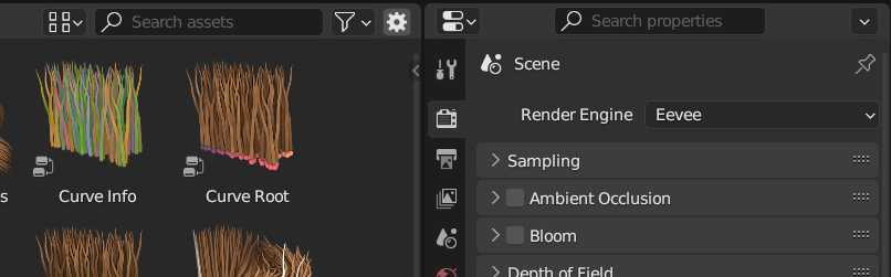
A data-block picker where the label doesn't necessarily explains which type is compatible with (other than the data-block icon):
Data-block selectors could have, by default, a placeholder with the name of the data-block type they support.
Sometimes we have a long field that expects content written in a certain way, but at a glance there are no hints about it:
A brief hint could work as example of what type of content the field expects:
Theme
The hint text in placeholders should be subtle yet visible but not nearly as prominent as the field's content. There's no need to add a new color theme for this as we could simply use the text color but with a 15% opacity (I think Firefox uses 20% by default).
Usage
Setting a placeholder could be done via a new attribute similar to
text, calledplaceholder. They contain text and can be translated. Placeholders can be added to fields of typetext,password, or future more specific ones likeURL,email, that require more specific validation.Placeholders are not a replacement for tooltips or labels. They are just an extra hint of information that can, in some cases, work as label when there's no room for one. For example inside nodes, narrow popovers or some modifier layouts.
I quite like this.
William also proposed this during the 2.8 work, but I can’t find it. It might be nice to dig it up in case there was any work toward it, or comments or concerns. This might seem like a no-brainer, but there are some gotchas.
Having these can create redundancy when the label and placeholder match, which can lead to the temptation to remove labels. Removing labels can cause strain on short-term memory. Basically the one thing that they are actively interacting with does not show the text unless they move away from it or empty it.
Placeholders also fill up the content more in a way that makes it harder to notice empty fields. Conversely it also makes it harder to notice non-empty fields. Although we would have control over which inputs have placeholders, I think once we started there would be a pull to have them on everything.
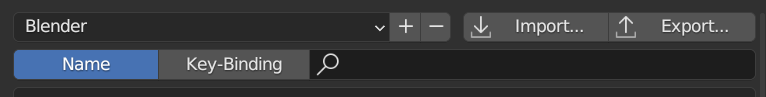
They can give extra visual weight to items that are meant to be optional and used infrequently. An example is how prominent “Search Properties” looks in the example above. When shown within a larger blender window that text could look like a title because of the placement and our current design. Note that your tabs proposal would eliminate this problem since it adds a titled area above.
The placeholder text cannot be super dim, as that would cause issues with users with eyesight impairment. But it also can’t have such contrast that the placeholder can be confused with content text. This is a delicate balance. I’d need to see samples with both dark and light themes. It is possible that a simple opacity change might not be enough in all cases because of our different perception of light highlights verses dark. We’d also want to consider these versus disabled text fields which might look similar.
The biggest question for me is what happens when a user tabs into, or clicks on, an empty field. Many implementations, including css ::placeholder, continue to show the placeholder text while actively editing (showing the text caret) if there are no characters entered. And will show the placeholder again if you delete the last character. When the contrast is sufficient for eyesight-impaired users it can lead to the situation where some users can be confused about whether they need to manually remove the text. This issue is usually more associated with users with some cognitive impairment. Although this applies to us less, I still like having a good accessibility score.
If the placeholder text is not ever shown during active editing (even when blank), then that can lead to a situation that bothers some users: The text pops in and out while tabbing through them.
But overall I do like this idea. I mostly just want your thoughts on when it is shown and then we’d need to do some more mockups in different situations. Note that one way to remove some problems is to add more visual cues to help differentiate. There could be a change of color, not just opacity. They could be drawn with a different width, weight, stroke width, or even slant.
One convention I've seen around is italicized placeholders. This helps differentiate between placeholders and real text in a disabled/greyed-out field.
Yeah, this is great
Closing. Implemented with #112104