UI: Possible Change of Interface Font #112209
Labels
No Label
Interest
Alembic
Interest
Animation & Rigging
Interest
Asset Browser
Interest
Asset Browser Project Overview
Interest
Audio
Interest
Automated Testing
Interest
Blender Asset Bundle
Interest
BlendFile
Interest
Collada
Interest
Compatibility
Interest
Compositing
Interest
Core
Interest
Cycles
Interest
Dependency Graph
Interest
Development Management
Interest
EEVEE
Interest
EEVEE & Viewport
Interest
Freestyle
Interest
Geometry Nodes
Interest
Grease Pencil
Interest
ID Management
Interest
Images & Movies
Interest
Import Export
Interest
Line Art
Interest
Masking
Interest
Metal
Interest
Modeling
Interest
Modifiers
Interest
Motion Tracking
Interest
Nodes & Physics
Interest
OpenGL
Interest
Overlay
Interest
Overrides
Interest
Performance
Interest
Physics
Interest
Pipeline, Assets & IO
Interest
Platforms, Builds & Tests
Interest
Python API
Interest
Render & Cycles
Interest
Render Pipeline
Interest
Sculpt, Paint & Texture
Interest
Text Editor
Interest
Translations
Interest
Triaging
Interest
Undo
Interest
USD
Interest
User Interface
Interest
UV Editing
Interest
VFX & Video
Interest
Video Sequencer
Interest
Virtual Reality
Interest
Vulkan
Interest
Wayland
Interest
Workbench
Interest: X11
Legacy
Blender 2.8 Project
Legacy
Milestone 1: Basic, Local Asset Browser
Legacy
OpenGL Error
Meta
Good First Issue
Meta
Papercut
Meta
Retrospective
Meta
Security
Module
Animation & Rigging
Module
Core
Module
Development Management
Module
EEVEE & Viewport
Module
Grease Pencil
Module
Modeling
Module
Nodes & Physics
Module
Pipeline, Assets & IO
Module
Platforms, Builds & Tests
Module
Python API
Module
Render & Cycles
Module
Sculpt, Paint & Texture
Module
Triaging
Module
User Interface
Module
VFX & Video
Platform
FreeBSD
Platform
Linux
Platform
macOS
Platform
Windows
Priority
High
Priority
Low
Priority
Normal
Priority
Unbreak Now!
Status
Archived
Status
Confirmed
Status
Duplicate
Status
Needs Info from Developers
Status
Needs Information from User
Status
Needs Triage
Status
Resolved
Type
Bug
Type
Design
Type
Known Issue
Type
Patch
Type
Report
Type
To Do
No Milestone
No project
No Assignees
5 Participants
Notifications
Due Date
No due date set.
Dependencies
No dependencies set.
Reference: blender/blender#112209
Loading…
Reference in New Issue
No description provided.
Delete Branch "%!s(<nil>)"
Deleting a branch is permanent. Although the deleted branch may continue to exist for a short time before it actually gets removed, it CANNOT be undone in most cases. Continue?
With Blender 4.0 I am hoping that we can consider upgrading our interface font to something...
Of these the first is quite subjective. But our current font, Deja Vu Sans Book came out in 2006, based on Bitstream Vera which was released in 2003. It has a look of its time and this look can cause our program to look similar dated.
Being "easy to read" can also be subjective. But I'm looking for good proportions, a good use of whitespace, etc. But also ideally avoid confusions like lowercase L and 1, "clear / dear", "turn / tum", etc
Support variable design axes is important to me because it allows the one font to support different weights, widths, tracking, slant, etc. Most will also tailor their feature sizes to output size. The majority of our fallback font stack consists of variable fonts, so this would complete that.
Most fonts are designed and become static. I want a font that is actively maintained. Bugs fixed, glyphs added, and features improved by an active designer and community. The current version of our current font was released in 2016 and has had no changes for more six years.
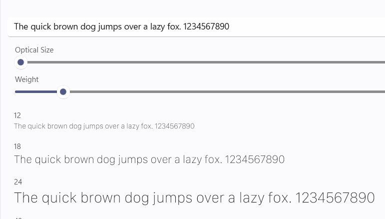
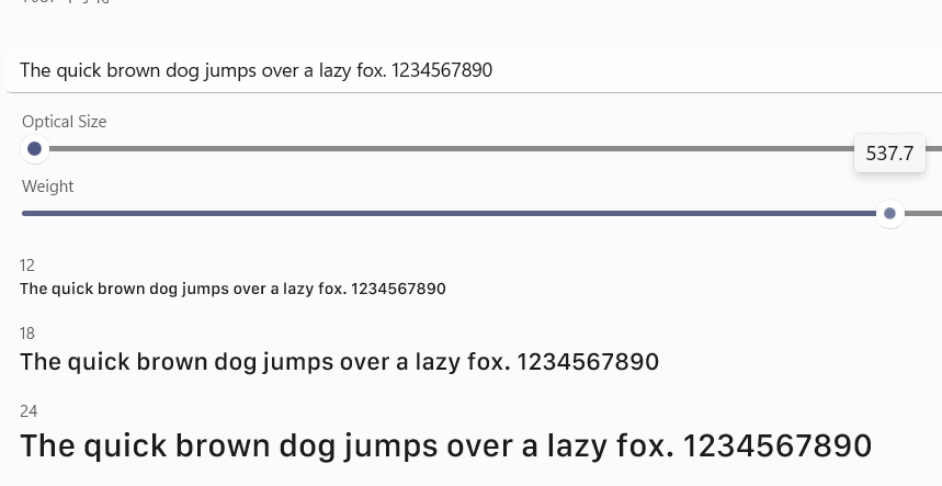
With the above in mind I can only find two fonts that meet my requirements: Inter and Roboto Flex. I would love to hear of any other suggestions.
For testing the suitability of fonts I would prefer to do so with the following PR applied: BLF: Subpixel Positioning, Anti-aliasing, Hinting #105441. This PR enables typographically-correct sizing, placement, and rendering.
Of these two fonts "Inter" is my favorite and has been the best-regarded interface font for a while now. However there is one way where it falls short for us.
Inter is kerned meticulously by its creator. Unfortunately the large amount of kerning corrections does not allow it to support the old style of kerning table that we use. It does not use the "KERN" table, but only the new style "GPOS" table. The former is supported by FreeType alone, while the latter requires a shaper like Harfbuzz (which also does complex languages, ligatures, etc). So in Blender, for now, Inter might show occasional kerning issues not shown in other applications or by Roboto. Whether anyone really cares though is up for debate - we have been using Deja Vu without kerning for years now.
Inter Variable V4.0 (Currently beta9h)
Roboto Flex 3.200
If want support variable font... We need to add the api of weight of font(If you don't, then support for variable fonts won't make sense)
Also the font feature or varian: ligature (likes “fi”or“ffl” )kerning
Even ClearType render of Windows(Somebody likes this font render...But many user think this is shit?)
Should we provide pixel font adaptation for low-resolution screens?(likes unifont when font size min than 12px)
Fallback font?
Noto sans and Noto sans CJK may be the best choice for the unicode of other language
Our text output code does support variable font axes, like weight, width, slant, spacing, and optical size. We just don't really use it or expose it to users yet. But we can do so when our main font is a variable font.
Supporting Ligatures requires a shaping engine like HarfBuzz. We do have that library as part of our project now, but are not yet using it. Here is a PR that uses it: #104662
We could have that as an option feature. That would require supporting multiple FreeType render formats at once, I have a patch that does this here: https://archive.blender.org/developer/D14422, but then it would require someone who is good with shaders to implement one for subpixel display.
I'm not sure what you mean. Could you explain this more? We are quite often outputting strings with sizes down to about 9px.
Yes, Blender currently ships with a stack of fonts to support different languages and Unicode ranges, almost entirely from the Noto Sans Family, and including Noto sans CJK.
Quite a few fonts match nicely with Noto fonts. Even the Android OS itself uses Roboto as its main font and falls back to Noto Fonts.
They do look pretty nice, I guess especially on higher dpi screens (From the screenshot, the text might want to be a little bit bigger related to the interface button size, but that's adjustable I guess).
To me I'm thinking of a somewhat slender font which can save screen real estate, or giving a glyph-advance distance adjustment, so if there's a font that have a good shape but characters are spaced apart too far (which happens in a ton of Chinese fonts), it's not gonna be very useful to be used on the UI.
Also, we need boldness selection if user have selected fonts that have multiple variants packaged together.
There are hardly any free/maintained Chinese fonts out there due to the number of glyphs. 🤔 and I agree
Noto sans CJKis probably gonna stay for a long time. (I think it is the same as current blender font?)I'm guessing kerning like "ffl" is probably harder to achieve in the current font rendering mechanism... but could be possible.
So... It will use the weight switch bar instead of the old font style list for variable font?
I likes this scroll bar:
Of course, we could also add a text box for user to custom the value of weight if the font is variable font.
It will be better if we also add the value of weight to font of Geometry nodes.[future]
I have to say I quite like the look of Inter. A font specifically designed for UIs? Interesting!
Now, it's probably not a high priority, but it would be nice to use 4.0 to change the font, if we want to do it anytime soon. But also a nice to give Blender a fresh look then, without another big theme upgrade or such. So maybe we can put this on the 4.0 agenda as a nice-to-have.
Does that mean we should look into #105441? Also, because of differences in spacing, this may require some small tweaks throughout the UI to avoid cut off text and to keep things look polished. So good to calculate in some time for that.
Kerning support is definetely a desired feature here. For example look at "Triangles" ("Tr"), "Window" ("ow").
Yes, it is mentioned in the first comment that we can't currently do the type of kerning ("gpos") used in modern fonts like Inter. We can only do the old-style ("kern") kerning, which is not in Inter, and we actually had that turned off for our old font DejaVuSans.
To do modern kerning we'd need to add a shaper like HarfBuzz, which also does things like OpenType features, ligatures, right-to-left and complex languages. That is on our to do list, but I wouldn't expect that any time soon.
Can't we include HarfBuzz and use it for kerning without making it a big project to also bring these other features? I would hope (expect even) that this can be a reasonably small task, while features like right-to-left and complex languages seem like big efforts. Honest question, I never worked with HarfBuzz and have no idea how many changes in BLF would be necessary.
Yes, that would be a series of small tasks using code that is already written.
Both Harfbuzz and Fribidi have been included in our libs for a while now. The first step is to just make them each optional components of the build so devs can choose to enable them in CMakeCache.txt. I could post those changes in half an hour as that has already been done and worked out with Ray for all platforms.
Using Harfbuzz there is one fundamental change even if using it only for typographic things like gpos and OpenType features. It works on a block of text at a time while our current code works character-by-character. But this has all be worked out in code that works well.
So just fixing the kerning would take a day and would probably be something that we could turn on at first using an experimental feature.
With just this in place we could also choose to allow users to select OpenType features. So they could turn on slashed zero or turn off the ambiguation set. These things can be enabled with a single line once Harfbuzz is in.
The next step is only ensuring that our code can handle getting back more or less glyphs than the number of characters in the output string. This too is code already done. But this allows ligatures. Typographically it is nice even for our regular Latin output because most fonts have specialized versions of combinations of letters like "fi", "fl", etc.
With support for ligatures then we could also allow users to turn them on in the text editor to support fonts like "Fira Code". So a checkbox, off by default, for "programming ligatures" that turns -> into →. I have already demonstrated this. There are small changes needed to the text output code to make that easier though: #110174.
With the above we would actually see some benefit for some foreign languages, those that need complex shaping yet are left-to-right. For example where now an accent might always be a set distance from the start of a character, it would now be centered on the character regardless of its width. And multiple accents on a single character will work much better.
Again, the above has largely been thought through, coded, and tested. A very small subset that can be plucked out of #104662.
The next step of allowing right-to-left is the hard part because of the reordering. At that point text caret insertion and movement has to be done by the output glyphs, and we have arrays that map input to output position that we have to consult. Similar happens with mouse selection. Some of this is done but it is complex to get to a point where RTL text can be edited well. This is the type of thing that I could get us close and usable, but really needs improvement by outside volunteer devs who use RTL languages. But I imagine having just "RTL language support" as an experimental feature on its own for a while.
Once that is working then it is quite surprising how much pressure there is for UI mirroring, to allow the various parts of the interface have a right-to-left flow. Editing RTL text while having it left-aligned is odd. Basically all that text needs to be right-aligned and so then you need to move dropdown arrows to the right, etc. I played with that and there weren't too many changes to make a big difference: https://archive.blender.org/developer/D15984