Regression: Blender 4.0 font rendering blurry and broken. #113005

Open
opened 2023-09-28 11:55:26 +02:00 by Ludvik Koutny · 13 comments
Contributor

System Information
Operating system: Windows-10-10.0.22621-SP0 64 Bits
Graphics card: NVIDIA GeForce RTX 2080 Ti/PCIe/SSE2 NVIDIA Corporation 4.6.0 NVIDIA 537.13

Blender Version
Broken: version: 4.0.0 Beta, branch: blender-v4.0-release, commit date: 2023-09-28 00:03, hash: 751c9ef620a0
Worked: 3.6.2

Short description of error
There appears to be something seriously wrong with font rendering in 4.0 beta. The font is much more blurry and weirdly distorted at exact same UI scale with exact same preferences. I keep squinting and reaching for my glasses just to realize I have them already on. The font is significantly blurrier not only compared to 3.6 but also any other Windows app I use, like Chrome or VSCode.

Some additional details:
Windows 11 with DPI scaling set to 1.0
Blender's UI resolution scale set at 1.0
Here are comparison images:
Font1.png
Font2.png
Font3.png

The example of font distortion is most prominent on the "Eevee" label of selected renderer, where then center line of "E" appears at about 1/3rd height instead of in the center.

Exact steps for others to reproduce the error

  1. On Windows 11 with DPI scaling set to 100%, open Blender 4.0 beta and Blender 3.6.2
    Result: The font rendering in 4.0 is much more blurry and font is weirdly distorted.
    Expected: The font rendering in 4.0 is better or same quality compared to 3.6.
**System Information** Operating system: Windows-10-10.0.22621-SP0 64 Bits Graphics card: NVIDIA GeForce RTX 2080 Ti/PCIe/SSE2 NVIDIA Corporation 4.6.0 NVIDIA 537.13 **Blender Version** Broken: version: 4.0.0 Beta, branch: blender-v4.0-release, commit date: 2023-09-28 00:03, hash: `751c9ef620a0` Worked: 3.6.2 **Short description of error** There appears to be something seriously wrong with font rendering in 4.0 beta. The font is much more blurry and weirdly distorted at exact same UI scale with exact same preferences. I keep squinting and reaching for my glasses just to realize I have them already on. The font is significantly blurrier not only compared to 3.6 but also any other Windows app I use, like Chrome or VSCode. Some additional details: Windows 11 with DPI scaling set to 1.0 Blender's UI resolution scale set at 1.0 Here are comparison images: ![Font1.png](/attachments/a27b16e7-5432-4129-aaa8-9bcec2c0dbb5) ![Font2.png](/attachments/c18fb375-789e-4204-a847-d95b3f28941a) ![Font3.png](/attachments/ff3d2bda-3342-4535-ad09-caf178874123) The example of font distortion is most prominent on the "Eevee" label of selected renderer, where then center line of "E" appears at about 1/3rd height instead of in the center. **Exact steps for others to reproduce the error** 1. On Windows 11 with DPI scaling set to 100%, open Blender 4.0 beta and Blender 3.6.2 Result: The font rendering in 4.0 is much more blurry and font is weirdly distorted. Expected: The font rendering in 4.0 is better or same quality compared to 3.6.
Ludvik Koutny added the
Priority
Normal
Type
Report
Status
Needs Triage
labels 2023-09-28 11:55:27 +02:00
Member

You could technically adjust the hinting option in the text rendering section, it will make some slight difference. This is also due to recently updated default font being a bit narrower.

图片

@Harley could you take a look?

You could technically adjust the hinting option in the text rendering section, it will make some slight difference. This is also due to recently updated default font being a bit narrower. ![图片](/attachments/72b8968d-ede4-46f7-901b-7822004c7038) @Harley could you take a look?
YimingWu added
Module
User Interface
Status
Needs Info from Developers
and removed
Status
Needs Triage
labels 2023-09-28 16:22:53 +02:00
Author
Contributor

You could technically adjust the hinting option in the text rendering section, it will make some slight difference. This is also due to recently updated default font being a bit narrower.

图片

@Harley could you take a look?

Ohhh, it's a new font! That explains it.

I forgot to mention. I always have hinting set to "Full" and I have migrated my settings from 3.6. I guess that could explain part of it. That the legibility didn't regress in 4.0 when it comes to default hinting setting. But still, when using full hinting, the old font seems much sharper.

So not sure, but would this still be considered a bug/issue when using non-default hinting setting (Full)?

> You could technically adjust the hinting option in the text rendering section, it will make some slight difference. This is also due to recently updated default font being a bit narrower. > > ![图片](/attachments/72b8968d-ede4-46f7-901b-7822004c7038) > > @Harley could you take a look? Ohhh, it's a new font! That explains it. I forgot to mention. I always have hinting set to "Full" and I have migrated my settings from 3.6. I guess that could explain part of it. That the legibility didn't regress in 4.0 when it comes to default hinting setting. But still, when using full hinting, the old font seems much sharper. So not sure, but would this still be considered a bug/issue when using non-default hinting setting (Full)?
Member

Ohhh, it's a new font! That explains it.

I forgot to mention. I always have hinting set to "Full" and I have migrated my settings from 3.6. I guess that could explain part of it. That the legibility didn't regress in 4.0 when it comes to default hinting setting. But still, when using full hinting, the old font seems much sharper.

So not sure, but would this still be considered a bug/issue when using non-default hinting setting (Full)?

I think I have to add a new configurable option in there. I added multiple features but they are right now controlled by the Hinting dropdown in a non-obvious way. In a nutshell I was hoping that I could make most users happy with the least amount of options.

Subpixel positioning was added so that I could do the hinting properly. There will be changes to the spacing when selecting the hinting options only because they are now doing what they are supposed to do. But this does mean you no longer get the big length expansion we used to get.

But I also added subpixel antialiasing. This is rendering multiple versions of glyphs (at small sizes) for ideal subpixel horizontal placement. For most people this will look better, especially as the font gets larger than our smallest size. But I have this OFF when hinting is off, but on for the two hinting modes. Tying this together is screwing you up. What you want, but don't know it I think, is Full hinting but without subpixel AA.

There are lots of good reasons to have the subpixel AA a separate configuration.

> Ohhh, it's a new font! That explains it. > > I forgot to mention. I always have hinting set to "Full" and I have migrated my settings from 3.6. I guess that could explain part of it. That the legibility didn't regress in 4.0 when it comes to default hinting setting. But still, when using full hinting, the old font seems much sharper. > > So not sure, but would this still be considered a bug/issue when using non-default hinting setting (Full)? I think I have to add a new configurable option in there. I added multiple features but they are right now controlled by the Hinting dropdown in a non-obvious way. In a nutshell I was hoping that I could make most users happy with the least amount of options. Subpixel positioning was added so that I could do the hinting properly. There will be changes to the spacing when selecting the hinting options only because they are now doing what they are supposed to do. But this does mean you no longer get the big length expansion we used to get. But I also added subpixel antialiasing. This is rendering multiple versions of glyphs (at small sizes) for ideal subpixel horizontal placement. For most people this will look better, especially as the font gets larger than our smallest size. But I have this OFF when hinting is off, but on for the two hinting modes. Tying this together is screwing you up. What you want, but don't know it I think, is Full hinting but without subpixel AA. There are lots of good reasons to have the subpixel AA a separate configuration.
Harley Acheson self-assigned this 2023-09-28 17:10:06 +02:00
Author
Contributor

Ohhh, it's a new font! That explains it.

I forgot to mention. I always have hinting set to "Full" and I have migrated my settings from 3.6. I guess that could explain part of it. That the legibility didn't regress in 4.0 when it comes to default hinting setting. But still, when using full hinting, the old font seems much sharper.

So not sure, but would this still be considered a bug/issue when using non-default hinting setting (Full)?

I think I have to add a new configurable option in there. I added multiple features but they are right now controlled by the Hinting dropdown in a non-obvious way. In a nutshell I was hoping that I could make most users happy with the least amount of options.

Subpixel positioning was added so that I could do the hinting properly. There will be changes to the spacing when selecting the hinting options only because they are now doing what they are supposed to do. But this does mean you no longer get the big length expansion we used to get.

But I also added subpixel antialiasing. This is rendering multiple versions of glyphs (at small sizes) for ideal subpixel horizontal placement. For most people this will look better, especially as the font gets larger than our smallest size. But I have this OFF when hinting is off, but on for the two hinting modes. Tying this together is screwing you up. What you want, but don't know it I think, is Full hinting but without subpixel AA.

There are lots of good reasons to have the subpixel AA a separate configuration.

If it helps, here's my 3.6 config (with addons stripped):
3.6.zip
Using that one in both 3.6 and 4.0 shows a huge difference.

BTW what is the name of the 3.6 font? I'd like to manually load it into 4.0 and see if it's just the font, or if there's more to it. If it's the lack of separation of hinting and AA options, then even the same font should look worse in 4.0. I just don't know which one the original was. There's many files in Blender's fonts directory:
image

> > Ohhh, it's a new font! That explains it. > > > > I forgot to mention. I always have hinting set to "Full" and I have migrated my settings from 3.6. I guess that could explain part of it. That the legibility didn't regress in 4.0 when it comes to default hinting setting. But still, when using full hinting, the old font seems much sharper. > > > > So not sure, but would this still be considered a bug/issue when using non-default hinting setting (Full)? > > I think I have to add a new configurable option in there. I added multiple features but they are right now controlled by the Hinting dropdown in a non-obvious way. In a nutshell I was hoping that I could make most users happy with the least amount of options. > > Subpixel positioning was added so that I could do the hinting properly. There will be changes to the spacing when selecting the hinting options only because they are now doing what they are supposed to do. But this does mean you no longer get the big length expansion we used to get. > > But I also added subpixel antialiasing. This is rendering multiple versions of glyphs (at small sizes) for ideal subpixel horizontal placement. For most people this will look better, especially as the font gets larger than our smallest size. But I have this OFF when hinting is off, but on for the two hinting modes. Tying this together is screwing you up. What you want, but don't know it I think, is Full hinting but without subpixel AA. > > There are lots of good reasons to have the subpixel AA a separate configuration. If it helps, here's my 3.6 config (with addons stripped): [3.6.zip](/attachments/972ac8b2-72b1-460f-aa3d-8f8a1e24961f) Using that one in both 3.6 and 4.0 shows a huge difference. BTW what is the name of the 3.6 font? I'd like to manually load it into 4.0 and see if it's just the font, or if there's more to it. If it's the lack of separation of hinting and AA options, then even the same font should look worse in 4.0. I just don't know which one the original was. There's many files in Blender's fonts directory: ![image](/attachments/e638cd2c-1d98-45a8-af3d-3f196d805c84)
Member

BTW what is the name of the 3.6 font?

It's "Inter".

https://rsms.me/inter/

Technically it is the base "Inter" with features "tnum", "ss01", and "ss04" turned on. You can explore those changes here: https://rsms.me/inter/lab/?antialias=default&feat-ss01=1&feat-ss04=1&feat-tnum=1

> BTW what is the name of the 3.6 font? It's "Inter". https://rsms.me/inter/ Technically it is the base "Inter" with features "tnum", "ss01", and "ss04" turned on. You can explore those changes here: https://rsms.me/inter/lab/?antialias=default&feat-ss01=1&feat-ss04=1&feat-tnum=1
Author
Contributor

BTW what is the name of the 3.6 font?

It's "Inter".

https://rsms.me/inter/

Technically it is the base "Inter" with features "tnum", "ss01", and "ss04" turned on. You can explore those changes here: https://rsms.me/inter/lab/?antialias=default&feat-ss01=1&feat-ss04=1&feat-tnum=1

So do I understand it correctly that both 3.6 and 4.0 use the same "Inter" font just with different features? I tried loading the Inter.woff2 from 4.0\datafiles\fonts and I saw no change. I was curious what the old font was, not the new one.

Funnily enough, when I load then Inter.woff2 from 4.0 into 3.6 with hinting set to full, entire first letters become missing:
image That's not the case with slight hinting.

> > BTW what is the name of the 3.6 font? > > It's "Inter". > > https://rsms.me/inter/ > > Technically it is the base "Inter" with features "tnum", "ss01", and "ss04" turned on. You can explore those changes here: https://rsms.me/inter/lab/?antialias=default&feat-ss01=1&feat-ss04=1&feat-tnum=1 So do I understand it correctly that both 3.6 and 4.0 use the same "Inter" font just with different features? I tried loading the Inter.woff2 from 4.0\datafiles\fonts and I saw no change. I was curious what the old font was, not the new one. Funnily enough, when I load then Inter.woff2 from 4.0 into 3.6 with hinting set to full, entire first letters become missing: ![image](/attachments/62c5e2ca-a99a-45ef-b189-18f38e87d735) That's not the case with slight hinting.
Member

So do I understand it correctly that both 3.6 and 4.0 use the same "Inter" font just with different features?

No, 3.6 has not changed. It is only 4.0 that ships with and uses Inter.

3.6 uses the "DejaVuSans.woff2" you see in its datafiles/fonts folder.

Funnily enough...

Just a thing that is fixed in 4.0

> So do I understand it correctly that both 3.6 and 4.0 use the same "Inter" font just with different features? No, 3.6 has not changed. It is only 4.0 that ships with and uses Inter. 3.6 uses the "DejaVuSans.woff2" you see in its datafiles/fonts folder. > Funnily enough... Just a thing that is fixed in 4.0
Member

I have a PR for this here: #113027

I have a PR for this here: https://projects.blender.org/blender/blender/pulls/113027
Author
Contributor

I have a PR for this here: #113027

Wait, you already did the patch? I just came to tell you that when using DejaVu font in 4.0 the rendering quality is nearly the same. :D

With "Full" hinting there's just tiny difference. Most of the blurriness doesn't come from the antialiasing, but from the font change:

With "Slight" hinting, the difference using the DejaVu font is more significant. It appears that in 4.0, "Slight" hinting is as wide as "Full" hinting was in 3.6:

Non the less, the most important piece of the information is that most of the blurriness and worsened readability doesn't come from changes to hinting and antialiasing, but from the change of the default font. Specifically when it comes to DejaVu font with Full hinting, the readability in 4.0 is just a little bit worse, but almost identical.

> I have a PR for this here: https://projects.blender.org/blender/blender/pulls/113027 Wait, you already did the patch? I just came to tell you that when using DejaVu font in 4.0 the rendering quality is nearly the same. :D With "Full" hinting there's just tiny difference. Most of the blurriness doesn't come from the antialiasing, but from the font change: <video src="/attachments/295c666c-8637-4fda-95d8-bd9b1304f820" title="2023-09-28_19-25-46.mp4" controls></video> With "Slight" hinting, the difference using the DejaVu font is more significant. It appears that in 4.0, "Slight" hinting is as wide as "Full" hinting was in 3.6: <video src="/attachments/2d93dc61-d9f9-42b2-8120-2dec65c80909" title="2023-09-28_19-27-55.mp4" controls></video> Non the less, the most important piece of the information is that most of the blurriness and worsened readability doesn't come from changes to hinting and antialiasing, but from the change of the default font. Specifically when it comes to DejaVu font with Full hinting, the readability in 4.0 is just a little bit worse, but almost identical.
Member

With "Full" hinting there's just tiny difference. Most of the blurriness doesn't come from the antialiasing, but from the font change:

Your testing won't really yield proper comparisons unless you compile blender from source using the PR linked above.

> With "Full" hinting there's just tiny difference. Most of the blurriness doesn't come from the antialiasing, but from the font change: Your testing won't really yield proper comparisons unless you compile blender from source using the PR linked above.
Member

@Rawalanche - Made you some custom builds that incorporate that PR. When you launch it you will have "Subpixel antialiasing" separate from "Hinting" to make it easier to see what each does. https://builder.blender.org/download/patch/PR113027/

@Rawalanche - Made you some custom builds that incorporate that PR. When you launch it you will have "Subpixel antialiasing" separate from "Hinting" to make it easier to see what each does. https://builder.blender.org/download/patch/PR113027/
Author
Contributor

@Rawalanche - Made you some custom builds that incorporate that PR. When you launch it you will have "Subpixel antialiasing" separate from "Hinting" to make it easier to see what each does. https://builder.blender.org/download/patch/PR113027/

Thanks. I gotta get my daily job done but I will definitely give it a thorough test before end of the week.

> @Rawalanche - Made you some custom builds that incorporate that PR. When you launch it you will have "Subpixel antialiasing" separate from "Hinting" to make it easier to see what each does. https://builder.blender.org/download/patch/PR113027/ > Thanks. I gotta get my daily job done but I will definitely give it a thorough test before end of the week.
Author
Contributor

@Rawalanche - Made you some custom builds that incorporate that PR. When you launch it you will have "Subpixel antialiasing" separate from "Hinting" to make it easier to see what each does. https://builder.blender.org/download/patch/PR113027/

@Harley
Hey, so I was finally able to test it. Sorry for the delay.
With turning subpixel AA OFF, even the new font seems much more readable:
Default.png

The old DejaVu font is also equally as readable as in 3.6 with subpixel AA OFF:
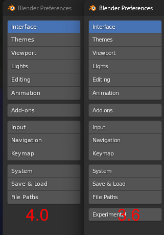
OldFont.png

That being said, even though the font is no longer blurry, the new 4.0 font still appears weirder and more distorted:
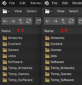
FontDifference.png
Maybe it's subjective but the old one seems to have simpler shapes with less visual noise.

Anyway, the bottom line is, that if the subpixel AA remains exposed, then it's possible to get 3.6 levels of font readability by changing the default configuration. It's just that the readability will be poor out of the box. If the subpixel AA is to be hidden again, it should probably be hardcoded to OFF, not ON, or perhaps toggled internally based on DPI scaling. At 100% DPI scaling, it seems to do more harm than good.

> @Rawalanche - Made you some custom builds that incorporate that PR. When you launch it you will have "Subpixel antialiasing" separate from "Hinting" to make it easier to see what each does. https://builder.blender.org/download/patch/PR113027/ > @Harley Hey, so I was finally able to test it. Sorry for the delay. With turning subpixel AA OFF, even the new font seems much more readable: ![Default.png](/attachments/dc9e58f6-f1d1-4901-b60f-75a4fb0a2ca1) The old DejaVu font is also equally as readable as in 3.6 with subpixel AA OFF: ![OldFont.png](/attachments/ee179c5d-c985-4ff7-acb2-86b281bc8e97) That being said, even though the font is no longer blurry, the new 4.0 font still appears weirder and more distorted: ![FontDifference.png](/attachments/4dcf6043-22e6-4057-95fb-7e0c89a7a419) Maybe it's subjective but the old one seems to have simpler shapes with less visual noise. Anyway, the bottom line is, that if the subpixel AA remains exposed, then it's possible to get 3.6 levels of font readability by changing the default configuration. It's just that the readability will be poor out of the box. If the subpixel AA is to be hidden again, it should probably be hardcoded to OFF, not ON, or perhaps toggled internally based on DPI scaling. At 100% DPI scaling, it seems to do more harm than good.
Sign in to join this conversation.
No Label
Interest
Alembic
Interest
Animation & Rigging
Interest
Asset Browser
Interest
Asset Browser Project Overview
Interest
Audio
Interest
Automated Testing
Interest
Blender Asset Bundle
Interest
BlendFile
Interest
Collada
Interest
Compatibility
Interest
Compositing
Interest
Core
Interest
Cycles
Interest
Dependency Graph
Interest
Development Management
Interest
EEVEE
Interest
EEVEE & Viewport
Interest
Freestyle
Interest
Geometry Nodes
Interest
Grease Pencil
Interest
ID Management
Interest
Images & Movies
Interest
Import Export
Interest
Line Art
Interest
Masking
Interest
Metal
Interest
Modeling
Interest
Modifiers
Interest
Motion Tracking
Interest
Nodes & Physics
Interest
OpenGL
Interest
Overlay
Interest
Overrides
Interest
Performance
Interest
Physics
Interest
Pipeline, Assets & IO
Interest
Platforms, Builds & Tests
Interest
Python API
Interest
Render & Cycles
Interest
Render Pipeline
Interest
Sculpt, Paint & Texture
Interest
Text Editor
Interest
Translations
Interest
Triaging
Interest
Undo
Interest
USD
Interest
User Interface
Interest
UV Editing
Interest
VFX & Video
Interest
Video Sequencer
Interest
Virtual Reality
Interest
Vulkan
Interest
Wayland
Interest
Workbench
Interest: X11
Legacy
Blender 2.8 Project
Legacy
Milestone 1: Basic, Local Asset Browser
Legacy
OpenGL Error
Meta
Good First Issue
Meta
Papercut
Meta
Retrospective
Meta
Security
Module
Animation & Rigging
Module
Core
Module
Development Management
Module
EEVEE & Viewport
Module
Grease Pencil
Module
Modeling
Module
Nodes & Physics
Module
Pipeline, Assets & IO
Module
Platforms, Builds & Tests
Module
Python API
Module
Render & Cycles
Module
Sculpt, Paint & Texture
Module
Triaging
Module
User Interface
Module
VFX & Video
Platform
FreeBSD
Platform
Linux
Platform
macOS
Platform
Windows
Priority
High
Priority
Low
Priority
Normal
Priority
Unbreak Now!
Status
Archived
Status
Confirmed
Status
Duplicate
Status
Needs Info from Developers
Status
Needs Information from User
Status
Needs Triage
Status
Resolved
Type
Bug
Type
Design
Type
Known Issue
Type
Patch
Type
Report
Type
To Do
No Milestone
No project
No Assignees
3 Participants
Notifications
Due Date
The due date is invalid or out of range. Please use the format 'yyyy-mm-dd'.

No due date set.

Dependencies

No dependencies set.

Reference: blender/blender#113005
No description provided.