Point/Spot Lights have Harsh Edges in Blender 4.0 (constant inside their radius) #114241
Labels
No Label
Interest
Alembic
Interest
Animation & Rigging
Interest
Asset System
Interest
Audio
Interest
Automated Testing
Interest
Blender Asset Bundle
Interest
BlendFile
Interest
Code Documentation
Interest
Collada
Interest
Compatibility
Interest
Compositing
Interest
Core
Interest
Cycles
Interest
Dependency Graph
Interest
Development Management
Interest
EEVEE
Interest
Freestyle
Interest
Geometry Nodes
Interest
Grease Pencil
Interest
ID Management
Interest
Images & Movies
Interest
Import Export
Interest
Line Art
Interest
Masking
Interest
Metal
Interest
Modeling
Interest
Modifiers
Interest
Motion Tracking
Interest
Nodes & Physics
Interest
OpenGL
Interest
Overlay
Interest
Overrides
Interest
Performance
Interest
Physics
Interest
Pipeline, Assets & IO
Interest
Platforms, Builds & Tests
Interest
Python API
Interest
Render & Cycles
Interest
Render Pipeline
Interest
Sculpt, Paint & Texture
Interest
Text Editor
Interest
Translations
Interest
Triaging
Interest
Undo
Interest
USD
Interest
User Interface
Interest
UV Editing
Interest
VFX & Video
Interest
Video Sequencer
Interest
Viewport & EEVEE
Interest
Virtual Reality
Interest
Vulkan
Interest
Wayland
Interest
Workbench
Interest: X11
Legacy
Asset Browser Project
Legacy
Blender 2.8 Project
Legacy
Milestone 1: Basic, Local Asset Browser
Legacy
OpenGL Error
Meta
Good First Issue
Meta
Papercut
Meta
Retrospective
Meta
Security
Module
Animation & Rigging
Module
Core
Module
Development Management
Module
Grease Pencil
Module
Modeling
Module
Nodes & Physics
Module
Pipeline, Assets & IO
Module
Platforms, Builds & Tests
Module
Python API
Module
Render & Cycles
Module
Sculpt, Paint & Texture
Module
Triaging
Module
User Interface
Module
VFX & Video
Module
Viewport & EEVEE
Platform
FreeBSD
Platform
Linux
Platform
macOS
Platform
Windows
Severity
High
Severity
Low
Severity
Normal
Severity
Unbreak Now!
Status
Archived
Status
Confirmed
Status
Duplicate
Status
Needs Info from Developers
Status
Needs Information from User
Status
Needs Triage
Status
Resolved
Type
Bug
Type
Design
Type
Known Issue
Type
Patch
Type
Report
Type
To Do
No Milestone
No project
No Assignees
17 Participants
Notifications
Due Date
No due date set.
Dependencies
No dependencies set.
Reference: blender/blender#114241
Loading…
Reference in New Issue
Block a user
No description provided.
Delete Branch "%!s()"
Deleting a branch is permanent. Although the deleted branch may continue to exist for a short time before it actually gets removed, it CANNOT be undone in most cases. Continue?
System Information
Operating system: Linux-6.5.9-zen2-1-zen-x86_64-with-glibc2.38 64 Bits, WAYLAND UI
Graphics card: Mesa Intel(R) Graphics (ADL GT2) Intel 4.6 (Core Profile) Mesa 23.2.1-arch1.2
Blender Version
Broken: version: 4.0.0 Beta, branch: blender-v4.0-release, commit date: 2023-10-27 13:13, hash:
b0a032e2eb0aCaused by
a4d792a3adShort description of error
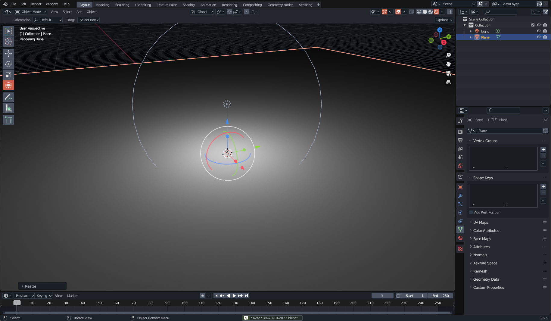
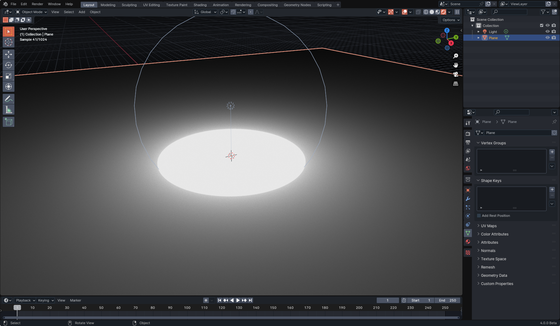
Point lights have extremely harsh edges, even with high radii like 5 meters. This behavior is not seen in Blender 3.6.5.
Blender 3.6.5:
Blender 4.0:
This behavior becomes annoying in practical scenes, such as this one (also attached to this report as

VT-28-10-2023.blend):Exact steps for others to reproduce the error
So apparently this is intended behavior (#108506). While I see the reasons why, I can't seem to replicate the old falloff behavior unless I set the power to an extremely high value. I think there should be an option to have the old falloff behavior, unless that would cause other issues?
Your light has massive radius. The main issue here is that Blender doesn't render light's visible surface by default, which leads to confusion like yours. The radius parameter in the point light is not falloff (the distance of illumination). It's literally the radius of the sphere that emits the light. The issue is that you don't see surface of that sphere, where as with mesh light, you would.
To get closer to your original result, reduce the radius of your light significantly, from 5 meters to like 5 centimeters, and then bring the light source closer to the surface.
The problem is a 5 centimeter light also has much harsher shadows, which is not what I'd want.
Looking in some older scene files, there's major compatibility issues causes by the change in how point lights are treated. It would be nice to have an option to opt out of treating point lights as emissive spheres and return to the old behavior, especially for compatibility reasons
The 3.6 behavior was so incorrect that it's borderline a bug. Cycles is a PBR renderer, and in physically based rendering, there should always be a relation between light source size and shadow softness. I mean even modern game engines do that. You should never run into a scenario where you need to break this relation, even for artistic purposes.
Could you explain why there is a need for the light to have such a big radius in your scenes?
(just trying to understand why it has been set up like this, since it does not really seem to be based on real light properties).
Other than that, pretty sure this will be closed (same as #111091).
From personal experience (and it seems this experience aligns with many others), it's pretty common to use large radius, dimmer point lights to add artificial artistic lighting to scenes. The same is true in games and other media. Due to this changed behavior, this would now be much more inconvenient to achieve, and all previous projects would no longer be compatible with newer versions without significant changes to the lighting.
From my perspective, this change makes complete sense from a pathtracing standpoint, the previous behavior doesn't make physical sense at all. That being said, this old behavior was significantly more artist friendly in a lot of ways, and it feels like an overall regression to simply remove it entirely. It would be amazing if this behavior could be toggled with a checkbox or something, but in its current state I fear it would only make things worse.
The scene I gave in the original issue was where I noticed the problem originally, so I'll use another scene I have to demonstrate.
In this scene below, we have a light that's supposed to act as environment light provided by the scene (off camera of course). Since this presumably comes from a large source of light, a large radius was assigned to said light.
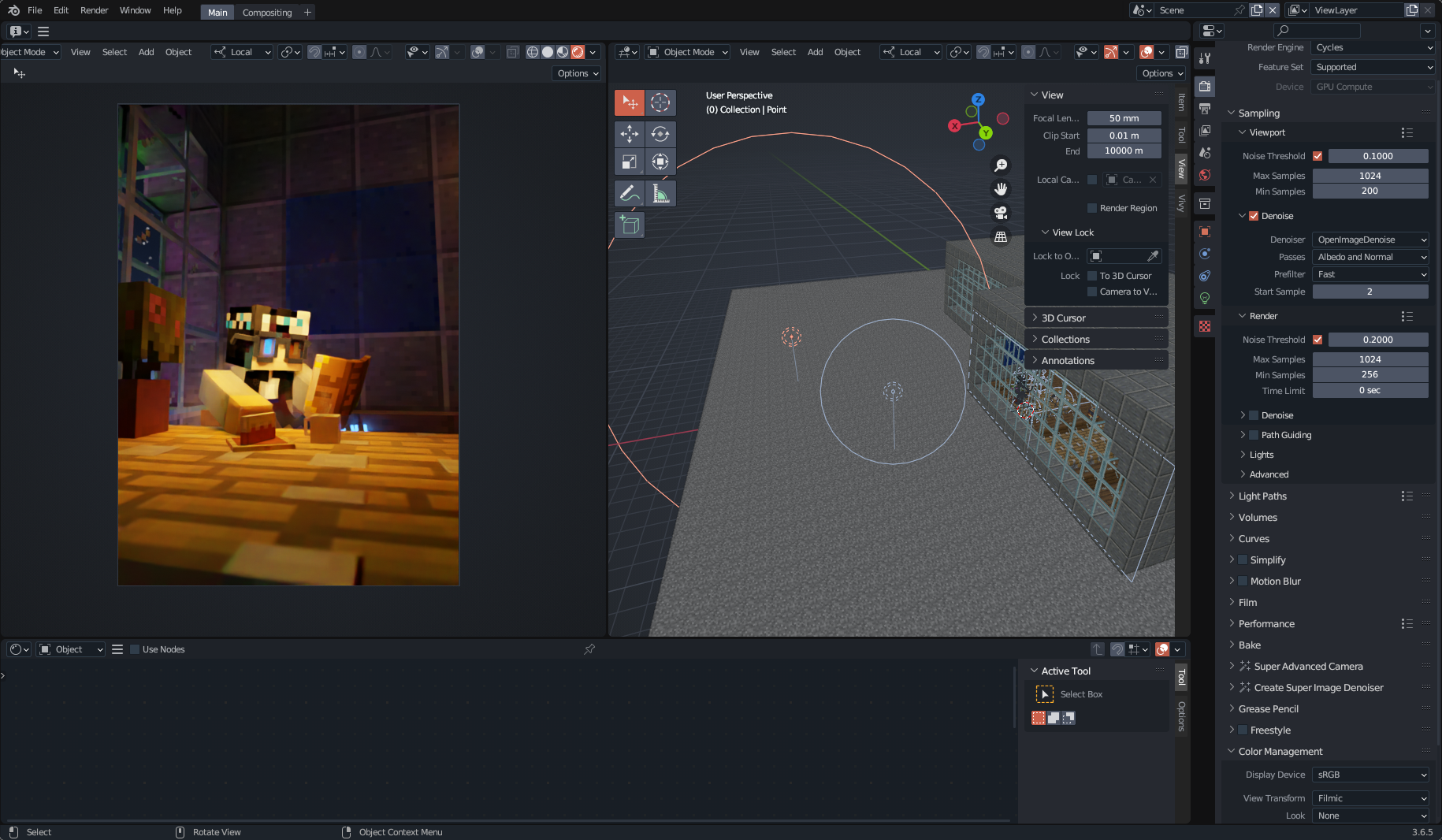
However, if we open this same scene in Blender 4.0, that same light now no longer acts in the same way.
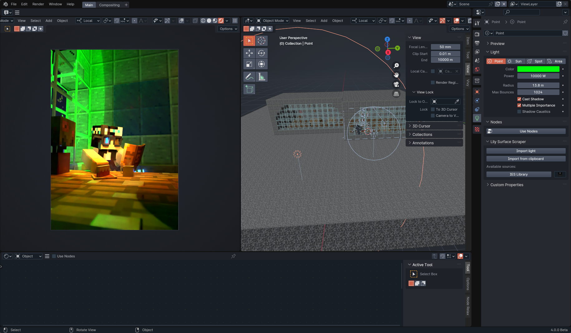
In addition, in the latter image, we also see the effects on negative lights, which now have a clearly defined border, and these are both small and quite close to the subject (hence why simply moving a light closer is not sufficient).

Now one might say "why not use an area light?". In some cases, yes an area light would be fine, but area lights are still at their core flat planes, which makes using them in certain circumstances much more annoying (say a lantern where you want to have soft shadows from for artistic reasons). In addition, that still doesn't address the fact that many old scenes are broken in Blender 4.0. Even if we factor that 4.0 is meant to be breaking, I don't think any user expects something as the point light to have a breaking change.
I'm not saying that light sources in Cycles need to break how shadows relate to size, I'm saying that it would be nice to have an option for point lights (and by extension spotlights) that allows Cycles to not treat them as a sphere.
Don't know how easy it would be to achieve, but having a "softness" slider would be the best of two world, so a slider going from the hard 4.0 light to the soft 3.6 light would be nice (and preferably also having the glossy reflection follow that instead of the disconnected behaviour in 3.6).
When I consider it more, it does seem like a lot of the cases where a point light is used like this could be achieved pretty equally with other light sources. It really just makes it slightly more annoying depending on your scene.
I’m mostly worried about the loss of compatibility with older versions, which is why i feel having both options would be a necessary change.
I don’t see the behavior of lights as only motivated by physical behavior, but also artistic usability and consistency. I this case, the changed behavior only satisfies the first.
Here's another case where the old behavior also made sense for artistic reasons, and where simply making lights smaller (or using area lights for that matter) isn't an option:
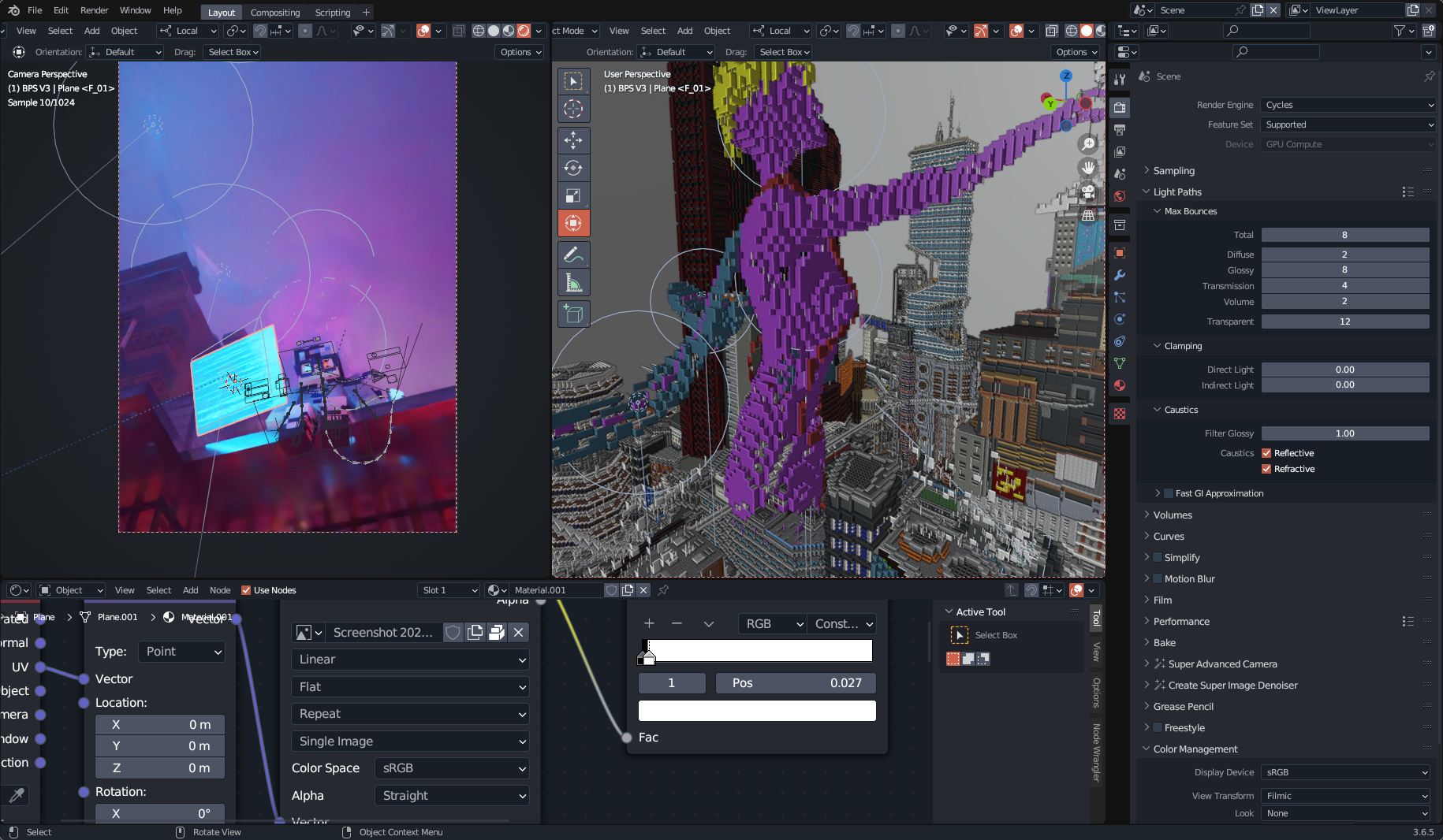
Meanwhile here's the new behavior as it stands:

Everything essentially becomes overblown here, and the new falloff makes the background much less interesting.
Since this change also affects spot lamps, one common example would be a street lamp. This sort of setup is very commonly used and while most street lamps are small and produce harsh shadows, some have coating on the glass that act as diffuser making the shadows softer, as blender does not have a concept of diffusers increasing the light size is the only way to get softer shadows, resulting in this. In this example the spot lamp could be replaced by area lamp as they now have spread control, but they dont behave the same as a spot and I have generally found using spot lights is easier for cases like this.
Got another example here. This is a wooden boat I made a while back where I comp in a flame on that chained ball and I used some point lights to exaggerate and help that flame a bit (while the white ball in the volume to the right is because of this change do ignore it for this example, it can be easily fixed in other ways).
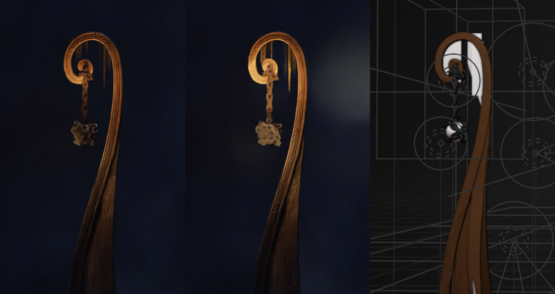
The one on the left is 3.6 and looks good with no hard shadows because of that semibig and soft ball, whereas the 4.0 in the middle doesn't work with that hard cutoff and very ambienty light inside that radius. Of course this is not physically correct lighting, but I'm using that (and many other lights in the scene) in an artistic way to enhance features on this boat and the skeleton that's standing on it that would not look like this if I only lit it 100 physically correct with that flame that I later comped in.
And while I'm not that bummed over this change I see why some people can be. I mean I can probably get something similar by cheating in other ways, but having this as an option or a slider to go between hard or soft lights would be nice :)
While I appreciate the new change, can see it's usefulness in certain circumstances, and understand that it is more "accurate"; it also completely eliminates a functionality and aesthetic that has been used and incorporated into projects and workflows for years (As demonstrated in this thread and the copious number of other bug reports citing this behaviour as undesirable); unilaterally demands that users spend extensive amounts of time updating any project prior to 4.0 that uses point and/or spot lights with no guarantee that we can achieve an identical effect, and forces users into a strictly photoreal rendering environment that goes directly counter to the entire ethos of Blender's flexibility and broad ranging use to this point. All for what, as far as I can tell, is a narrow minded belief that photorealism is inherently preferable and anyone not okay with that view does not hold a valid opinion and should be forced to reconfigure their workflows, styles and general relationship to creating in Blender to align to that view. I hope it goes without saying how utterly insulting that is to users who do not put photorealism on a holy pedestal.
The fact that this sort of change was pushed through without any consideration for the above is, at best, disappointing, and a spit in the face of every Blender artist that doesn't align to the narrow view of photorealistic superiority. Blender is a tool for creating art, among many other things, yes, but it is a tool for art, and this continued insistence that the only valid uses that should be supported are those judged by strictly photorealistic, reality based metrics is as disappointing as it is misguided. I applaud the efforts to push Blender's ability to pursue photorealism, but when it comes at the direct cost of tools and capabilities that have been present for years, without even a passing consideration to the users who use and rely on those tools and capabilities, it feels like a slap in the face for something that could have easily coexisted with existing tools.
I can only hope and ask that this decision be reconsidered, and the new point & spot light functionality are incorporated in a way that broadens Blender's usability instead of limiting it.
I will pass this on to
Cycles & Renderingdevs for considerationCC @brecht
CC @weizhen
I really hope we won't go back to stone age of non physically based rendering it. People have been placing huge light sources intersecting geometry in their scene and abuse buggy behavior for "artistic" purposes. And now complain that the bug was fixed.
Just start doing the lighting the right way. It's not hard.
Not treating point lights as spheres is exactly breaking how shadows relate to size. The point light, therefore infinitely small point in space could only ever have super sharp, infinitely small penumbra shadow.
We're not saying the new behavior should be removed (it makes sense why it exists), we're saying that either an option for the old behavior (that wouldn't be default) should be added or a slider for softness that would also return the old behavior as Gurra suggested.
If by "the right way" you mean the photorealistic way, that's a pretty bold thing to claim. There are just as many non-photorealistic rendering artists in the Blender community are there photorealistic ones, so simply shunning non-photorealistic rendering as "wrong" is pretty narrow minded. If a feature is developed without consideration for those that don't do photorealistic rendering, then what's the point of advertising Blender as a powerful tool for the non-photorealistic artists out there?
Cluttering UI with these kinds of buttons that intentionally break something is about the worst thing that can happen. It returns us back to really ugly days of renderers like Mental Ray or Brazil RS.
There are many other renderers used for NPR that don't have this kind of control. Even in modern game engines. There's nothing about abusing buggy point light behavior that's artistic. Even for NPR rendering, you should consider what it is that lights your scene. What kind of light source are you trying to illuminate your scene by.
If you need very soft shadows coming out of the window then simply consider using environment light for that. On your picture examples, you don't provide anything that can even showcase the problem given how messy your lighting is in the first place. You could achieve the random lighting on your example picture in many other ways that don't require separation of light size and shadow softness. You just got used to a bug and you are now unwilling to give up the buggy behavior.
Here you would generally use Disc area lights with reduced spread value. But I agree that spot light should provide same shape options as area lights (the source shape should not be limited to just sphere):

We can look into adding falloff options to get something similar to the previous behavior, either using nodes or a native option on the light. But this was an intentional change that we are not going to change in 4.0, falloff options would be for 4.1 or later.
I do not see where treating spotlights not as spheres would be going back to the stone age. As long as a spotlight exists in Blender, it still is this "stone age" you are talking about. Because in real life a light source does not simply shine in one direction with a certain angle.
In reality this is created by the shape of the surrounding lamp. And in real life, a small point light inside a lamp can create a spotlight shining in a certain direction with a certain angle and with a diameter much larger than the point light. But in Blender this surrounding lamp mesh now needs to cover up a whole sphere, which is not how the lamp needs to be designed in reality.
I admit though that the 4.0 spotlight is better at creating the cone of light according to the radius/diameter.
Just to make this clear: I totally agree with the new behavior making much more sense for Point lights, however Spot lights are somewhat a cheat to replicate how real spot lights work, without the need for a mirror and a focusing lens etc. to build it physically accurate, so it is completely different from the Point light.
Point Lights have Harsh Edges in Blender 4.0to Point/Spot Lights have Harsh Edges in Blender 4.0 (constant inside their radius)Please do, it's really annoying how photorealism at all costs is being pushed so aggressively. There's nothing wrong with photorealism, but I beg you and the other developers to consider that it's not the only workflow, and chipping away at a non-photorealistic workflow is harmful to many Blender users. Thanks for your consideration!
This is a volume cube with a spotlight in 3.6 version

Same but 4.0.1 version
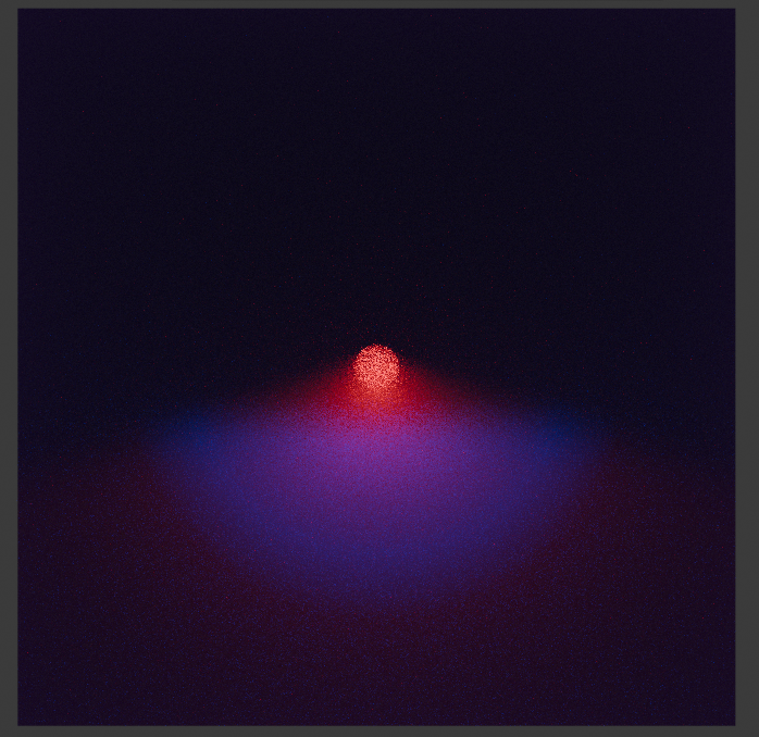
This is a fake fix I did with a light path node, may be helpful, you wont get that harsh edge on any object.
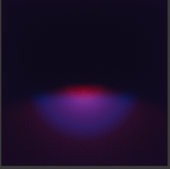
@Alejandro-Barkovsky So how can we 'fake' fix this with a light path node. I am a bit new to blender, and I don't have the experience on how to do it, Im trying to finish a project (tutorial) but Im having the issue with the spot light, and I haven't found anyone that knows how to fix it, except you. I would really appreciate your help, thanks.
Unfortunately this is an expected behavior of Blender 4.0. We should have an option to disable the sphere representation of the light.
You blew it with your new light display system.
In a word ; I want to throw up. :(
Hell yeah, please fix that, i have some scene with this problem, im happy (not realy for you sorry) that im am not the only one with this problem. This new lighting system is good idea, but a least don't totaly replace the old One, i miss it :/
If you look at the notes from the rendering meeting a week ago you'll see that "Brecht works on an option to get back the old, non physically based falloff for 4.1" :)
That would be awesome !
How long we will have to wait untill blender 4.1 doe?
Sorry about the late response, play with those nodes i added below, as you can see there isnt harsh lights, play with the color ramp to soften the radius of your light. btw cool scene sir.
@Alejandro-Barkovsky Thank you for the help, but Ive tried and couldnt get yet the result I wanted. I gess ill have to wait until blender 4.1 is out and they add the option to have the old light spot back
Brecht Van Lommel referenced this issue2024-02-05 11:35:57 +01:00
I have good news and bad news on this topic.
The good news is that the issue has been resolved. The bad news is that we have to wait for version 4.2.
I found a workaround for the issue. This can help you solve it or at least manage it, as demonstrated in the video I created (link below).
[https://youtube.com/live/XoW3GxS7W2Y]
The PR was merged in the 4.1 release branch, so it's coming in 4.1
I'm hoping for the stable version, but not in 4.1 alpha yet.
The option was added in 4.2 Alpha, as you see in this screenshot.
It is already in 4.1 beta.
Appreciate your work Brecht ❤