Extensions Platform UI #118733
Labels
No Label
Interest
Alembic
Interest
Animation & Rigging
Interest
Asset System
Interest
Audio
Interest
Automated Testing
Interest
Blender Asset Bundle
Interest
BlendFile
Interest
Collada
Interest
Compatibility
Interest
Compositing
Interest
Core
Interest
Cycles
Interest
Dependency Graph
Interest
Development Management
Interest
EEVEE
Interest
EEVEE & Viewport
Interest
Freestyle
Interest
Geometry Nodes
Interest
Grease Pencil
Interest
ID Management
Interest
Images & Movies
Interest
Import Export
Interest
Line Art
Interest
Masking
Interest
Metal
Interest
Modeling
Interest
Modifiers
Interest
Motion Tracking
Interest
Nodes & Physics
Interest
OpenGL
Interest
Overlay
Interest
Overrides
Interest
Performance
Interest
Physics
Interest
Pipeline, Assets & IO
Interest
Platforms, Builds & Tests
Interest
Python API
Interest
Render & Cycles
Interest
Render Pipeline
Interest
Sculpt, Paint & Texture
Interest
Text Editor
Interest
Translations
Interest
Triaging
Interest
Undo
Interest
USD
Interest
User Interface
Interest
UV Editing
Interest
VFX & Video
Interest
Video Sequencer
Interest
Virtual Reality
Interest
Vulkan
Interest
Wayland
Interest
Workbench
Interest: X11
Legacy
Asset Browser Project
Legacy
Blender 2.8 Project
Legacy
Milestone 1: Basic, Local Asset Browser
Legacy
OpenGL Error
Meta
Good First Issue
Meta
Papercut
Meta
Retrospective
Meta
Security
Module
Animation & Rigging
Module
Core
Module
Development Management
Module
EEVEE & Viewport
Module
Grease Pencil
Module
Modeling
Module
Nodes & Physics
Module
Pipeline, Assets & IO
Module
Platforms, Builds & Tests
Module
Python API
Module
Render & Cycles
Module
Sculpt, Paint & Texture
Module
Triaging
Module
User Interface
Module
VFX & Video
Platform
FreeBSD
Platform
Linux
Platform
macOS
Platform
Windows
Priority
High
Priority
Low
Priority
Normal
Priority
Unbreak Now!
Status
Archived
Status
Confirmed
Status
Duplicate
Status
Needs Info from Developers
Status
Needs Information from User
Status
Needs Triage
Status
Resolved
Type
Bug
Type
Design
Type
Known Issue
Type
Patch
Type
Report
Type
To Do
No Milestone
No project
No Assignees
4 Participants
Notifications
Due Date
No due date set.
Dependencies
No dependencies set.
Reference: blender/blender#118733
Loading…
Reference in New Issue
Block a user
No description provided.
Delete Branch "%!s()"
Deleting a branch is permanent. Although the deleted branch may continue to exist for a short time before it actually gets removed, it CANNOT be undone in most cases. Continue?
I find the current state of the Extensions Platform UI to be a little confusing. A search area, followed by two different filter lists, an "arrow" icon bringing up general options and a "gear" icon showing repository options. remote repositories represented by a "lan storage" icon. There are refresh and download icons in multiple places meaning different things.
We can break the options into two rows, operations versus searching/ filtering. Use the "Refresh" icon only for "Check for Updates", "download" for install.
The arrow next to "install" shows a menu with more options:
"Repositories" item to add/remove repos:
In my opinion both the existing and this design make important buttons not prominent enough. I would rather have filter options, Check for Updates, Update All and Install from Disk available directly. I don't think we lack space here.
But not sure that this little list needs a search and two different filters. Maybe those filters can be combined.
We could put "Update All" and "Install from Disk" as buttons if they don't share the same icon. Install from disk could just have the file folder we use for other file open.
Hmmm.... "Extensions" above does not look like a menu but just a static label.
I think it's better to have two rows and buttons with labels on them, than these small buttons where it's not obvious what they do. I don't really understand why we are trying to make this more compact than it was with add-ons.
The difficulty here isn't really the amount of space. Current Add-ons can be used with just a small number of labelled buttons. But this Extensions is adding complexity beyond what can be a accomplished with just simple labelled buttons.
Just the actions of installation/refresh goes from having to differentiated between two - "Install" and "Refresh" - to having to do so between four - "check for updates", "Update all", "Install extension", "install legacy addon". Then there is the added complexity of having to maintain the list of repositories.
I think the legacy add-on stuff can be in an advanced menu. Then you could have a row of buttons like this:
Though it's not clear to me why legacy add-on needs to be a separate operator, if they both install from a file on disk.
And Check for Updates could be automatic when you open these preferences, or share the same location as Update All.
Yeah, that could work, although I would probably still hide the repository list behind an icon. And expand out the filter...
The little arrow beside "Check for Updates" could be removed after we take this out of experimental since everything else is exposed.
I think the extension types enum should not be expanded, there will be more types and it's not going to fit.
The filtering buttons should be the second row, nearer to the list that it affects, same as it is with the current add-on preferences.
Personally I would add some text to the repositories button rather than only the generic gear, to me it seems important enough.
Could work. Not nearly as pretty as my minimal version. LOL
Designing with this many iterations back and forth is not very efficient, but anyways I suggest:
Agreed, but not sure of how to do this any better, as you and I seem to be the only ones interested in this.
We are generally iterating from a current design that hides too much (which I dislike) toward showing everything like current Add-ons (which I also dislike), which is probably why this is taking so long. With this many options I'd prefer to prominently show the often-used ones and make lesser-used items secondary.
There also seems to be reluctance on the part of the designers of this to be acceptable of change suggestions.
I don't think that "Refresh" here properly tells the story that this will use an internet connection and check for the newest version of each item. Could be read more like a "reload", "redraw", etc. Without any text it at least makes it more likely the user will look at a "Check for Updates" tooltip.
I'll probably next post both a capture of it looking as you suggest above, and also another streamlined version (if I have any success with that).
Another minimal version. This seems to cover everything, showcases the most important parts (check for updates, update, load), de-emphasizes the repo list since used less often. There are no dropdowns side-by-side to cause "mouse toward" issues.
And your version with two rows:
The above does have the "mouse towards" issue between the filter icon and the filter list.
I would still wager that mine would win a rap battle or poetry slam. snap, snap, so will update the first comment with it.
I think we really need the bigger buttons. Also based on the feedback in the devtalk topic, where people continue to be confused.
Small buttons like these with just icons are difficult to identify the purpose and easy to miss. For a user interface that is permanently visible, they can be an acceptable trade-off because saving space is important, and users hopefully will use them frequently.
But for a user interface like this that only temporarily appears, we should absolutely prioritize easy of use. People have more important things to learn and remember than the subtle differences between these icons.
The repositories popup can also have bigger buttons with text for refresh and update all, instead of the small buttons, for the same reason.
@ideasman42 @dfelinto, can we make installing legacy and the new add-ons a single operator? This is causing confusion too. Add-on authors need to be aware of the difference, but I don't think we should be confusing users with this.
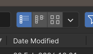
The compact version, although more "sexy", compromises too much on usability too me. Important actions are hidden between vague icons. The icon-only buttons look more like choices (radio or enum buttons) rather than operations. I don't think we have such a UI to expose actions elsewhere, but it does misleadingly look like the display mode selection in the file browser:
So I agree fully with Brecht that we should use label buttons.
On the used icons/labels:
I don't think we need an icon for this.
+1, also proposed that here: #118876 (comment)
@JulianEisel
I updated the first comment with fresh captures. A big +1 for not using the download icon for "Update" as that does remove confusion.
A minor thing is that the "Install" item on the menu is called "Install from Disk" while having a download icon. Just removing the "from Disk" text might be enough to make that feel better though.
I do have (just locally) a version of the "url" icon without the mouse pointer.
For the Repositories popover I'd consider just removing those two buttons. Then it is used only to add/remove/change them and there isn't confusion on why the same operations seem to be in two places. Can't think of much utility in having per-repo updating.
Thanks for the updates, this is looking good now in my opinion.
If we can unify the install operators, then the whole ⌄ menu only has a purpose for development utilities. So then it could be hidden if developer extras is disabled (also not sure why it has a separate checkbox).
Updated the captures only to show the "Check for Updates" button a bit wider because it would have overflowed with French and Spanish.
What was the issue with the filter popup button not showing the downwards triangle? I think that should really be addressed as this looks quite like a new kind of button to me, rather than a popup button.
Besides that, looking good!
It is a hacky thing...
The little arrow on the right is only shown for UI_BTYPE_POPOVER if there is room - defined as the width being greater than the height (in ui_draw_but). But why is the one here and in Outliner different?
uiItemPopoverPanel_ptrcallsui_item_menuwith "force_menu" set to true.Inside there we have a test for
layout->root->type == UI_LAYOUT_HEADERmarked with an "/* Ugly! */" comment. for "force_menu" in a header this increases apad_factor.icon_onlyfrom "0" to "0.6" which make the button wide enough for the dropdown arrow. This is around line 2997 in interface_layout.ccUnfortunately our layout root type is UI_LAYOUT_PANEL here.
I'm not sure why we have a "force_menu", nor why we are forcing this button size change for header only. Without knowing this it is not clear that we want to allow this in UI_LAYOUT_PANEL as well. Or do this for header OR if force_menu. Or perhaps for header Or (panel and force_menu) would be the narrowest change.
I think that check is probably overly conservative. I would just change it so popovers with an icon are wider regardless of the layout type, do a quick check to see if anything obviously breaks and then make the change.
Yes, you are right. It looks like this "force_menu" is for this purpose, but I think the least conservative we can go here is this: https://projects.blender.org/blender/blender/pulls/119181/files
A PR that adds an "internet" icon, like our current "url" without the mouse cursor.
#119186
I committed a few UI changes with @pablovazquez today. I believe this can be closed for now.