Switch the manual theme to Furo #104735
No reviewers
Labels
No Label
Meta
Good First Issue
Module
Animation & Rigging
Module
Core
Module
Development Management
Module
Eevee & Viewport
Module
Grease Pencil
Module
Modeling
Module
Nodes & Physics
Module
Pipeline, Assets & IO
Module
Platforms, Builds, Tests & Devices
Module
Python API
Module
Rendering & Cycles
Module
Sculpt, Paint & Texture
Module
User Interface
Module
VFX & Video
Priority
High
Priority
Low
Priority
Normal
Status
Archived
Status
Confirmed
Status
Duplicate
Status
Needs Information from Developers
Status
Needs Information from User
Status
Needs Triage
Status
Resolved
Type
Bug
Type
Design
Type
Known Issue
Type
Patch
Type
Report
Type
To Do
No Milestone
No project
No Assignees
5 Participants
Notifications
Due Date
No due date set.
Dependencies
No dependencies set.
Reference: blender/blender-manual#104735
Loading…
Reference in New Issue
Block a user
No description provided.
Delete Branch "furo-theme"
Deleting a branch is permanent. Although the deleted branch may continue to exist for a short time before it actually gets removed, it CANNOT be undone in most cases. Continue?
Since moving from the Wiki we have used the
sphinx_rtd_themewhich has worked well but has become a little dated and has had slow development. This changes to use "Furo" instead.Furo is a lightweight theme that is responsive and has native dark mode support.
Dark mode is one of the major enhancements but this change also brings:
So far the caveat that I have noticed with this is slower compile times and larger pages, this is due to the better sidebar navigation.
This change also brings a lot of simplifications to customizations that we made to the
sphinx_rtd_theme. There is still likely room for improvement in the future.Ive requested review from different people for different purposes:
@brecht evaluate the burden of increased build times on build-bot
@pablovazquez Review of front end changes
@ideasman42 For historical interest in the project / python side
@blender-bot package
Package not supported for blender/blender-manual. See documentation for details.
@blender-bot build
Looks good, only one minor issue noted.
The reference box seems a little low contrast compared with the background (they're used in many places, to pick one example:
interface/window_system/areas.html).Checked Blender's Python API docs and they also look good.
Kinda agree with the ref boxes, I'll look into adjusting the colors some more.
I plan to make a PR for the API once this PR is accepted.
Noticed another issue with shortcuts:
Alt-Gis displayed asAlt-Gfor e.g..See:
animation/constraints/relationship/follow_path.htmlThis is intentional by the theme, I have no preference either way.
Having them separate doesn't read so well, especially with multiple key shortcuts separated by commas.
Build times on the buildbot should not be a problem.
Overall it looks nice. Personally not a big fan of the extra font size on large screens, and I would tweak the h1..h6 text to be a bit smaller, not pure black and maybe increase margins. Compared to the old the theme or the developer docs it looks quite busy to me. But that's personal opinion.
@ideasman42 @brecht your review points have been addressed with the exception Brecht's comments on font sizes on larger screens and the body text color.
I think those are a little bit more subjective, so it would be nice to hear from others before making those adjustments.
On a side note, I have kept the google analytics but I have noticed some Blender sites have been using https://analytics.blender.org is that service still in testing?
Perhaps @fsiddi can answer this question. I can switch the manual to use that service if desired.
Checking again, noticed another issue.
For the page:
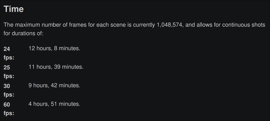
advanced/limits.html.Before:

After:

This seems like a bug in the theme since those values use a field-list, unlike table widths which are adjustable:
Thanks for the changes, the titles look so much better now.
Two minor comments.
I suggest to make the caption font size a bit smaller than other text, as it was before and is quite common I think. It helps make it stand apart from the rest of the text, otherwise you can confuse it for a regular paragraph in some cases.
On various compositing index pages I noticed there is too much spacing. The solution may be to edit those pages to remove the horizontal lines, they seem to be the only index pages using them like this.
No need for me to review this further I think, my comments are not blocking.
Please remove Google Analytics, it's been replaced with a self-hosted Plausible instance. Use this code instead:
5b789ef42btoc42be80e8d