Brush thumbnail redesign #104476
Labels
No Label
Interest
Alembic
Interest
Animation & Rigging
Interest
Asset System
Interest
Audio
Interest
Automated Testing
Interest
Blender Asset Bundle
Interest
BlendFile
Interest
Collada
Interest
Compatibility
Interest
Compositing
Interest
Core
Interest
Cycles
Interest
Dependency Graph
Interest
Development Management
Interest
EEVEE
Interest
EEVEE & Viewport
Interest
Freestyle
Interest
Geometry Nodes
Interest
Grease Pencil
Interest
ID Management
Interest
Images & Movies
Interest
Import Export
Interest
Line Art
Interest
Masking
Interest
Metal
Interest
Modeling
Interest
Modifiers
Interest
Motion Tracking
Interest
Nodes & Physics
Interest
OpenGL
Interest
Overlay
Interest
Overrides
Interest
Performance
Interest
Physics
Interest
Pipeline, Assets & IO
Interest
Platforms, Builds & Tests
Interest
Python API
Interest
Render & Cycles
Interest
Render Pipeline
Interest
Sculpt, Paint & Texture
Interest
Text Editor
Interest
Translations
Interest
Triaging
Interest
Undo
Interest
USD
Interest
User Interface
Interest
UV Editing
Interest
VFX & Video
Interest
Video Sequencer
Interest
Virtual Reality
Interest
Vulkan
Interest
Wayland
Interest
Workbench
Interest: X11
Legacy
Asset Browser Project
Legacy
Blender 2.8 Project
Legacy
Milestone 1: Basic, Local Asset Browser
Legacy
OpenGL Error
Meta
Good First Issue
Meta
Papercut
Meta
Retrospective
Meta
Security
Module
Animation & Rigging
Module
Core
Module
Development Management
Module
EEVEE & Viewport
Module
Grease Pencil
Module
Modeling
Module
Nodes & Physics
Module
Pipeline, Assets & IO
Module
Platforms, Builds & Tests
Module
Python API
Module
Render & Cycles
Module
Sculpt, Paint & Texture
Module
Triaging
Module
User Interface
Module
VFX & Video
Platform
FreeBSD
Platform
Linux
Platform
macOS
Platform
Windows
Priority
High
Priority
Low
Priority
Normal
Priority
Unbreak Now!
Status
Archived
Status
Confirmed
Status
Duplicate
Status
Needs Info from Developers
Status
Needs Information from User
Status
Needs Triage
Status
Resolved
Type
Bug
Type
Design
Type
Known Issue
Type
Patch
Type
Report
Type
To Do
No Milestone
No project
No Assignees
3 Participants
Notifications
Due Date
No due date set.
Dependencies
No dependencies set.
Reference: blender/blender#104476
Loading…
Reference in New Issue
Block a user
No description provided.
Delete Branch "%!s()"
Deleting a branch is permanent. Although the deleted branch may continue to exist for a short time before it actually gets removed, it CANNOT be undone in most cases. Continue?
This task is about revamping the current set of thumbnail images that are used across various modes and object types.
This is aimed to be done for the release of further brush assets in upcoming releases.
Current Issues
The issues with the current thumbnails are:
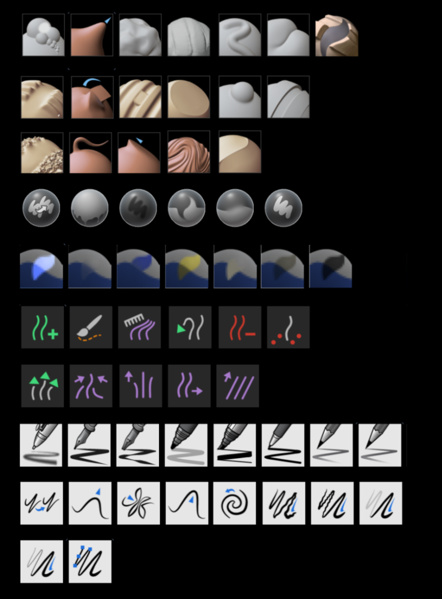
Here is an overview of most current brush thumbnails:
Proposal
There are various aspects that can improve and unify the current use of brush thumbnails.
Brush Type Icons
A common use of online brush pack is to indicate the type of a brush via icons.
This can
The inital idea was to tag brushes and have icons autoamtically added and dynamically scale with the asset thumbnail.
But for free customizability and unqiue visuals for each brush, these are instead part of the image.
Accessible Style
There are key aspects for the new thumbnails. They must be:
This will reduce the friction when making your own brushes. The ideal end result is that a casual brush user can screenshot their current work for a custom brush, and their brush will immediately fit in.
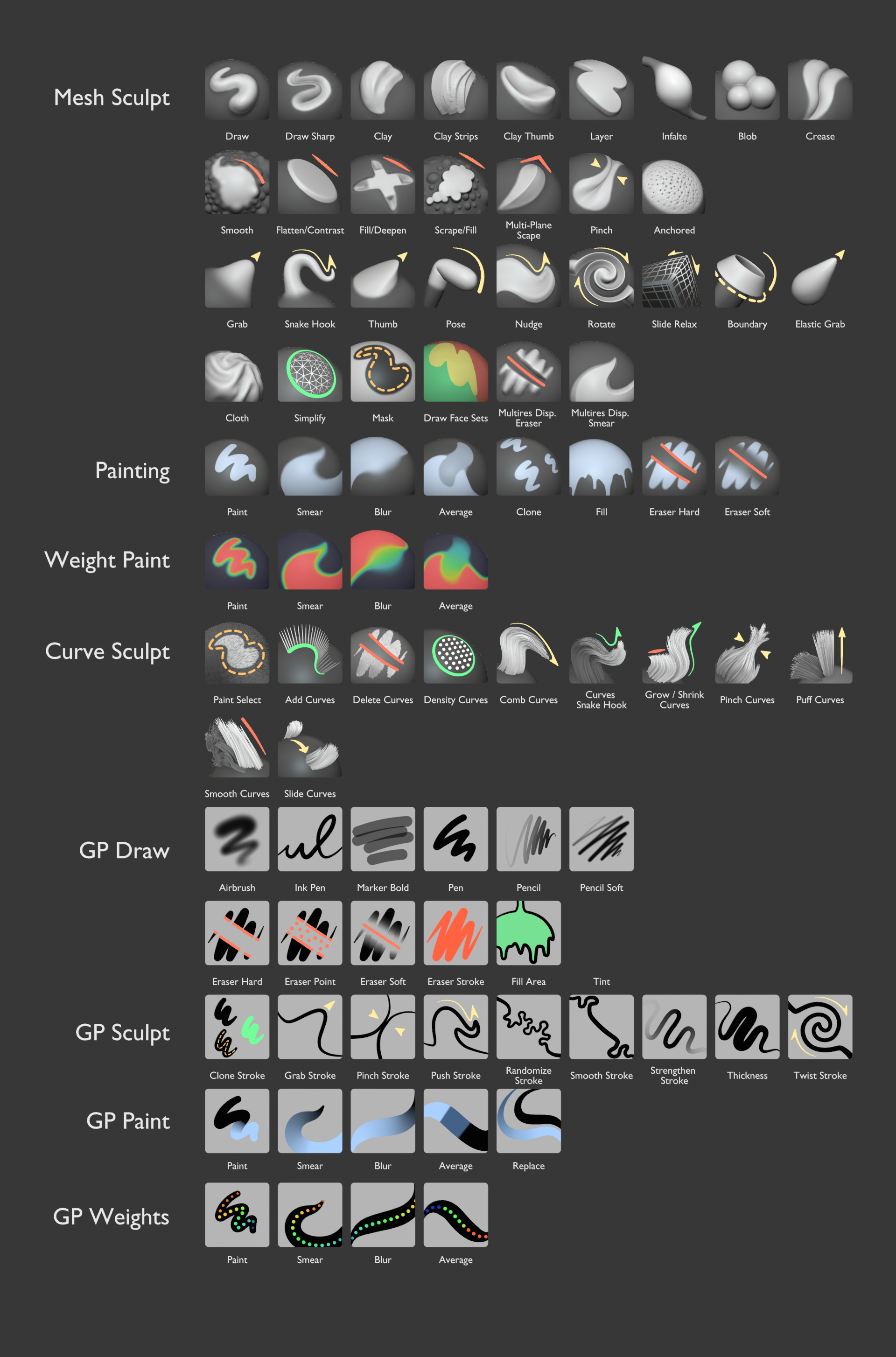
This is the current set of thumbnails:
An update on the set of thumbnails. Still experimenting.
Some important things to note:
Open questions to still address:
This was tried in this version with yellow being used for 'Transforming' brushes.
This especially affects the curve sculpt mode, which is taking its colors from edit/object mode. We could also decide to unify the mesh sculpt mode with the other modes instead
Ink Pen RoughandMarker Chiselthumbnails are hard to replicate. Are the brushes even useful?We could try to unify the color palette for the toolbar and brushes between all modes:
Orange = Select / Mask
Green = Adding (and subtracting)
Red = Delete / Contrast
Purple = Adjust / Deform
Yellow = Simulation / Geo Nodes
Blue = Painting
Red-Yellow-Green = Face Sets
White = Misc
This would also mean that some tools need to be updated across different modes:
Rip Regionfrom Purple -> GreenMeasurefrom Green -> WhiteMesh Filterfrom Blue -> GreenCloth Filterfrom Purple -> YellowColor Filterfrom Green -> BlueMask by Colorfrom Green -> BlueInterpolatefrom Green -> PurpleBreakdownerfrom Green -> PurpleTintfrom Green -> BlueReplacefrom Green -> BlueThe
Cursortool could stay as it is? Or should this also be white?EDIT: Some feedback was that we should make sure that color blind friendly colors are used. If the amount of colors is too high, the proposed use colors for 'Painting' and 'Simulation / Geo Nodes' can be removed.
Some more progress on the thumbnails.
Notes for next to do's:
Hello JulienKaspar, I just wanted to show you that when converted to black and white some icons lose contrast, when I think it should be maintained.
The blue seems to hold contrast better than the green, even with the darker background.
Updated: Just adding that Ph gives different results when converting thumbnails to grayscale via image adjustments (desaturate or convert to black and white), than when doing so by adding a mixed gray layer in saturation mode. In this second mode you don't lose as much contrast.
Thanks @wevon-2 !
That's definietly something I want to figure out for all used colors. Either the colored lines need to be adjusted based on what the value beneath them is, or the value beneath needs to be changed. Or both.
I'll do some mockups on that.
Here's another update on the thumbnail style:
Next it's important to make the values and use of colors more consistent.
I'm also unsure if it's wise to add corner icons like orginally proposed. The use of colored lines can be efficient in communicating most vital info about the brush already.
Also before iterating further and adding all missing thumbnails for existing and planned brushes, there should ideally be a rough concept of the entire set of thumbnails.
Some feedback from @filedescriptor
I have done some tests transforming the direction line of the drawing to a contour line, and this has been the result, I hope you like it.
I attach the .blend.
https://drive.google.com/file/d/1vVSCuoh5KOXVcNxfwXd7zhUHaUmb8dQ3/view?usp=sharing
@wevon-2 That's also a nice idea. But it loses the advantages of a manually placed stroke:
I recognize that more than the Annotate Tool, Grease Pencil is fantastic for helping to represent what each tool does.
My process can be greatly simplified. I've created a couple of Matcaps, one without a contour line and one with a slightly lopsided contour line, so it's more pronounced in the upper right corner. Although it works, I think the optimal solution would consist of a parametric overlay (inverted circle matcap alpha over a base matcap) for the contour line. This would make the process much easier and also allow you to adjust the thickness, color and direction of the line.
Several details to assess:
I leave some new tests carried out with the described matcap.
I insist a bit, since in general I love the appearance of the whole, but in the case of the reliefs I just don't see it, and when I have tried to put the line on the relief I find it difficult to fit it well.
I leave the link to the Drive in case someone wants to play with the files.
https://drive.google.com/drive/folders/1J_IZKYmOF2JFRv3u-b1ec1dcqknZ1nDW?usp=share_link
One last thing,
In case you want to tint the sculpted part, you could use this group of nodes that compares a perfect sphere with the sculpted sphere.
I don't know if the mesh of a ShapeKey can be captured, if so, the process could be simplified a bit.
@wevon-2 Thanks for the input! I'll review this next month when I have time to work on this again.
Some node groups to automate some visual elements could be nice but my focus with these thumbnails is also that any user can easily create them in a moments notice and add them to a custom brush.
So while use of nodes can make the default thumbnails cleaner and faster to set up, I wouldn't rely on them too much ;)
I'll post this here so it doesn't get lost.
Dialoque from blender.chat
I wrote:
Julien answered:
Cheers! :)
@Dantti I'll bring this up for the technical design like #101908.
This has little to do with this task though, which is just about the visual design of the thumbnails.
Ah! I'm sorry! Thank you! :)
@Dantti I checked and apparently this is already no problem with the new implementation of brush assets.
Finally got to work on this again. Here's an update. This is a wip mix of new renders and rough paintings + a bunch of feedback and help from others.
What's new
Some thoughts on how I want to continue:
As an experiment I removed most colored elements and purely focues on contrast.
This time there's also a preview screenshot of sculpt mode brushes in the asset shelf.
The shapes seem to be very readable and better for very small scales.
But bringing back color in a way would be good.
Some thumbnails are still missing:
Another quick update!
There's also a collage of screenshots of the asset shelf with the brushes in it.
Currently the order is by name but eventually they should be sorted by catalog.
Now that I have time, I wanted to play a bit with the nodes that allow coloring from the difference between a base mesh and a modified one, to see if it's practical and to contrast the results a bit with the Contat_sheet_v7.
On the one hand, I would like to comment that the Contat_sheet_v7 in general seems very successful to me, it works symbolically and visually unifies the interface, but on the other hand the creation of these thumbnails is too manual, although this way you have more control.
Although I do not consider my results to be better, I want to write down some of my conclusions.
Pros:
Cons:
The thread is a bit off, but I suppose something is progressing internally, I'm available for a few days, if you see that I can help with something other than confusing, I can lend a hand.
@wevon-2 Thanks a lot for getting back to this topic!
After working on these thumbnails a while I agree that the process is dauntingly 'manual'.
Some procedural tools would help a lot here.
I likely won't have time to continue on this design for Blender 4.0 but afterwards I'd love to try these geometry node setups to save some time on creating the full set of thumbnails for 4.1 👍
Here you have the .blend to test.
Notes:
The Collection References contains the base meshes without the applied subdivisions that serve to reference the initial position.
Thumnails are ShapeKeys.
If you want to experiment with other base geometry, they must contain a VertexColor attribute and the GeometryNodes must expose it in the output.
Apart from this, the rest seems obvious to me, but if you have any problem, say so.
Small update. I'm starting to work on this again.
I reverted the color palettes to the ones in the current releases. Color meaning is not very consistent across Blender, so trying to synch them up isn't fruitful.
It's better to at least keep the colors consistent among the brushes.
Added some icons to thumbnails and made some shapes prettier.
Paint and GP Sculpt icons are mostly monochrome in white or black. No need for color coding there.
Next up I'd like to polish them more, make a better set of icons and have them approved so the Brush Essentials can be worked on with these thumbnails in mind.
Another update. No polishing or work on icons yet.
Still could use some work.
Some more work on the thumbnail design. This ready for some more involvement and feedback at this point. They need more polish and final icons at this point.
Another update from a lot of community feedback and adjustments. This is now a complete initial set that can be added to Blender once approved.
Now that the new brush thumbnails are part of the brush asset implementation and svn repos, I consider this task done.
More work on expanding the brush thumbnails will go hand in hand with expanding the brush library itself.