Inter Font Tweaking #112748
Labels
No Label
Interest
Alembic
Interest
Animation & Rigging
Interest
Asset Browser
Interest
Asset Browser Project Overview
Interest
Audio
Interest
Automated Testing
Interest
Blender Asset Bundle
Interest
BlendFile
Interest
Collada
Interest
Compatibility
Interest
Compositing
Interest
Core
Interest
Cycles
Interest
Dependency Graph
Interest
Development Management
Interest
EEVEE
Interest
EEVEE & Viewport
Interest
Freestyle
Interest
Geometry Nodes
Interest
Grease Pencil
Interest
ID Management
Interest
Images & Movies
Interest
Import Export
Interest
Line Art
Interest
Masking
Interest
Metal
Interest
Modeling
Interest
Modifiers
Interest
Motion Tracking
Interest
Nodes & Physics
Interest
OpenGL
Interest
Overlay
Interest
Overrides
Interest
Performance
Interest
Physics
Interest
Pipeline, Assets & IO
Interest
Platforms, Builds & Tests
Interest
Python API
Interest
Render & Cycles
Interest
Render Pipeline
Interest
Sculpt, Paint & Texture
Interest
Text Editor
Interest
Translations
Interest
Triaging
Interest
Undo
Interest
USD
Interest
User Interface
Interest
UV Editing
Interest
VFX & Video
Interest
Video Sequencer
Interest
Virtual Reality
Interest
Vulkan
Interest
Wayland
Interest
Workbench
Interest: X11
Legacy
Blender 2.8 Project
Legacy
Milestone 1: Basic, Local Asset Browser
Legacy
OpenGL Error
Meta
Good First Issue
Meta
Papercut
Meta
Retrospective
Meta
Security
Module
Animation & Rigging
Module
Core
Module
Development Management
Module
EEVEE & Viewport
Module
Grease Pencil
Module
Modeling
Module
Nodes & Physics
Module
Pipeline, Assets & IO
Module
Platforms, Builds & Tests
Module
Python API
Module
Render & Cycles
Module
Sculpt, Paint & Texture
Module
Triaging
Module
User Interface
Module
VFX & Video
Platform
FreeBSD
Platform
Linux
Platform
macOS
Platform
Windows
Priority
High
Priority
Low
Priority
Normal
Priority
Unbreak Now!
Status
Archived
Status
Confirmed
Status
Duplicate
Status
Needs Info from Developers
Status
Needs Information from User
Status
Needs Triage
Status
Resolved
Type
Bug
Type
Design
Type
Known Issue
Type
Patch
Type
Report
Type
To Do
No Milestone
No project
No Assignees
2 Participants
Notifications
Due Date
No due date set.
Dependencies
No dependencies set.
Reference: blender/blender#112748
Loading…
Reference in New Issue
No description provided.
Delete Branch "%!s(<nil>)"
Deleting a branch is permanent. Although the deleted branch may continue to exist for a short time before it actually gets removed, it CANNOT be undone in most cases. Continue?
With the change of interface font to Inter, we have some opportunities to make some tweaks to it and to how we use it.
Default Sizes
With the default UI resolution of 1.0 we currently use a font size of 11. We could change this if we like. I personally like the font up to about 12 points, but most people would find that a bit large.
Notable is a change that happens at 11.6.
We have "Slight" hinting on by default, and that greatly aids in the readability. No regret there I think. With "Slight" hinting the glyphs are not altered horizontally only vertically. As in horizontal features can move vertically to better align to the bitmap grid. This generally makes the top and bottom of the letters look less fuzzy.
But at small sizes I get an uppercase "E" that bothers me. At 11 points and WITHOUT hinting it would look like this:
With Hinting it is much clearer, BUT the midline arm looks too low:
This goes away at 11.6:
Font Features
Inter supports OpenType Typographic Features. These are optional changes to the font, usually to do with using alternative glyphs for different ranges and purposes. For example having a slashed zero versus a regular zero.
Your web browser fully supports changing these features using
font-feature-settings. However, Blender is using only FreeType for text output so we don't have a way of checking or manipulating these. This is left to higher-level font shapers like HarfBuzz, which does other things like supporting Ligatures and complex languages.But we can still create a variation of our font and "bake in" features that we want. You can experiment with these feature sets here: https://rsms.me/inter/lab/?size=22&letterSpacing=0&opsz=22.
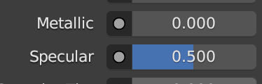
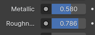
One likely candidate is "tnum", "Tabular Numbers". By default Inter uses proportionally-spaced numbers because they look better. But our old font spaced the numbers identically.
Old Font:
New Font:
Other things to consider are slashed zero. There is also a "Disambiguation" option that yields an uppercase "i" with serifs and a lowercase "L" with a curve, to better differentiate the two. I found that a bit ugly, but that might be because I have stared at this font too long.
Other Text Style Options
Because Inter is a variable font we could allow changes to the weight, slant, and spacing of it. This would mean, for example, that users could choose to use the equivalent of the "Light" (300 in css) weight rather than "Normal (400)" weight. Or have bolder or wider headings for example. In fact we might want to make these types of changes for our default theme.
These things can be experimented with here: UI: Configurable UI Variable Text Styles #112454
There are questions in the thread of that PR regarding how these settings should be exposed to users.
Tried using 11.3 for most of the day today and stil found myself making the interface bigger. Testing 11.6 now and I can even use Blender with resolution scale
1.0.Absolutely. It will make the UI feel less jumpy. Especially handy in places like the header when showing values while in a modal operation.
I think we should aim for accessibility here and go with Disambiguation. Might not be the prettiest but it's easier to read.
Another one that I find easier to read is open digit numbers. It feels like there's more negative space when numbers are together.
Yes, that seems pretty non-contentious. I think it would drive Campbell nuts.
Agreed.
That's totally in your wheelhouse to decide. So be it.
I'll make a PR and merge it today. That way we can play with it for a while before the Tuesday meeting and if anyone cares they can mention it then.
Closing. All parts done that we wanted. We kept the font size the same but turned on the disambiguation set, open numbers, and tabular numerals, but not slashed zero.