VSE: Strips Design Tweaks #118288
Labels
No Label
Interest
Alembic
Interest
Animation & Rigging
Interest
Asset Browser
Interest
Asset Browser Project Overview
Interest
Audio
Interest
Automated Testing
Interest
Blender Asset Bundle
Interest
BlendFile
Interest
Collada
Interest
Compatibility
Interest
Compositing
Interest
Core
Interest
Cycles
Interest
Dependency Graph
Interest
Development Management
Interest
EEVEE
Interest
EEVEE & Viewport
Interest
Freestyle
Interest
Geometry Nodes
Interest
Grease Pencil
Interest
ID Management
Interest
Images & Movies
Interest
Import Export
Interest
Line Art
Interest
Masking
Interest
Metal
Interest
Modeling
Interest
Modifiers
Interest
Motion Tracking
Interest
Nodes & Physics
Interest
OpenGL
Interest
Overlay
Interest
Overrides
Interest
Performance
Interest
Physics
Interest
Pipeline, Assets & IO
Interest
Platforms, Builds & Tests
Interest
Python API
Interest
Render & Cycles
Interest
Render Pipeline
Interest
Sculpt, Paint & Texture
Interest
Text Editor
Interest
Translations
Interest
Triaging
Interest
Undo
Interest
USD
Interest
User Interface
Interest
UV Editing
Interest
VFX & Video
Interest
Video Sequencer
Interest
Virtual Reality
Interest
Vulkan
Interest
Wayland
Interest
Workbench
Interest: X11
Legacy
Blender 2.8 Project
Legacy
Milestone 1: Basic, Local Asset Browser
Legacy
OpenGL Error
Meta
Good First Issue
Meta
Papercut
Meta
Retrospective
Meta
Security
Module
Animation & Rigging
Module
Core
Module
Development Management
Module
EEVEE & Viewport
Module
Grease Pencil
Module
Modeling
Module
Nodes & Physics
Module
Pipeline, Assets & IO
Module
Platforms, Builds & Tests
Module
Python API
Module
Render & Cycles
Module
Sculpt, Paint & Texture
Module
Triaging
Module
User Interface
Module
VFX & Video
Platform
FreeBSD
Platform
Linux
Platform
macOS
Platform
Windows
Priority
High
Priority
Low
Priority
Normal
Priority
Unbreak Now!
Status
Archived
Status
Confirmed
Status
Duplicate
Status
Needs Info from Developers
Status
Needs Information from User
Status
Needs Triage
Status
Resolved
Type
Bug
Type
Design
Type
Known Issue
Type
Patch
Type
Report
Type
To Do
No Milestone
No project
No Assignees
6 Participants
Notifications
Due Date
No due date set.
Dependencies
No dependencies set.
Reference: blender/blender#118288
Loading…
Reference in New Issue
No description provided.
Delete Branch "%!s(<nil>)"
Deleting a branch is permanent. Although the deleted branch may continue to exist for a short time before it actually gets removed, it CANNOT be undone in most cases. Continue?
Following the discussion from #116821, it is clear that strips have multiple states that often clash with each other, and introducing yet another one (missing media) is making it worst.
This is not meant as a full re-design of strips (that could be part of the VSE 2.0 project #78986), it's intended to address these issues doing minimal changes, and serve as guideline for the future.
The following proposal has been discussed already with @fsiddi and @Sergey.
Strips have the following states:
Plus all the usual selection (active, selected) states, and combinations of them.
Regular State
The overall design of strips in their regular state stays as it is. The only small tweaks that would help are:
Proposal on the left, current main on the right:
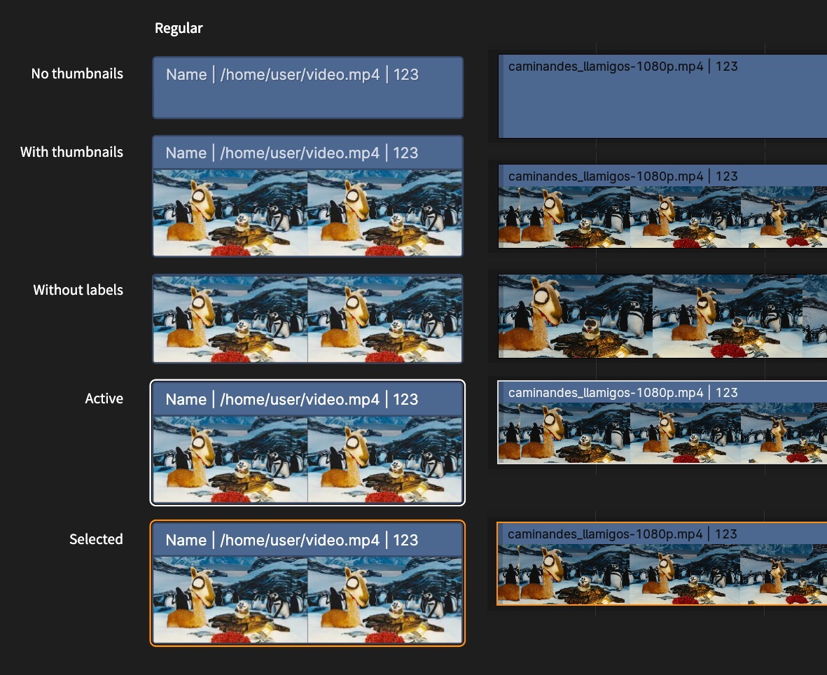
Anatomy of a Strip
A strip is divided in two non-overlapping sections:
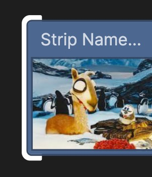
Header: A full-width band at the top of each strip, containing information as text and icons. Its height is defined by the label font size plus some padding. At the moment the header displays too much info by default: strip title, path, and length in frames. By default it should just show the strip title (which is often derived from the path anyway). Other info can be enabled back by the user of course.
Preview: The bottom part of the strip, containing a preview the content such as image/video/scene thumbnail, waveform for sound strips, the content of a metastrip, etc. This is the section that reflects "missing media", or locked in time via diagonal lines as in the original mockups.
State: Disabled/Muted
Currently, when a strip is disabled it becomes semi-transparent (except the thumbnails, which are drawn in full opacity).
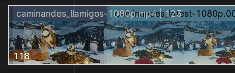
This is not only hard to read, but also confusing when moving a disabled strip on top of others, you can see through which is unreadable and gets on the way.
The proposal is to draw disabled strips:
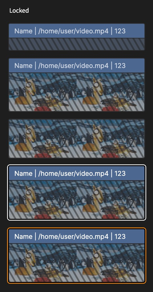
State: Locked
Currently, locked strips draw diagonal lines over the entire strip, covering the labels which hurts readability.
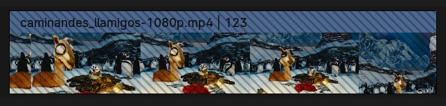
Proposal is to keep the diagonal lines, but draw them below the header/labels:
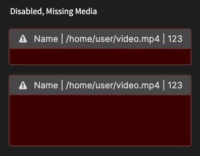
State: Missing Media or Data-block
Currently, strips with missing data-block have a red header. Missing media is work-in-progress in #116869.
Both states have a similar outcome: content is not visible, requires attention. So both will be drawn similarly just with a different indicator.
Proposal is to:
ERROR) or missing data-block (LIBRARY_DATA_BROKEN).Mockup:
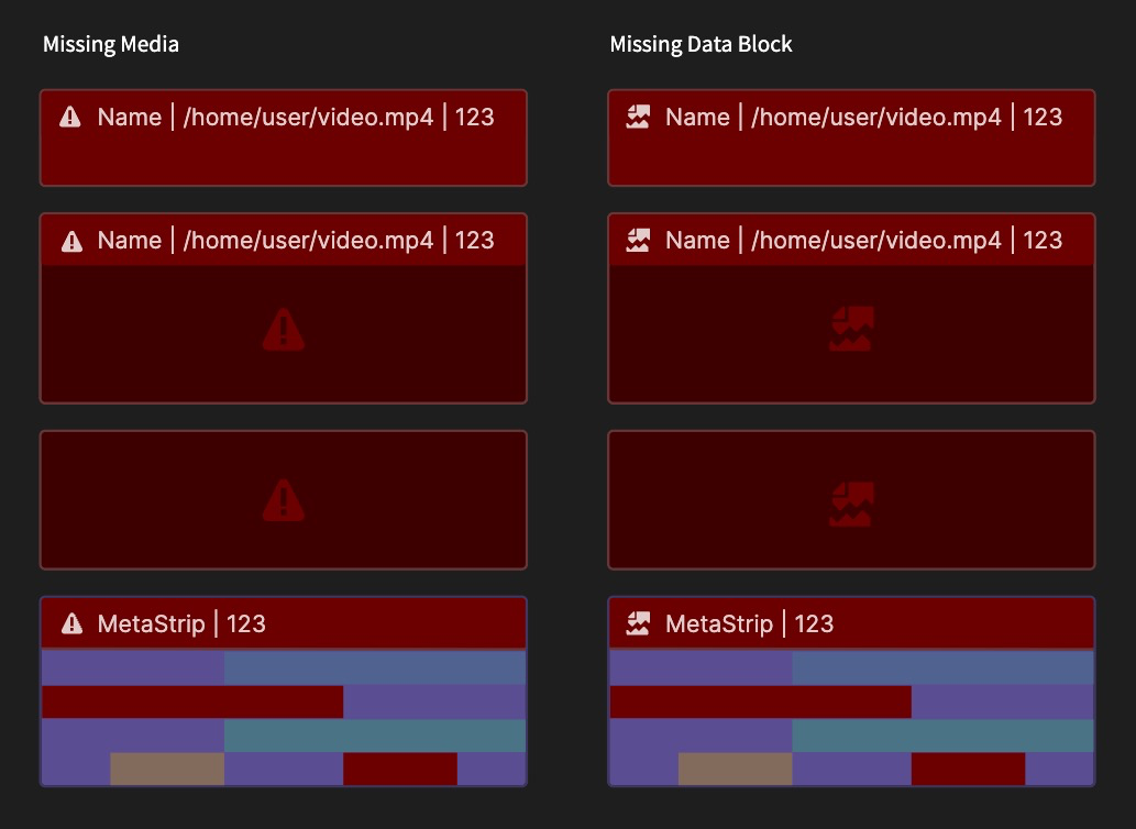
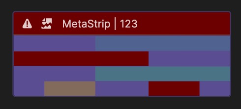
Metastrips with both missing media and data-blocks show both icons:
Drawing an icon might not be enough when the strips are too narrow to fit, so we could also draw an indicator over the time topbar.
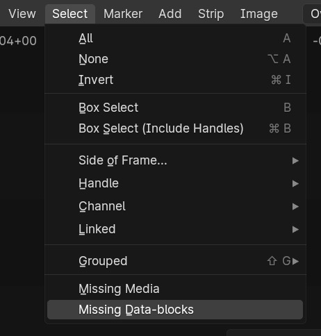
Additionally, we could add new Select operators to find the problematic strips more easily:
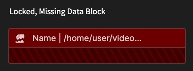
Combined
Locked + Missing data-block
Disabled + Missing Media
Conclusion
The idea is to help @aras_p land #116869 with as little cosmetic changes as possible. I know icons in strips are something new but hopefully @Harley can help Aras if needed.
Why not using magenta for missing data? Red is the universal hue for things that are wrong. Blender uses magenta only for missing textures/shaders when rendering, every other error/alert is red.
This looks great! But looking at the design mockups, my questions are about... the rounded corners lol :)
IMHO, the very slightly rounded corners do make the overall look much better. But, they are more complex to draw than just "a rectangle". So the question is, do we want these rounded corners? These might require some thinking, e.g. how do make it so that the thumbnail is properly "clipped" by the rounded corner, etc. And how to draw them efficiently (might need a new shader), etc. All of that is doable and probably Not Terribly Hard (famous last words), but the question is, do we want them.
On the mockups I think rounding is only on outside line, inside thumbnails are still square. That could work.
My first (and last (incomplete (pretty raw)) ;) ) OpenGL program was UI with round rectangles. Don't want to say it is something so basic, but, for example, node editor is only round rectangles. What I'm afraid of is the padding for this new overlay.
EDIT: Doesn’t Blender already make the entire interface rounded?
@nickberckley @mod_moder rounded corners are possible to do, I'm just trying to clarify whether they are implied by this design (judging from the screenshots), or not (since the text never mentions them).
@pablovazquez another question I have, how/if does this interact with the strip resizing "handles". Right now these are just "wider" rectangles on either side of the strip. With the proposed very-slightly-rounded corners, and the active outline that goes beyond the strip rectangle, does it affect the resizing handles in any way? Should they continue to be where they are, or be drawn in the space between strip and the outline?
And/or does that interact with the WIP handle drawing visual change over at #109522 ?
Knew this would come up, should’ve clarified :D
For the sake of getting #116869 in main soon, let’s forget about rounded corners for now.
That being said…
I do think that rounded corners have a benefit other than just looking pretty, they communicate more clearly where a strip starts and ends, and allows for “breaking” that to communicate other elements such as transitions.
Ideally yes, images would be masked by the rounded corner, but even without, if the image is slightly smaller then the gap between the thumbnail and the strip background could serve as outline?
So to sum up, for the time being and even in the future if they affect performance in any way, let's just forget about it. I'd much rather have a responsive ugly timeline than a sluggish but slightly prettier one.
I'm hoping we can couple this with #109522. Removing the dark overlay strips currently have and replace it with changing the mouse cursor on hover. With an indicator when the handle is active.
It'd probably have to be inside, outside looks good:
...but it gets tricky when there are two handles of adjacent strips selected.
For the time being and to move forward with the patch, they can continue as is. If we find the motivation it'd be great to look into drawing it between the strip and outline, perhaps as part of #109522 or a larger re-design?
@pablovazquez I have a question about this:
Bbbbut... you yourself added "when overlapping other strips, draw the content transparent" three years ago (https://projects.blender.org/blender/blender/commit/f5cc34861076), with "It's convenient to see what's underneath" reasoning.
Did you change your mind? :P
@aras_p
Short answer: Yes :D
Long answer: Kind of! While transparency helps a bit to see what's underneath, making the entire strip transparent ends up being not readable at all.
Then I thought okay the title/header should never be transparent, just the media, but a quick mockup proves it wrong:
So no, no transparency. Sorry for the confusion.
@pablovazquez question wrt "Metastrips with missing content have a red header, and the problematic strips in red. Plus the corresponding icon":
Today meta strips do not have a "header area", i.e. they do display the title (name), but the actual background of "strips contained within it" is drawn across the whole strip rectangle, not below the "header". Should that be changed so it is drawn below the header?
@aras_p It's something I forgot to fix. The meta strip got a title area in #109472 but the visual change was accidentally reverted iirc in this commit.
Yes, the way I see it is that the "anatomy" of a strip is divided in two non-overlapping sections:
Header: A full-width band at the top of each strip, containing information as text and icons. Its height is defined by the label font size plus some padding. At the moment the header displays too much info by default: strip title, path, and length in frames. By default it should just show the strip title (which is often derived from the path anyway). Other info can be enabled back by the user of course.
Preview: The bottom part of the strip, containing a preview the content such as image/video/scene thumbnail, waveform for sound strips, the content of a metastrip, etc. This is the section that reflects "missing media", or locked in time via diagonal lines as in the original mockups.
These two sections never overlap, the background of the header should not be see-through, in order to preserve readability.
In this design, how does the user know what strip is the active strip (w. exposed values in the sidebar), if no strips are selected, and therefore have no outline?
In this design, all strips have white texts, previously only the active strip had a white text and thereby indicated which strip was the active strip.
Looking at the saturation levels of @aras_p latest update, as the most saturated elements gets the most attention. And IMHO should the active/selected elements get the most attention.
Good point, thanks! Addressed via !121029
I agree. This could be tackled as its own task, since it's related mostly to theme (except the waveforms). The default values for color tags need to be revisited, that issue was highlighted in the re-design PR.
I will close this since most of the issues have been tackled and are now part of main (yay!)
Thanks Aras and everyone for the feedback!