VSE: Timeline strip visual design updates #118581
No reviewers
Labels
No Label
Interest
Alembic
Interest
Animation & Rigging
Interest
Asset System
Interest
Audio
Interest
Automated Testing
Interest
Blender Asset Bundle
Interest
BlendFile
Interest
Collada
Interest
Compatibility
Interest
Compositing
Interest
Core
Interest
Cycles
Interest
Dependency Graph
Interest
Development Management
Interest
EEVEE
Interest
EEVEE & Viewport
Interest
Freestyle
Interest
Geometry Nodes
Interest
Grease Pencil
Interest
ID Management
Interest
Images & Movies
Interest
Import Export
Interest
Line Art
Interest
Masking
Interest
Metal
Interest
Modeling
Interest
Modifiers
Interest
Motion Tracking
Interest
Nodes & Physics
Interest
OpenGL
Interest
Overlay
Interest
Overrides
Interest
Performance
Interest
Physics
Interest
Pipeline, Assets & IO
Interest
Platforms, Builds & Tests
Interest
Python API
Interest
Render & Cycles
Interest
Render Pipeline
Interest
Sculpt, Paint & Texture
Interest
Text Editor
Interest
Translations
Interest
Triaging
Interest
Undo
Interest
USD
Interest
User Interface
Interest
UV Editing
Interest
VFX & Video
Interest
Video Sequencer
Interest
Virtual Reality
Interest
Vulkan
Interest
Wayland
Interest
Workbench
Interest: X11
Legacy
Asset Browser Project
Legacy
Blender 2.8 Project
Legacy
Milestone 1: Basic, Local Asset Browser
Legacy
OpenGL Error
Meta
Good First Issue
Meta
Papercut
Meta
Retrospective
Meta
Security
Module
Animation & Rigging
Module
Core
Module
Development Management
Module
EEVEE & Viewport
Module
Grease Pencil
Module
Modeling
Module
Nodes & Physics
Module
Pipeline, Assets & IO
Module
Platforms, Builds & Tests
Module
Python API
Module
Render & Cycles
Module
Sculpt, Paint & Texture
Module
Triaging
Module
User Interface
Module
VFX & Video
Platform
FreeBSD
Platform
Linux
Platform
macOS
Platform
Windows
Priority
High
Priority
Low
Priority
Normal
Priority
Unbreak Now!
Status
Archived
Status
Confirmed
Status
Duplicate
Status
Needs Info from Developers
Status
Needs Information from User
Status
Needs Triage
Status
Resolved
Type
Bug
Type
Design
Type
Known Issue
Type
Patch
Type
Report
Type
To Do
No Milestone
No project
No Assignees
11 Participants
Notifications
Due Date
No due date set.
Dependencies
No dependencies set.
Reference: blender/blender#118581
Loading…
Reference in New Issue
Block a user
No description provided.
Delete Branch "aras_p/blender:vse_strip_design"
Deleting a branch is permanent. Although the deleted branch may continue to exist for a short time before it actually gets removed, it CANNOT be undone in most cases. Continue?
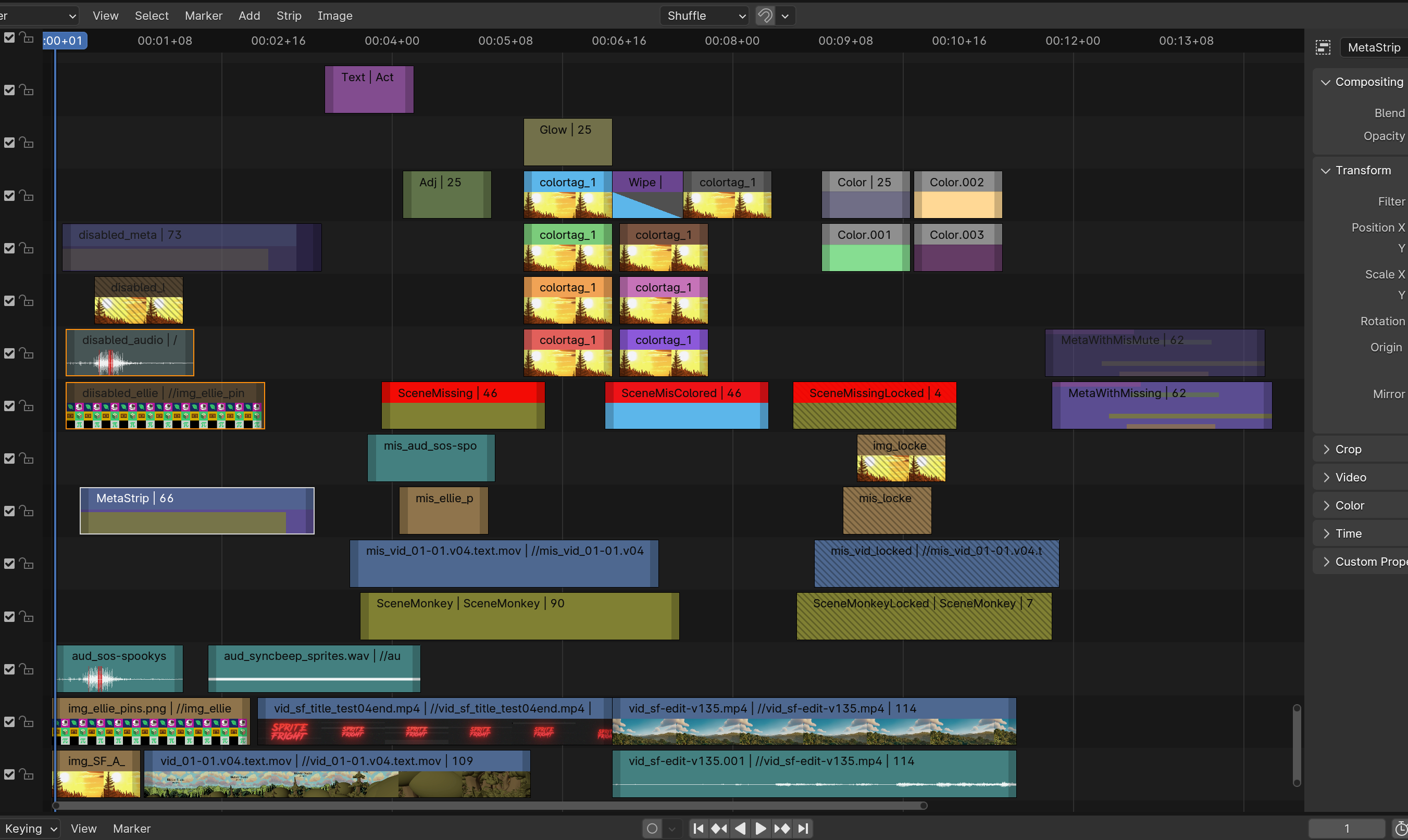
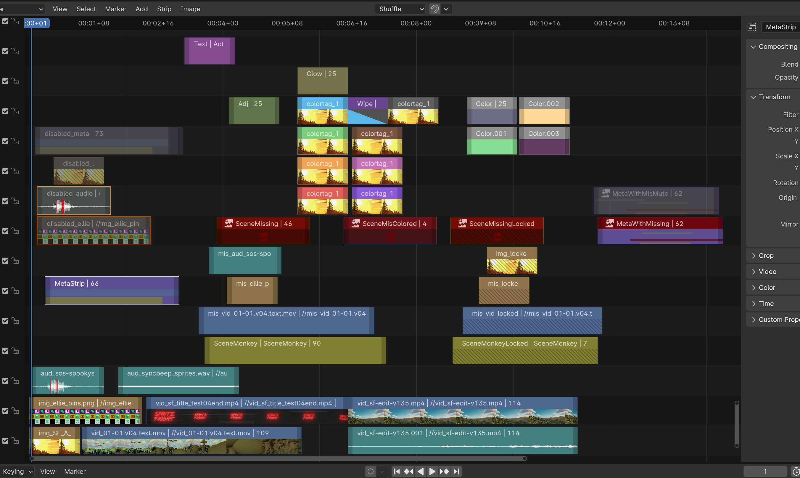
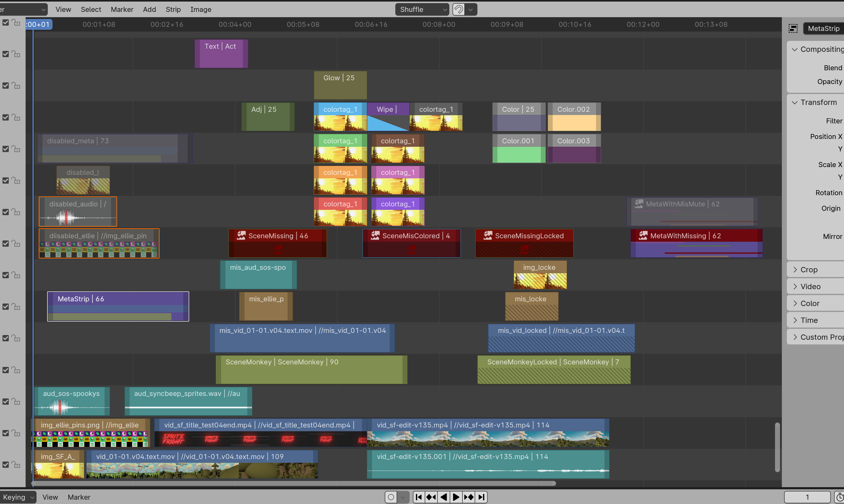
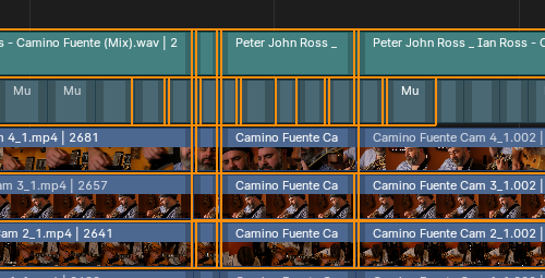
Design updates as per #118288:
Strip border is darker background color, selected/active state is additional outline around the stripNot done from the design task:
"Outside of VSE" things I had to do in this PR:
UI_view2d_text_cachealpha color was being ignored, and text was always drawn at full opacity. The only other place I canfind that draws a semi-transparent text was
nla_draw.ccthat tries to render non-soloed track texts. So now they shouldbe properly semi-transparent, unlike previously.
UI_icon_draw_mono_rectfor drawing icons in VSE timeline space. Existing icon drawing functions assume that coordinatespace is "square" aspect ratio, which is very much not the case in the timeline.
Dark theme, before:
Dark theme, now:
Light theme, before:
Light theme, now:
@blender-bot build
WIP: VSE: Timeline strip visual design updatesto VSE: Timeline strip visual design updatesThis is so great! I love how you can tell much more even with headers turned off now, before/after:
A big part of it is thanks to the borders which are colored based on tag or type. Which when I first saw them they felt too thin (also didn't seem to change when setting lines to be thick in the Preferences), but I got used to it.
One bit that feels a bit off is when two adjacent strips are selected, that we can still see the orange line underneath, is that a limitation of this new system? Otherwise clipping that part out and giving priority to the white line (or drawing the active strip on top of the orange line) could work.

Other than that it's awesome, thanks for working on it!
It's not a "new system", it's just that previously the "borders" were never drawn outside of the strip rectangle. Now they are (just 2px outside), but if strips are right next to each other, you do get this overlap, since one border eats 2px into the other strip, and vice versa. That could be fixed/improved somehow, with some more complex code -- like detecting when strips are right next to each other, and then for that side, make the border line not go beyond the strip, or something. But that would be somewhat more complex -- right now each strip is drawn without any knowledge of any others, whereas for this they would need to gain awareness of "what is right next to me".
I think it is harder to see which strip(s) are selected now with the colored borders.
Before it was kinda easy to spot as the selected ones were the only strips with a visible border.
Now when every strip has a border color I feel like my eyes have to dart around quite a bit more to detect which strips are selected as the other border also is grabbing my attention.
It feels a bit like the "random color" mode for wire frames.


IE before:
After:
A bit exaggerated of course, but I hope you get my point.
@ZedDB yeah that's a good point. @pablovazquez any ideas how to make "what is selected" more visible? Like maybe the "selected" outline should be thicker line, or something else? or the "regular border color" should be more desaturated and/or darker?
@blender-bot package
Package build started. Download here when ready.
One of the very difficult things in VSE drawing is that elements two pixels wide will be drawn as one or two pixels wide. 1 px will be 0 or 1 wide. So, the outline outside the strips causes several problems:

The 2 px distance to the outline can't stay at ex. narrow channel height:

With little, or no distance between channels, it becomes very hard to see if a strip surrounded by selected strips is selected or not:
I agree with @ZedDB there are some challenges in making the selected strips stand out. Outlines vs. outlines (if the user colors the strip white, it'll look like the strip is selected, even if it is not), Also, having all texts white is diffusing the attention on the selected strip(previously, only the active strip had white text).
From the chat:
@pablovazquez I checked what other video editing software does wrt selected strip outlines, and basically: no one seems to do them "outside the strip boundaries". It is very common for the whole "strip border" to be way wider than 1px. Some tuck in the whole preview/content area by that, i.e. the border region is never showing the preview. Some display preview right up to the edge, but when a strip is selected, there's N pixels worth of selection outline that is drawn over whatever preview is rendered.
Maybe something like that would work? e.g. along the lines of:
@aras_p Indeed it seems that lines outside the bounds can be problematic. Thanks for trying it out though, sometimes something looks okay as mockups but not as good irl.
Sounds good! The only downside is that waveform/preview will be slightly smaller but that's okay as trade-off for better readability.
So basically a border inline that gets either the strip type/color, or the active/selected status. I think it is still important to keep the 1px darker outline for contrast.
Made a quick mockup:
Selected plus active:
Close-up:

What do you think?
PS: It look so much better with rounded corners :D
@pablovazquez ok, implemented this:
No rounded corders for now though, as that would require writing a whole new shader. Some other day.
It's impossible to see which strips are selected and active in above images, unless you take your time with it. And you're not taking into consideration that different themes are using different colors for active/selected. It's gonna look like rainbow in many cases.
All strips should have same colored outline so that active and selected colors are visible at the first glance. Different color for each is super impractical. Have never seen that in any editing software.
I also feel like it is harder to spot what is selected at a glance now.
So I tried to experiment to see what happened if I tweaked certain things in the new design a bit.
Here is the new style without any changes:

Here it is if I change the unselect outlines to pure black:

Even if I darken the outlines I still don't think it is easy to spot the select strips in my peripheral vision. So I tried to see if it would improve by copying the "select object" text color scheme for the outliner:

And an example if I combine both dark outlines with the text:

I personally feel like the highlighted text grabs my attention the most. Especially for the active strip since it is hard to tell otherwise which strips are selected because the text appears the same-ish on all strips without it. (My eyes are usally drawn to the center of the strip, not the outline around it)
For the dark outlines, I think it makes the view a lot less busy and focused. Perhaps it doesn't help too much with helping me spot the selected strips. But I feel like it brings down the visual clutter a lot.
@ZedDB @pablovazquez alright, since the whole "change border color" thing seems to be controversial, I have reverted that. So it is back to being dark 1px border for unselected strips, and 2px border for selected/active, using colors from the theme. For text labels, I went with something towards Sebastian's suggestion, where selected/active text labels also use colors from the theme (however slightly brighter, as the default orange-text is a bit hard to read).
Dark and light theme, before:


Dark and light theme, now:


@blender-bot package
Package build started. Download here when ready.
@blender-bot package macos-arm64
Package build started. Download here when ready.
A note on the saturation levels: #118288 (comment)
@pablovazquez @fsiddi Can you give final go/no-go here?
Just compiled the latest version.
Text labels
The orange text for selected strips doesn't work, I wouldn't do that. It doesn't really solve the issue and it is inconsistent with the rest of Blender.
The main issue is that the
Active Striptheme property in the theme by default is actually gray (0.8value) not completely white, so even while fully opaque it still doesn't look as bright when active. We should make this change in the theme.Another change to do theme-wise is to adjust the value of the Strip Colors. They were simply copied over from Collections Colors, they work fine there because they're used only for the collection icon and hierarchy line in the Outliner. In the VSE we have text over and it's hard to read.

If we ship with better colors it'll help. However, users can still make it unreadable (that's on them though). One way to mitigate this a bit would be to introduce label drop shadows. Something we do everywhere already. Every widget label and more recently attribute previews in the viewport.
Outlines
Great! One more thing we could do to improve contrast for active/selected strips, is an additional 1px black inner border before the 2px white/orange.
Which also helps contrast when the strip color matches the active/selected theme colors.
To sum up:
TH_BACKmight work? I should test this) inner border to active/selected strips.@pablovazquez alright, implemented your suggestions (except the "more readable strip colors in the theme" bit, since I don't know what colors to pick -- but I did update the theme entry for active strip to be white).
Those changes looks good to me! 👍
Very nice with the drop shadow on the texts! So much better. I have only a few questions left:
Was it tested to make the selection outlines 2px wide, so they'll stand out more? IMO, they need all the attention they can get.
Was there found a solution on how to identify the active unselected strip? And also when the texts are un-displayed?
IIRC, the reason for the outline white/orange headroom was because originally, when dragging/transforming the outlines would light up even further, but that might have been removed by now, and if not, it properly should if the white outline is full white now.
Checking: The orange outline still changes color:

Thanks Aras! Looking so much better. The theme needs adjusting which should be a separate task, no need to delay this even further.
I think they are already 2px, or you mean 2x?
Good point. Perhaps the active-and-selected strip could have this wider outline, while active-but-not-selected has the current outline width. I'll try to test this locally, no need to bother Aras with such a small cosmetic change that might not even make it (rather focus on more important things like rounded corners :D )
There is only one strip with a white outline anyway, no need to extra highlight it to indicate it's been transformed, it's pretty obvious already you're staring at it. The other items light up bright orange as usual:
I'd rather push the current state as-is, since this iteration seems to not have major usability issues, and get back to finishing up the "display missing media" part of the whole effort. It's been two months on this PR alone already :) Various tweaks to colors, outline widths, etc. can be done separately.
On the 2px outlines, I guess it's hard to see, but what if they're double as wide as they are now?
The outline indicates that the strip can be transformed, and the active strip can't be transformed, when it isn't selected(+outline), but it's properties can still be changed in the sidebar:
These shared pixels are less than optimal, but I guess we'll have to live with that.

@pablovazquez In your mockups, you had a separating line between the text area and the content area of the strip like the color strips has, is this something you want implemented on all strip types?
I've made a PR !121029 trying to cover this case. It's basically the same thin black outline we have on unselected strips, but whiteish.
We can continue discussion in that PR.
I think it'd help in some cases but it also adds a bit of visual clutter. We could experiment with a subtle version of it.
We can discuss all this over the chat perhaps or on another design task. I've looked at the code for making that other PR and it's fairly easy to play with outline width to test things.
I think this PR and related task can be left alone for now.
Thanks Aras for the work and (most importantly) patience!