Subjective regression #15
Labels
No Label
bug
duplicate
enhancement
help wanted
need info
not a bug
wontfix
No Milestone
No project
No Assignees
2 Participants
Notifications
Due Date
No due date set.
Dependencies
No dependencies set.
Reference: extensions/space_view3d_pie_menus#15
Loading…
Reference in New Issue
Block a user
No description provided.
Delete Branch "%!s()"
Deleting a branch is permanent. Although the deleted branch may continue to exist for a short time before it actually gets removed, it CANNOT be undone in most cases. Continue?
I liked the Shading Pie menu options; having Shade Smooth and Shade Flat on
Zwas good. It would've been nice to add Shade Auto Smooth too. But they both got removed so now right-click is the only option.I liked the
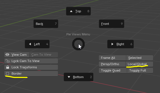
Alt+QViews pie menu and I used it often. It seems it has been completely reworked and scattered to the winds across multiple more complicated hotkeys, with only a few of the functions surviving. The things that were added to the newCtrl+Alt+Qalready have easy, native hotkeys.First, Toggle Quad View is natively
Ctrl+Alt+Q.Now we're forced to use the pie menu for this function if we want to use the View pie.Frame All:
HomeFrame Selected:
Numpad Period(Although I have this bound to Mouse 4 side button)Enter Local View:
/Fly: Shift + ` (backtick)
Set Render Border (Region) and Clear Render Border:
Ctrl+BandCtrl+Alt+BToggle Clipping Border (Region):
Alt+BSo, all of these new View Pie menu options are redundant. I liked the old View Pie menu on
Alt+Qbecause it had some key buttons like, "Lock Camera to View" which doesn't have a native hotkey, and it consolidated many other convenient and commonly used view-related functions. Rather than having niche functions like fly, and render/clipping regions, which already have easy native hotkeys. And moving a handful of camera-related functions to a new 3-button hotkey seems unnecessary.I don't see the point in changing the Sculpt or Origin pie menus around. Those were fine. The new versions seemed to have shuffled around the options for no apparent reason.
Please do not touch the Editor Switch pie menu. That is one of the most useful and important ones, and it doesn't need any adjustments.
Thanks for the feedback.
👍 Fair points here. I'd like to add a new pie menu that deals with object display, where these would be a much better fit. There is already a viewport shading pie menu in core Blender, and I think having view shading and object display in the same pie can be pulled off, but it should be very clear which buttons are going to do destructive object/data editing operations, and which ones are just toggling viewport settings.
👍 Fair point, I can change this pie to appear on mouse drag only.
👎 Laptops don't have those keys, and those operations were already in the old pie menu.
👎 These were also already in the old pie menu...

By the way, the "Border" tickbox didn't do anything when you weren't looking through a camera, so, that's probably why you didn't register that the button was even there. But it was there. Doing nothing. Great, right?
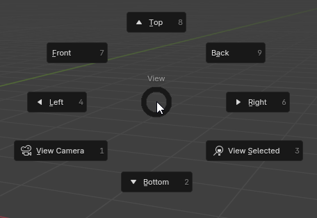
👎I know I addressed them separately already but I just want to point out that the pie menu below is now built into core Blender. It's on the ` key. So, if you want to see something redundant, look no further than most directions of the old View pie! :D

👎And now Shift+Alt+C has them! C for Camera!
👍I could change the shortcut to Alt C if you think Shift+Alt+C is too annoying to press, it will just have a conflict in Curve Edit mode, but maybe that's worth it. Will consider. Leaning towards doing it!
🤷Felt like it belonged next to Set Render Border. Plus, I think most users don't know about this, so I thought this would help make it more discoverable, but I don't feel too strongly about it, it could be removed or replaced.
🤷Same, I don't feel too strongly about it, it could be removed or replaced, but I don't see why not use the space if we have it. We could argue about clutter ofc, but, seeing how the old menu looked, I think it's pretty fine.
👎You can certainly say that my take on it is a downgrade, but to say that "it was fine" is like saying the sky is green. So this feedback is not useful or constructive.
I promise you once you get used to the directional gestures, you'll be picking brushes before the pie menu animation even has time to finish!
👎 It was omitting the "Origin to Volume" option, some options had icons and others didn't, and even its capitalization was inconsistent. Frankly, this pie was slapped together, and I'm sure the original author would agree.
The logic behind the new layout is to put the most commonly used option on the right, and its conceptual opposite on the left, if there is one. These are consistent principles throughout the add-on. Then, "Origin to Bottom" stays on the bottom, obviously, and the rest fall into place.
👎 Well, that's just rude.
As I hope you can see, I didn't make these changes on a whim (except the 🤷ones maybe), and I am open to feedback (the 👍 ones I will probably implement), and you can still try to change my mind about the rest, but your arguments need to have more substance than "I was used to the old shit.".
And besides, keep in mind that it is also possible to just use the old shit. You can just download v1.3.2, which has none of my design changes, and it's compatible with 4.3! I would of course prefer if people enjoyed my changes, but if really all you want is for everything to stay the same, then that is a possibility. It's not like Windows Updates! :D
I actually don't know when I should close or not close feedback tasks. Feel free to re-open, don't take my setting the task status to closed as me saying "END OF DISCUSSION!" Not at all. I'll get notifications either way.
Fair enough, thank you for the thorough response.