UI: Web Assets v2 upgrade #85
No reviewers
Labels
No Label
Priority
Critical
Priority
High
Priority
Low
Priority
Normal
Reviewed
Confirmed
Reviewed
Duplicate
Reviewed
Invalid
Reviewed
Won't Fix
Status
Abandoned
Status
Blocked
Status
Need More Info
Type
Breaking
Type
Documentation
Type
Enhancement
Type
Feature
Type
Report
Type
Security
Type
Suggestion
Type
Testing
No Milestone
No project
No Assignees
2 Participants
Notifications
Due Date
No due date set.
Dependencies
No dependencies set.
Reference: infrastructure/extensions-website#85
Loading…
Reference in New Issue
Block a user
No description provided.
Delete Branch "martonlente/extensions-website:ui/web-assets-v2-upgrade"
Deleting a branch is permanent. Although the deleted branch may continue to exist for a short time before it actually gets removed, it CANNOT be undone in most cases. Continue?
This pull request upgrades Git submodule Web Assets to v2, resolves post-upgrade issues, and makes the necessary project-specific changes.
Web Assets v2 brings UI fixes, improvements, and new features to the platform as detailed on the Web Assets v2 guidelines and notes wiki page.
Technical changes focus mainly only reducing project-specific styling, and rely more on v2 changes to improve maintenance and scalability.
Visual changes include improved typography and more consistent sizing and spacing among others. Example mockups and screens:
c4a14b21a5to75c389634af245e93162to7a06add6f0WIP: Web Assets v2 upgradeto UI: Web Assets v2 upgradeLooking great! Just got some minor notes (besides the crash in approval-queue detail page):
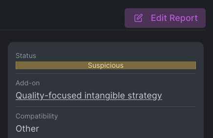
Abuse Report status in detail page looks like an alert, not a badge. To test make a fake report on an extension by clicking Report Abuse in the bottom of the page, then go to http://extensions.local:8111/abuse/reports/

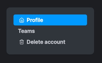
Too much padding in the sidebar of profile settings.

Teamsis missing icon (you could usei-users), and styling on the list in http://extensions.local:8111/settings/teams/@ -169,2 +169,3 @@<div class="d-flex align-items-center"><div class="btn-row ml-3 w-100 justify-content-end"><div class="btn-row ms-3 w-100 justify-content-end">{% if is_maintainer or request.user.is_moderator %}Getting a template error on items in approval-queue. This added
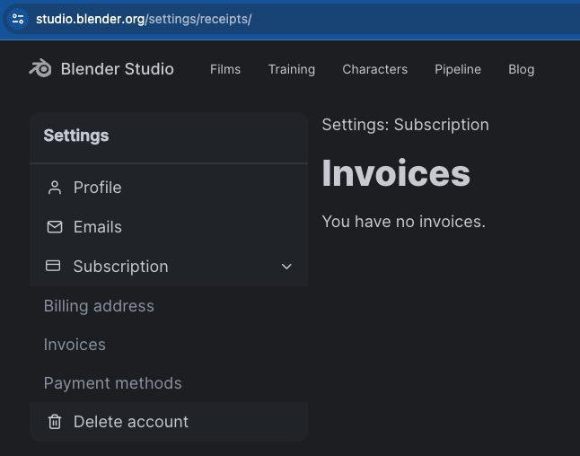
ifis not closed.Looking at it again, it's not just the padding but the use of the active color is strange. Understandable though since in Blender Studio we don't even highlight the active area. Notice how we are in "Invoices" but the sidebar does not reflect it.

It should look something like in Blender Conference at the moment. Perhaps you could copy the markup so it's unified.
Thanks for the remarks. The fixes and improvements have been done.
The navdrawers' paddings now match other sidebar panels' padding, but can be drecreased further to look closer to the example instead.
Thanks for the fixes!
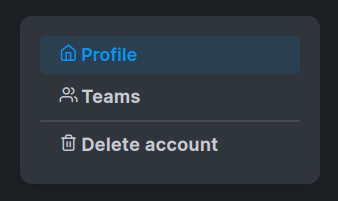
Do you mean this padding? It's not matching, seems bigger in the profile settings to me?


Still not totally sold on the styling of the navdrawer but we can tackle that later on web-assets. We could make a section there since this is a component that is used in several websites.
@pablovazquez thanks for the remarks. I think why the navdrawer's padding felt bigger is that its inner buttons with transparent backgrounds indeed had an extra padding, which resulted in more horizontal spacings overall. I made some spacing tweaks and changes to font-weights: it looks better to me. (Alternatively we can make an exception here, and fine-tune visually.)
Currently almost all boxes in Extensions have a dedicate utility class assigned defining their spacings which are basically the same: we can do a cleanup and check all box-spacings in the project systematically.
Good idea to make navdrawer component in web-assets, let's do that. 👍
Thanks for the fixes!