UI: Hint about "Type to Search" in add menus #112584
Labels
No Label
Interest
Alembic
Interest
Animation & Rigging
Interest
Asset Browser
Interest
Asset Browser Project Overview
Interest
Audio
Interest
Automated Testing
Interest
Blender Asset Bundle
Interest
BlendFile
Interest
Collada
Interest
Compatibility
Interest
Compositing
Interest
Core
Interest
Cycles
Interest
Dependency Graph
Interest
Development Management
Interest
EEVEE
Interest
EEVEE & Viewport
Interest
Freestyle
Interest
Geometry Nodes
Interest
Grease Pencil
Interest
ID Management
Interest
Images & Movies
Interest
Import Export
Interest
Line Art
Interest
Masking
Interest
Metal
Interest
Modeling
Interest
Modifiers
Interest
Motion Tracking
Interest
Nodes & Physics
Interest
OpenGL
Interest
Overlay
Interest
Overrides
Interest
Performance
Interest
Physics
Interest
Pipeline, Assets & IO
Interest
Platforms, Builds & Tests
Interest
Python API
Interest
Render & Cycles
Interest
Render Pipeline
Interest
Sculpt, Paint & Texture
Interest
Text Editor
Interest
Translations
Interest
Triaging
Interest
Undo
Interest
USD
Interest
User Interface
Interest
UV Editing
Interest
VFX & Video
Interest
Video Sequencer
Interest
Virtual Reality
Interest
Vulkan
Interest
Wayland
Interest
Workbench
Interest: X11
Legacy
Blender 2.8 Project
Legacy
Milestone 1: Basic, Local Asset Browser
Legacy
OpenGL Error
Meta
Good First Issue
Meta
Papercut
Meta
Retrospective
Meta
Security
Module
Animation & Rigging
Module
Core
Module
Development Management
Module
EEVEE & Viewport
Module
Grease Pencil
Module
Modeling
Module
Nodes & Physics
Module
Pipeline, Assets & IO
Module
Platforms, Builds & Tests
Module
Python API
Module
Render & Cycles
Module
Sculpt, Paint & Texture
Module
Triaging
Module
User Interface
Module
VFX & Video
Platform
FreeBSD
Platform
Linux
Platform
macOS
Platform
Windows
Priority
High
Priority
Low
Priority
Normal
Priority
Unbreak Now!
Status
Archived
Status
Confirmed
Status
Duplicate
Status
Needs Info from Developers
Status
Needs Information from User
Status
Needs Triage
Status
Resolved
Type
Bug
Type
Design
Type
Known Issue
Type
Patch
Type
Report
Type
To Do
No Milestone
No project
No Assignees
11 Participants
Notifications
Due Date
No due date set.
Dependencies
No dependencies set.
Reference: blender/blender#112584
Loading…
Reference in New Issue
No description provided.
Delete Branch "%!s(<nil>)"
Deleting a branch is permanent. Although the deleted branch may continue to exist for a short time before it actually gets removed, it CANNOT be undone in most cases. Continue?
In 3.6 the ability to search as a quick way to add a node was very discoverable:
In 4.0 this was removed in favour of supporting direct typing the node/primitive name. The only hint of this, however, is on the tatus bar:
The proposal is to improve the discoverability by adding the hint to "Type to search ..." faded out by the menu name:
This only works well with short titles. Even if we make it work for all default cases, it breaks easily with different languages (which may use a longer string or use wider characters) and font sizes.
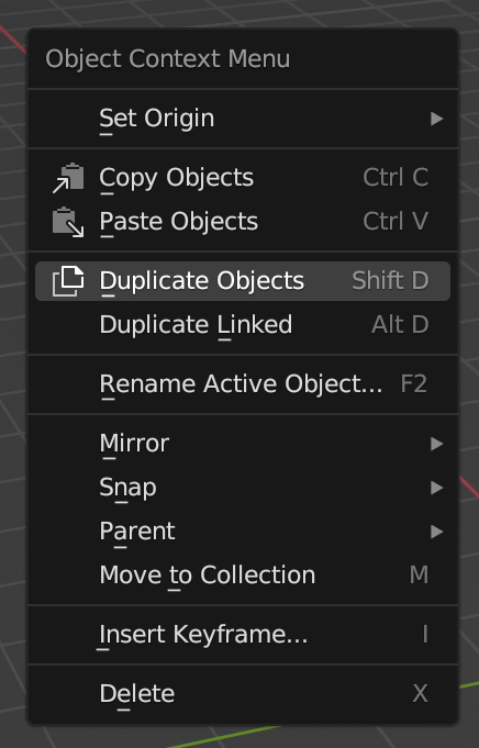
For example, just the object mode context menu doesn't give enough space for this hint, and this is a type of menu we discussed should have search instead of constantly changing accelerator keys:
@JulianEisel Was there a plan to have the instant-search option for the non-add menus?
Plan is a big word, but we discussed that this should be used in more places probably. This design would limit us in that.
Even if just the add menus, we can't just assume that the title would leave enough space. For example the German word for "Add" is "Hinzufügen", which uses quite a bit more space already.
Another suggestion was to bring back the operator, but with the text Type to search... and icon. Clicking on it would trigger the search dialog.
Regarding non-add menus, it won't happen soon since there's no consensus about introducing a preference or the rules on which to use action keys or search in all menus. So for the time being (for 4.0), going with the label/operator would be best.
What I suggested in the UI meeting is showing just a search icon in the right side of the header, with a tooltip which says "Type to Search." I think it makes sense to avoid adding a separate line for the search, since the search isn't really an item in the menu.
I think that would be a nice compromise between hinting users in the right direction and overall UI cleanliness/consistency.
Use the title as a placeholder?
Or we could decide that a context menu doesn't need to have a title that says it is a "context menu".
The more I play with the idea, the more I like not having any titles on any context menus. They are user-initiated and context specific. Removing the titles makes me just feel that they get in the way.
Funny that you mention that. The
Object Context Menutitle is exactly what gets on the way of having the Add menu contents as context menu in Object mode. I mentioned it a few hours before your comment.I imagine some people will miss the drag feature if titles are removed.
That's a really good point. Even though it is invisible now (it should have the
GRIPicon, or at least use the hand cursor on hover), it is super useful to be able to drag it. Especially when teaching or explaining, to make room for submenus.Okay, how about this:
Remove the title on Context and Add menus, and replace it with a search label/operator.
On non-searchable menus, the title area now shows a
Search...entry that users can click to search, or pressS(hence the underline) to start searching. Similar to the old search in the Node Editor.On searchable menus, the title area now shows a
Type to search...entry that users can click to search (for consistency, since they also get the hint that they can start typing anyway).The title area always shows a
GRIPicon on the right side, similar to panels, where users can click to drag the menu.Why do we have two types of menu, with two types of search? The solution above is good for the current state of things, but what's the reason for current state of things to exist? I am asking because that's exactly what the average user is going to ask. Shouldn't it be just unified to one general search feature?
From the point of view of average user, it's just going to be frustration caused by both menus being searchable, some times requiring a mouse click or button press while others don't. The answer to this question is an internal, technical reason that the end user should never care about.
If you take a step back you will realize the ridiculousness of this situation. We have have a thing we call a "non-searchable" menu, which has an operator called "Search" as its very first entry.
This one is best, but instead of Search or Type to Search tooltip should be menu name. In Object Context Menu it isn't necessary, but in Edit Mode it tells you if you have Vertex, Edge, or Face Context, and it's useful. If you call menu in header area for example, sometimes you get Header context menu in 3D Viewport, sometimes Area context menu, sometimes you misclick on workspace context menu. Having names in those areas helps.
Also custom menus created by addons will need titles to differentiate from regular menus.
During yesterday's meeting it was agreed that for 4.0 this would be the easiest way (with the current bcon3 deadline) to give a hint about this new feature.
Later on we can explore ways to integrate it with the title.
I don't want to get much into this here (it is a bit beyond the scope of the task). But I would expect the context menu to be a high-curated set of options. That would mean there is no need for search there.
I feel that this could benefit from a big picture design of how we are using search in Blender, and how the different searches relate to each other. For example:
Outliner: Hierarchy navigation
Properties Editor: Discoverability
Viewport: (F3) Quick Access + Discoverability (*)
Add menus: Quick Access
Context Menu: ?
...
(*) Which one is more important of those? Should we focus on them separately? e.g., leaving discoverability for F1 that could expand menus, while spacebar for quick access?
Yes, exactly. There seem to be two types of menus in Blender. Those for which accelerator keys make sense and those for which search makes sense. Issue we have now is that both menu types use same code and style for drawing.
Things like add menus for objects and nodes should be searchable, but quick operation menus where people tend to use accelerator keys are almost used as a pie menu which is just not a pie. But like in the case of pie menu, it's still expected to execute the operation in as little time as possible.
What I'd be very afraid of is following:
If we have two types of menu, which are nearly identical in that they share UI style, and both of them start with a gray eyeglass icon and a text containing the word search, at a glance they are identical. The only difference is that one says type to search while other one says search. At a glance, no one will notice that, especially in Blender where consistency hasn't been historically very good.
Most end users will not know that the inconsistency here is intentional, unless they read some external documentation or stumble upon some forum thread. Instead, they will simply assume that the type to search feature doesn't work reliably, but works only sometimes.
So what users will likely end up doing is always just click the search button, to ensure that the search succeeds in 100% of cases, rather than having to pause and actually concentrate on which type of menu they just opened.
I agree with @dfelinto 's point and I'd simply suggest to:
The general point is that both accelerator keys and search should not exist in the same menu, as they are solution to same problem, but optimized for a different scale of the problem.
Is the 'add' text even that important? If you are opening the menu via header menu item the menu item itself presumably already features the text. And if someone invokes it via shortcut then presumably they are aware of which menu they invoked...
@dfelinto
I'm still struggling with the inconsistencies with this menu search.
This document seems to only talk about the Shift-A "Add" context menu. But the "Add" menu on the 3DView header has the same new behavior. And I don't think you are advocating for adding a "Search" hint there, but why here and not there? And if not adding a hint to the dropdown "Add" menu, then how do we communicate that some menus act one way and not another?
If I'm not being clear, here is a capture of opening the "Select" menu, pressing "a" and all objects are selected, then opening the "Add" menu and pressing "a" to search. This difference, in the dropdown menus, can't be communicated with the proposed hint in this design document.
@Harley I would be totally fine having a different behaviour for the quick access (shift+a) - where speed is more important, and accessing the menu from the slow top-menu (where discoverability is more important.
I think once again this taps into defining (and mapping it) what we are trying to acchieve with "searching" in the different parts of Blender.
I think clear signposting in the menu is important for discoverability. Also many users like to have a positive engagement with a tool (eg clicking on tool shelf icons rather than going straight to shortcuts). The small print in the lower window bar currently is not really visible enough / close enough to where your attention is to be useful.
I like Pablo's version here with the search instead of the title and the hint text in it: #112584 (comment)
I also think the search makes sense to implement in all menus as a standard behaviour - why shouldn't it also work in the file menu etc?
That is what you get with the following PR if you want to try it: #112925
Looks like this is already addressed in #113520 /
b688414223("search" operator in "Add" menu)@dfelinto I think we can close this task :)