UI: Object Types Visibility Popover Tweaks #111285
No reviewers
 Pablo Vazquez
Labels
No Label
Interest
Alembic
Interest
Animation & Rigging
Interest
Asset Browser
Interest
Asset Browser Project Overview
Interest
Audio
Interest
Automated Testing
Interest
Blender Asset Bundle
Interest
BlendFile
Interest
Collada
Interest
Compatibility
Interest
Compositing
Interest
Core
Interest
Cycles
Interest
Dependency Graph
Interest
Development Management
Interest
EEVEE
Interest
EEVEE & Viewport
Interest
Freestyle
Interest
Geometry Nodes
Interest
Grease Pencil
Interest
ID Management
Interest
Images & Movies
Interest
Import Export
Interest
Line Art
Interest
Masking
Interest
Metal
Interest
Modeling
Interest
Modifiers
Interest
Motion Tracking
Interest
Nodes & Physics
Interest
OpenGL
Interest
Overlay
Interest
Overrides
Interest
Performance
Interest
Physics
Interest
Pipeline, Assets & IO
Interest
Platforms, Builds & Tests
Interest
Python API
Interest
Render & Cycles
Interest
Render Pipeline
Interest
Sculpt, Paint & Texture
Interest
Text Editor
Interest
Translations
Interest
Triaging
Interest
Undo
Interest
USD
Interest
User Interface
Interest
UV Editing
Interest
VFX & Video
Interest
Video Sequencer
Interest
Virtual Reality
Interest
Vulkan
Interest
Wayland
Interest
Workbench
Interest: X11
Legacy
Blender 2.8 Project
Legacy
Milestone 1: Basic, Local Asset Browser
Legacy
OpenGL Error
Meta
Good First Issue
Meta
Papercut
Meta
Retrospective
Meta
Security
Module
Animation & Rigging
Module
Core
Module
Development Management
Module
EEVEE & Viewport
Module
Grease Pencil
Module
Modeling
Module
Nodes & Physics
Module
Pipeline, Assets & IO
Module
Platforms, Builds & Tests
Module
Python API
Module
Render & Cycles
Module
Sculpt, Paint & Texture
Module
Triaging
Module
User Interface
Module
VFX & Video
Platform
FreeBSD
Platform
Linux
Platform
macOS
Platform
Windows
Priority
High
Priority
Low
Priority
Normal
Priority
Unbreak Now!
Status
Archived
Status
Confirmed
Status
Duplicate
Status
Needs Info from Developers
Status
Needs Information from User
Status
Needs Triage
Status
Resolved
Type
Bug
Type
Design
Type
Known Issue
Type
Patch
Type
Report
Type
To Do
No Milestone
No project
No Assignees
3 Participants
Notifications
Due Date
No due date set.
Dependencies
No dependencies set.
Reference: blender/blender#111285
Loading…
Reference in New Issue
No description provided.
Delete Branch "Harley/blender:ObjectTypesVisibility"
Deleting a branch is permanent. Although the deleted branch may continue to exist for a short time before it actually gets removed, it CANNOT be undone in most cases. Continue?
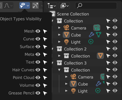
Small visual changes to the Object Types Visibility Popover
Someone forwarded me the following tweet (post / xing) that compares this popover between Blender and Bforartists: https://twitter.com/bforartists/status/1692580912372809745
Comparing the two, what bugs me the most are the spacing between Name, Icon, Icon. There is more space between the icons than between name and icon.
I do realize that the gap below "Grease Pencil" is intentional, but it seems a bit wonky. We have only two sections (Geometry & Other) that are untitled, so I'm sure many people know the significance or if it actually helps anyone.
This also changes the alignment, adds icons, and also adds tooltips for all the buttons.
Current state on the left, the PR on the right:
Indeed, the gap looks weird since it's not even in all places where it is in other lists such as the Add menu or Select by Type.
But there are some good points there, we usually left-align text in popovers so it'd make sense to have it that way too.
About the icon I'm not sure, since we usually have it on operators or specific menus (Add menu). I thought of making the label an operator to select all objects of the that type but it felt like a hidden feature so I'd rather not.
However, icons are good for accessibility, readability and easy to recognize even in translated UIs.
It's also a good point to have icons follow the order of the Outliner for consistency.
I also made the column
align=Trueso it's a bit more compact.What do you think? This is the code to test:
@pablovazquez - That's awesome. I updated the PR with your changes and also added tooltips to all the buttons. The wording of them would need some thought, all "Show this" and "Selectable that"
I'm not quite certain about the change of toggle order.
Probably just my L2R language bias, but the visibility icon seems the more likely-used., and has a clearer icon representation so explains the column a bit better. What I mean for the latter is that I would be okay with some hypothetical dialog that had only the column of eyes, but having only the arrows would need more explanation.
Deselecting the eye disables the selectability, so there is a right-to-left effect flow that I liked better when it was left-to-right.
But... this is totally not my call and I should be given very little weight for this kind of thing as I don't use this popover. I'd rather @pablovazquez just made the call.
It is probably more used, but this is about keeping consistency with how these icons are displayed in other areas.
The "downside" in usability would be having to click a couple pixels to the right, which I think is less bad than having different order in icons in the entire column.
So I think we should go with the same order as the Outliner.
@blender-bot build
Why not in alphabetical order?
They mirror the order in the
Addmenu. Which is sorted by functionality/frequency of use.I would have not imagined that Surface would be the third type of element in order of use 😮
It's not. It's legacy, I guess because of how "similar" to
Curveit was.Makes sense.
I guess this could be a matter for a separate UI update conversation, then.
Yes, if you have any suggestions please make a proposal. Thanks!