WIP: UI: Camera View Drawing #117117
No reviewers
Labels
No Label
Interest
Alembic
Interest
Animation & Rigging
Interest
Asset Browser
Interest
Asset Browser Project Overview
Interest
Audio
Interest
Automated Testing
Interest
Blender Asset Bundle
Interest
BlendFile
Interest
Collada
Interest
Compatibility
Interest
Compositing
Interest
Core
Interest
Cycles
Interest
Dependency Graph
Interest
Development Management
Interest
EEVEE
Interest
EEVEE & Viewport
Interest
Freestyle
Interest
Geometry Nodes
Interest
Grease Pencil
Interest
ID Management
Interest
Images & Movies
Interest
Import Export
Interest
Line Art
Interest
Masking
Interest
Metal
Interest
Modeling
Interest
Modifiers
Interest
Motion Tracking
Interest
Nodes & Physics
Interest
OpenGL
Interest
Overlay
Interest
Overrides
Interest
Performance
Interest
Physics
Interest
Pipeline, Assets & IO
Interest
Platforms, Builds & Tests
Interest
Python API
Interest
Render & Cycles
Interest
Render Pipeline
Interest
Sculpt, Paint & Texture
Interest
Text Editor
Interest
Translations
Interest
Triaging
Interest
Undo
Interest
USD
Interest
User Interface
Interest
UV Editing
Interest
VFX & Video
Interest
Video Sequencer
Interest
Virtual Reality
Interest
Vulkan
Interest
Wayland
Interest
Workbench
Interest: X11
Legacy
Blender 2.8 Project
Legacy
Milestone 1: Basic, Local Asset Browser
Legacy
OpenGL Error
Meta
Good First Issue
Meta
Papercut
Meta
Retrospective
Meta
Security
Module
Animation & Rigging
Module
Core
Module
Development Management
Module
EEVEE & Viewport
Module
Grease Pencil
Module
Modeling
Module
Nodes & Physics
Module
Pipeline, Assets & IO
Module
Platforms, Builds & Tests
Module
Python API
Module
Render & Cycles
Module
Sculpt, Paint & Texture
Module
Triaging
Module
User Interface
Module
VFX & Video
Platform
FreeBSD
Platform
Linux
Platform
macOS
Platform
Windows
Priority
High
Priority
Low
Priority
Normal
Priority
Unbreak Now!
Status
Archived
Status
Confirmed
Status
Duplicate
Status
Needs Info from Developers
Status
Needs Information from User
Status
Needs Triage
Status
Resolved
Type
Bug
Type
Design
Type
Known Issue
Type
Patch
Type
Report
Type
To Do
No Milestone
No project
No Assignees
4 Participants
Notifications
Due Date
No due date set.
Dependencies
No dependencies set.
Reference: blender/blender#117117
Loading…
Reference in New Issue
No description provided.
Delete Branch "Harley/blender:CameraView"
Deleting a branch is permanent. Although the deleted branch may continue to exist for a short time before it actually gets removed, it CANNOT be undone in most cases. Continue?
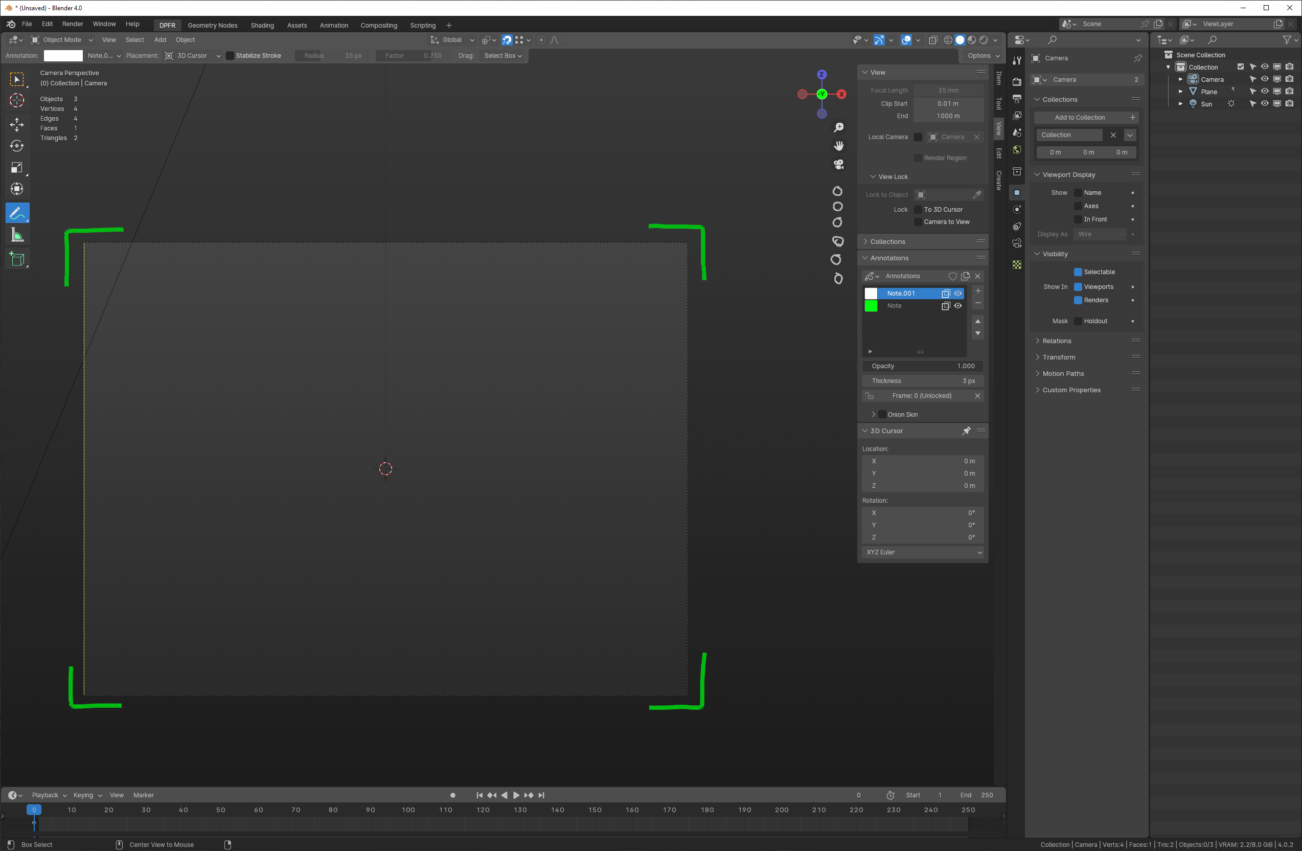
Incomplete. Changes to drawing while in Camera View.
Current samples. Unselected camera and showing safe guides:
Selected (active) camera and also showing third guides.
Selected camera, locked to view, with center guides.
Weekend Harley is different beast!
Early feedback: Compositional guides and safe areas should always be fully drawn lines, and never curved. They're very technical and necessary in that form, while this looks cooler its very impractical and isn't gonna stand well with animation studios.
Fixed. Thanks!!
Sorry it maybe images aren't updated yet but by fully drawn lines I meant like this. Safe areas can be dashed still its standard.
Some workflows and studios have very strict requirements about centering / splitting stuff in frame, and eyeballing things isnt good in that case. It can be optional but its important for some in my experience.
But I really love lines going over the border. Overscanned guides and very important too
Are the orange corners just for visibility purposes, or are they functional somehow?
As it stands they look draggable like a gizmo to adjust something, but I don't know what they'd be useful for.
For render resolution doesn't seem adequate, render region already has gizmos. Maybe for camera Focal Length or FOV adjustment, perhaps?
Gizmos for Dolly and Roll camera would actually be useful though. I think I've seen a patch for that somewhere before.
I think I stole that idea from a camera monitor display. But no worries. Fixed and I updated the captures.
@DuarteRamos
Trying to find some way of differentiating between active (selected) and locked, in some way that combines well. As in I don't want a red outline around a gold outline.
A few alternative suggestions
To differentiate between selected active and unselected, maybe use a triangle marker like the regular camera object, colored or black
Other suggestion a small cursor icon to the side select the camera, the color indicates whether it is active or not.
Dreaming out loud, gizmos for Dolly, Roll, and FOV camera. I think it was you who proposed a similar patch for those a while ago.
Maybe to keep things consistent those should be drawn on the right side of the viewport along with other navigation gizmos, only when in camera view, rather than by the camera object frame as illustrated.
Oh, that might work and would be nicely consistent. Although I have been trying hard to take inspiration from camera viewfinders and monitors so it looks more familiar to camera operators.
I would love that but struggle with a way to add this for a proper camera view.
The first problem is the navigate icons on the right. We can't just remove them while in such a mode otherwise you are clicking the "Camera" one and then having it disappear. So then you think of ways of extending those to include camera operations and I only get a big mess.
A weird thing is just to imagine an icon in that list that looks like a camera viewfinder. Makes sense, you click on that and get lots of camera controls. But that would be backwards from the current perp/ortho button which shows you the current state, not the one you would enter. This means this camera view mode would be entered by clicking on an icon that somehow means "not viewfinder"? Yikes.
Another consideration is that there are quite a large number of potential camera operations that would be put there, so any plan has to potentially support that. "Dolly" forward and back, "Truck" left and right, "Pedestal" camera up and down, "Pan" to twist left/right in same location, "Tilt" up and down in the same location, "roll", and "zoom" to change focal length.
Mockups definitely welcome.
Yours does look sleeker and more "camera like" though. The upwards arrow informs about camera direction for an object, not so useful in camera view. Maybe just making them slimmer would suffice to make them look less conspicuous.
Maybe we can change the current camera icon to also show state. An outline would show User view, clicking it would activate the camera
Indeed there are quite a few to the point where showing all possibilities may be too much. Just call them all "Pan" and be done with it 😝
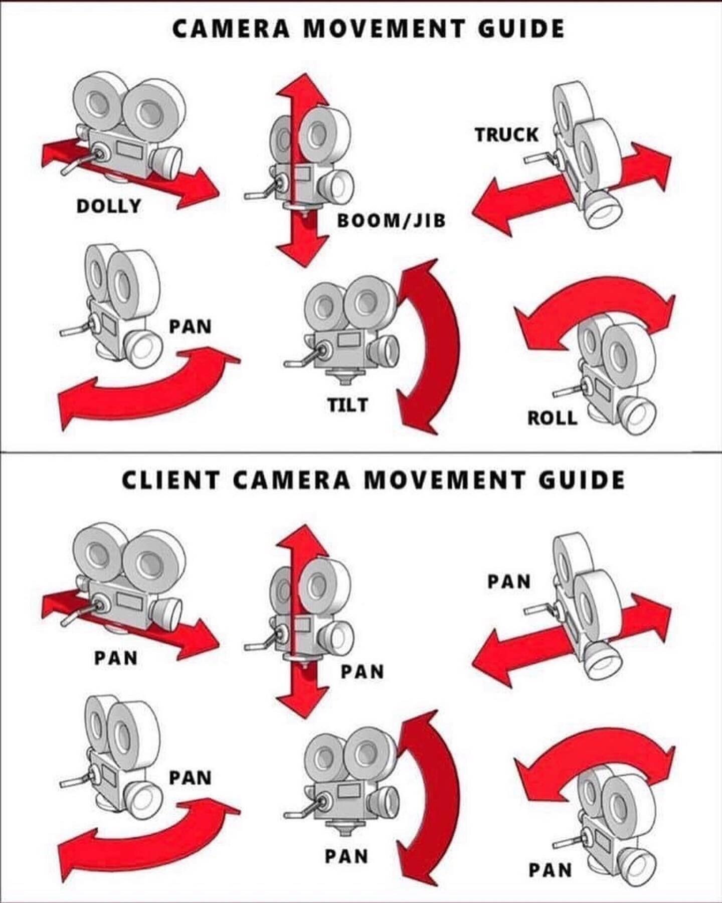
Image stolen from Streamsemester.com
Joking aside, maybe leave selecting the camera to the camera frames, just make them slimmer.
Then get a bunch of camera control icons to conditionally appear when in camera view, replacing the Perspective/Ortho one. Here is a quick mockup.
One conceptual issue this rises is that all current navigation gizmos affect the viewport only, while these actually alter your scene. They'd also have to take into account any transform locks on the camera object.
I would prefer something far less visually dominant than brightly-colored corners. When spending a good deal of time in a camera view, doing eval on "does everything look good, shading, lighting, etc" - having bright markers in the view would be rather distracting to the task at hand.
As to "6 camera control buttons for pan / roll / tilt / etc" - feels like very much overkill, especially given that we're lacking the most basic option at present of lock camera to view.
Any suggestions? A mockup would be wonderful.
First attempt at a mockup. I very much like your solid lines.
Inner lines (thirds, safe title) at 1 pixel, solid.
Outer border (lens) at 2 pixels, solid.
I do not believe the outer border needs to change color, when the camera object itself is selected. (Others might disagree, but I don't see the reason).
For "Camera is Locked to View", which I believe was the intent of the orange corners - i believe a simple non-intrusive (instead of a color change) would be to just append the work "locked" to the name of the camera.
_(As an aside - related but unrelated: having a pulldown for Safe Areas, a pulldown for Viewport Display, with another pulldown within for Compositional Guides - is more pulldowns than life needs. One gets lost trying to find the magic pulldown for Thirds)
Would be nice if at least Safe Area and Comp Guides were grouped in the same dropdown.)_
Awesome. Thanks!
Possibly. But what is the reasoning behind that? Is the color, or change of color intrusive?
In this PR as it is currently, the corner pieces change from grey to orange as the camera is selected. The red border is shown when camera is locked to view. Note that I really don't like the red at all, but that is just what we have now. Well, currently a dotted red border.
Currently the display of camera name is an option, so it isn't always shown. Of course that could change. I always thought it would be nice to show the camera name along with buttons to go to next/previous cameras.
Yes, I've noticed that too while making demos of this. It would be really nice to have those guides together.
It's a feeling of - just visually not necessary. If i'm view locked, then it doesn't matter if the camera is selected or not - rotating with the mouse, will move the camera. If i am not view locked, the mouse rotate action - well, it rotates the camera, but certainly not in any way that's useful.
So, the visual border of "camera is selected" - i don't see the functional reason, so it feels like just visual clutter (whether thick corners, or a different color).
If it were a decision of "Nope, we need to have something indicate it's selected" - then I would choose something rather ... not brightly shocking. A darker blue, or darker green, perhaps.
Actually, when I did the label on the mockup - it did occur to me that the camera name might not be present, if the user unclicked that box. So i debated what label to type. Perhaps
CAMERA 1 | LOCKED (if camera name activated)
LOCKED (and if not)
Checkout
From your project repository, check out a new branch and test the changes.