Rework/New: Object & Mesh Select Pies #21
No reviewers
Labels
No Label
bug
duplicate
enhancement
help wanted
need info
not a bug
wontfix
No Milestone
No project
No Assignees
2 Participants
Notifications
Due Date
No due date set.
Dependencies
No dependencies set.
Reference: extensions/space_view3d_pie_menus#21
Loading…
Reference in New Issue
Block a user
No description provided.
Delete Branch "selection_pies"
Deleting a branch is permanent. Although the deleted branch may continue to exist for a short time before it actually gets removed, it CANNOT be undone in most cases. Continue?
Rework Selection Pies (A)
These two pie menus had similar operations but their layouts weren't consistent with each other.
They also had drop-down menus with less frequently used operations, which I think is fine, but they were missing entries and weren't very well organized imo.
Also a lot of the pie menu was taken up by operations which already have easy to use built-in shortcuts.
What's exposed and what's tucked away
I think the purpose of pie menus is to speed up workflow by exposing the most commonly used operators and properties to very quick access.
Icons
As you can tell, I used a lot of icons. I try not to stretch their meaning too much, so for a couple things I did not use an icon because I just couldn't find anything remotely relevant. For Select Linked, I wanted to explicitly use an icon that isn't the library linking icon, to suggest to users that this menu has nothing to do with library linking. I used the "Duplicate" icon, since you'd usually get shared object data by duplicating objects. The rest I feel are justified without further explanation.
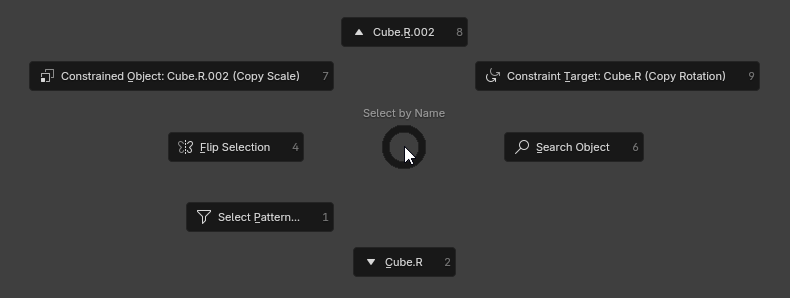
New Name-based Selection Pie (Ctrl+F)
In addition to reworking the existing selection pies, the PR also adds a new name-based selection pie.

Entries don't appear or are grayed out if no corresponding object exists.
Rework: Object & Mesh Select Piesto Rework/New: Object & Mesh Select PiesI am not against some change per se, but I confess that I didn't expect "Select All" not to be placed at the top and I kind of expected with this UI rework that Deselect All would be placed at the bottom. I guess I'll have to update my core memory. 🤷😀
Just a few observations:
Here is a mock-up concept for the Object Select pie menu (with "Select All" at the top):
And here is one for the Mesh Select pie menu:
Thanks for the feedback! Although your first image isn't working, I tried to gather it from the text. But if you can edit the post to fix that image, I'll take another look.
Will fix the typo, good catch.
I think you're right about keeping "Select Active Camera". It could take the spot of "Select All Children".
I like your idea of having a dynamic drop-down of other cameras, will definitely add that.
I could rotate the up/down and left/right positions so Select All goes back on top. Will think about it, but no promises. On one hand, reducing how much I piss off existing users seems wise. On the other hand, I do feel like having the most commonly used operator on the right is the most intuitive if you don't have pre-existing bias.
As for putting a million buttons on the top level, this is really not what pie menus are good at. This would look and feel infinitely better in a regular, rectangular pop-up panel. The strength of pie menus is gestures. If we need more selection operators to be accessible with gestures, I'd rather consider sub-pies or more pies on different shortcuts. The drop-down that's in there now is an exception I was willing to make because I find Blender's built-in selection menu a bit disorganized.
I actually think a rectangular pop-up menu would be a cool idea with how many selection operations there are, but for the moment I'm gonna say this is out of scope for the add-on.
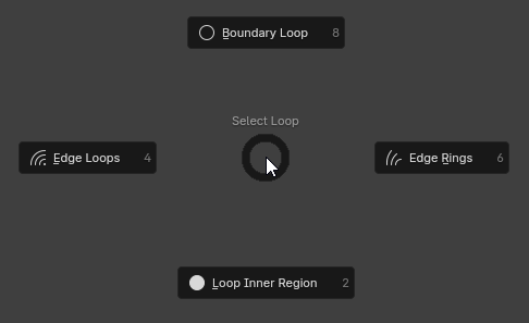
I would have nothing against adding another pie dedicated to just the Select Loop menu's 4 entries. It's just a matter of finding a shortcut for it. It could also be a sub-pie, since mesh edit mode still has an available empty space. I'll think about that. Lmk if you have any thoughts on that.
Addressed the parts of your feedback that I agreed with, including putting Select All back on top. Updated PR description including images. I'm pretty happy with this, so I'll merge this in a few days if there's no further feedback.
Again, lmk if you have any thoughts on this!
Thank you very much for this.
I think there are now a lot of pies, I don't think there should me more tbh.
But I would be happy to see a sub-pie to select Loops and Rings on the Mesh Select pie menu. 👍
8ca070c9afto48353b37bdAdded the Select Loops sub-pie, updated PR description accordingly, but putting the image of the sub-pie here:

Will likely publish with the next version on Sunday evening.
75a87cb5ebtob5288e7d81