UI: Increase Color Picker Size #111153
No reviewers
Labels
No Label
Interest
Alembic
Interest
Animation & Rigging
Interest
Asset System
Interest
Audio
Interest
Automated Testing
Interest
Blender Asset Bundle
Interest
BlendFile
Interest
Code Documentation
Interest
Collada
Interest
Compatibility
Interest
Compositing
Interest
Core
Interest
Cycles
Interest
Dependency Graph
Interest
Development Management
Interest
EEVEE
Interest
Freestyle
Interest
Geometry Nodes
Interest
Grease Pencil
Interest
ID Management
Interest
Images & Movies
Interest
Import Export
Interest
Line Art
Interest
Masking
Interest
Metal
Interest
Modeling
Interest
Modifiers
Interest
Motion Tracking
Interest
Nodes & Physics
Interest
OpenGL
Interest
Overlay
Interest
Overrides
Interest
Performance
Interest
Physics
Interest
Pipeline, Assets & IO
Interest
Platforms, Builds & Tests
Interest
Python API
Interest
Render & Cycles
Interest
Render Pipeline
Interest
Sculpt, Paint & Texture
Interest
Text Editor
Interest
Translations
Interest
Triaging
Interest
Undo
Interest
USD
Interest
User Interface
Interest
UV Editing
Interest
VFX & Video
Interest
Video Sequencer
Interest
Viewport & EEVEE
Interest
Virtual Reality
Interest
Vulkan
Interest
Wayland
Interest
Workbench
Interest: X11
Legacy
Asset Browser Project
Legacy
Blender 2.8 Project
Legacy
Milestone 1: Basic, Local Asset Browser
Legacy
OpenGL Error
Meta
Good First Issue
Meta
Papercut
Meta
Retrospective
Meta
Security
Module
Animation & Rigging
Module
Core
Module
Development Management
Module
Grease Pencil
Module
Modeling
Module
Nodes & Physics
Module
Pipeline, Assets & IO
Module
Platforms, Builds & Tests
Module
Python API
Module
Render & Cycles
Module
Sculpt, Paint & Texture
Module
Triaging
Module
User Interface
Module
VFX & Video
Module
Viewport & EEVEE
Platform
FreeBSD
Platform
Linux
Platform
macOS
Platform
Windows
Severity
High
Severity
Low
Severity
Normal
Severity
Unbreak Now!
Status
Archived
Status
Confirmed
Status
Duplicate
Status
Needs Info from Developers
Status
Needs Information from User
Status
Needs Triage
Status
Resolved
Type
Bug
Type
Design
Type
Known Issue
Type
Patch
Type
Report
Type
To Do
No Milestone
No project
No Assignees
2 Participants
Notifications
Due Date
No due date set.
Dependencies
No dependencies set.
Reference: blender/blender#111153
Loading…
Reference in New Issue
Block a user
No description provided.
Delete Branch "Harley/blender:ColorPickerSize"
Deleting a branch is permanent. Although the deleted branch may continue to exist for a short time before it actually gets removed, it CANNOT be undone in most cases. Continue?
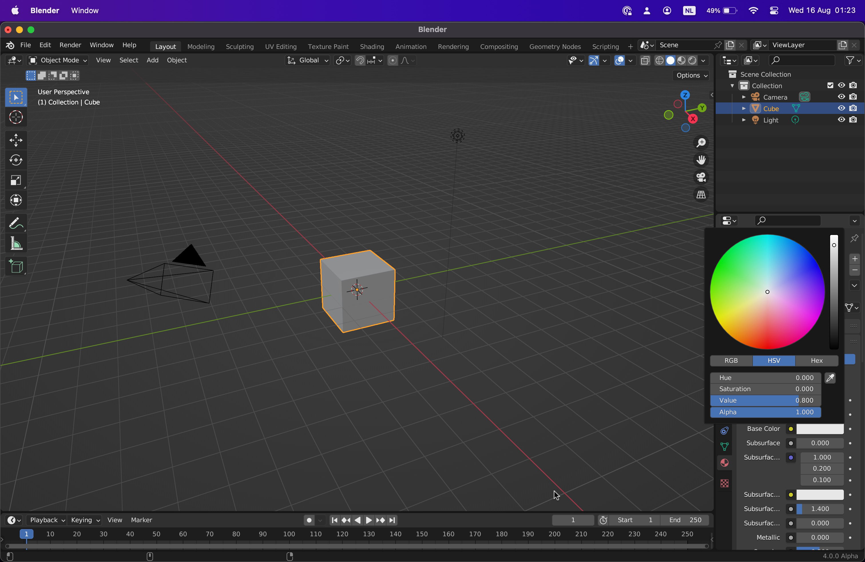
Increase the Color Picker Size by 33%
The color picker is just a bit too small. This increases the size of it by 33%, in each linear direction so we get a 78% increase in total surface area. Before and after with default startup and Resolution Scale set to 1.0:
Note that we used to be more constrained with this size, because the popup was always rooted to the launching button. This was addressed in #106122 so that it can reposition if needed. Therefore it can be any size now
Note too that this is an alternative to #106135, or possibly a precursor to. It can at least be a convenience in place for now.
+1
Feels a bit large at first but I think it is an improvement. It also gives us some room for possibly having more controls in the future, like a color-picker type switch or palettes.
Reference how it looks on a clean build by default on macOS (14" MacBook)

It can really be any size at all. If you think it feels a bit big we can always dial it down a bit. In current code it is 150, while in the this PR is 225, chosen completely arbitrarily. We could make it 200, or any other size if you prefer.
It might be a good compromise. We don't want to make it too large that it gets on the way on small screen sizes. I'll test it tomorrow at the office.
Tested locally. I think 200 is a good compromise until we can get them to be resizable.
The widget is much larger but not too large for small screens, and sliders don't feel too wide like they do at 225.
Left: 225
Middle: 200
Right:
main(150)@Harley if you could please update the patch for
PICKER_TOTAL_Wto be200.0f * UI_SCALE_FACit can be committed without further review. Thanks!Thanks Pablo!
@blender-bot build