Image Editor Vectorscope Improvement #116974

Merged
Aras Pranckevicius merged 13 commits from JonasDichelle/blender:vectorscope-update into main 2024-02-06 12:22:57 +01:00
Contributor

Design Issue: #116973

Image Editor Vector Scope Improvement

Overview

The vectorscope in the image editor currently has several issues, mostly in terms of readability.
I've made some updates to the code in an attempt to improve the UI.

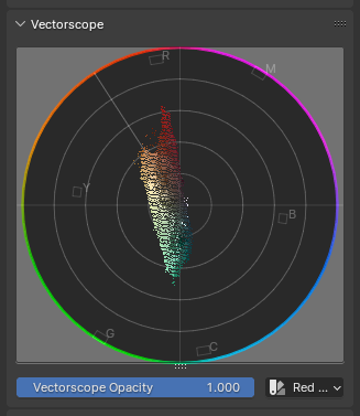
Old Scope Design New Scope Design
The current vector scope My proposed update

Key Issues

  • Readability:

    • Low contrast: White points on a light gray background make it hard to read.
    • Transparency problems: The skin tone line's semi-transparency reveals the underlying image instead of the scope itself.
  • Color Representation:

    • Color indication: There's no clear representation of what colors are shown in different scope areas.
    • Color targets: The color targets are bulky and lack labels.
  • Aesthetic Concerns:

    • The circles have a low point count, which doesn't look great.

The Proposal

The code changes I have made tackle the issues I've outlined above.

  • The Color Point Cloud

    • I added an RGB mode to the scope, which colors the points, according to the color they represent, the old display mode is still accessible through the Luma option.
    • The Vectorscope Opacity affects the opacity of the individual points allowing the user to find areas where certain colors are more concentrated.
  • The Scope

    • Changed Background color to increase readability.
    • Made the colors of the outermost circle represent the colors at that point.
    • Removed the outside target to reduce visual bloat.
    • Added labels to the targets for clarity.
    • Removed color and transparency from the skin tone line.

Demonstration


Demonstration of the usability improvements of the update

Design Issue: https://projects.blender.org/blender/blender/issues/116973 # Image Editor Vector Scope Improvement ## Overview The vectorscope in the image editor currently has several issues, mostly in terms of readability. I've made some updates to the code in an attempt to improve the UI. | Old Scope Design | New Scope Design | |:----------------:|:----------------:| | ![The current vector scope](/attachments/c02637a3-7293-4355-899d-d95a13c7935f) | ![My proposed update](/attachments/d377258f-8ce6-4829-bbd9-21c3357a9a9d) | --- ## Key Issues - **Readability:** - Low contrast: White points on a light gray background make it hard to read. - Transparency problems: The skin tone line's semi-transparency reveals the underlying image instead of the scope itself. <video src="/attachments/d65cdfb0-3d7c-4fac-86f1-4d5e505fea29" title="blender_0VbqGXzK2K.mp4" controls></video> - **Color Representation:** - Color indication: There's no clear representation of what colors are shown in different scope areas. - Color targets: The color targets are bulky and lack labels. - **Aesthetic Concerns:** - The circles have a low point count, which doesn't look great. --- ## The Proposal The code changes I have made tackle the issues I've outlined above. - **The Color Point Cloud** - I added an `RGB` mode to the scope, which colors the points, according to the color they represent, the old display mode is still accessible through the `Luma` option. - The `Vectorscope Opacity` affects the opacity of the individual points allowing the user to find areas where certain colors are more concentrated. <video src="/attachments/62ebd31b-ea79-442e-8cd3-bfa58c5c72d6" title="blender_oal5AqaZyP.mp4" controls></video> - **The Scope** - Changed Background color to increase readability. - Made the colors of the outermost circle represent the colors at that point. - Removed the outside target to reduce visual bloat. - Added labels to the targets for clarity. - Removed color and transparency from the skin tone line. --- ## Demonstration <video src="/attachments/8fb87777-0d3d-4fc0-b441-47f9adc64464" title="blender_PJI7YesVfc.mp4" controls></video> _Demonstration of the usability improvements of the update_
Jonas Dichelle added 5 commits 2024-01-10 08:54:08 +01:00
Jonas Dichelle changed title from WIP Image Editor Vectorscope Improvement to WIP: WIP Image Editor Vectorscope Improvement 2024-01-10 09:04:36 +01:00
Jonas Dichelle changed title from WIP: WIP Image Editor Vectorscope Improvement to WIP: Image Editor Vectorscope Improvement 2024-01-10 09:04:44 +01:00
Aras Pranckevicius reviewed 2024-01-10 09:17:16 +01:00
@ -166,2 +168,2 @@
int waveform_tot;
char _pad[4];
float *vecscope_rgb;
char _pad[8]; // Adjusted for alignment

Is the _pad needed at all now?

Is the `_pad` needed at all now?
Author
Contributor

good catch thanks!

good catch thanks!
JonasDichelle marked this conversation as resolved
Aras Pranckevicius reviewed 2024-01-10 09:17:34 +01:00
@ -1763,6 +1763,8 @@ void DRW_draw_render_loop_ex(Depsgraph *depsgraph,
drw_engines_draw_scene();
// Clean up

Looks like leftover comment.

Looks like leftover comment.
JonasDichelle marked this conversation as resolved
Aras Pranckevicius reviewed 2024-01-10 09:18:07 +01:00
@ -956,2 +951,2 @@
polar_to_x(centerx, diam, tampli + dampli, tangle - dangle + dangle2),
polar_to_y(centery, diam, tampli + dampli, tangle - dangle + dangle2));
//draw text

In general blender uses C style comments, i.e. /* foo */ not // foo

In general blender uses C style comments, i.e. `/* foo */` not `// foo`
Author
Contributor

thanks for the hint!

thanks for the hint!
JonasDichelle marked this conversation as resolved

I have recently done a "facelift" for the video sequence editor scopes -- #116798 -- do you think it would make sense to unify the "look" of image & sequencer scopes maybe?

I have recently done a "facelift" for the video sequence editor scopes -- #116798 -- do you think it would make sense to unify the "look" of image & sequencer scopes maybe?
Jonas Dichelle added 1 commit 2024-01-10 11:30:13 +01:00
Author
Contributor

@aras_p, I like the intensity accumulation changes you made, they help readability a lot.
It would be good to implement those in the image editor's histogram and waveform too.
I also think the inconsistency between the scopes is something to think about. The way the appearance of the VSE scopes is dependent on the dimensions of the scene feels weird to me.
I think it would probably be best to have the scopes also be in the side panel as they are in the image editor.

@aras_p, I like the intensity accumulation changes you made, they help readability a lot. It would be good to implement those in the image editor's histogram and waveform too. I also think the inconsistency between the scopes is something to think about. The way the appearance of the VSE scopes is dependent on the dimensions of the scene feels weird to me. I think it would probably be best to have the scopes also be in the side panel as they are in the image editor.
Jonas Dichelle changed title from WIP: Image Editor Vectorscope Improvement to Image Editor Vectorscope Improvement 2024-01-10 23:52:42 +01:00
Jeroen Bakker requested review from Jeroen Bakker 2024-01-11 07:39:23 +01:00
Jeroen Bakker added this to the 4.1 milestone 2024-01-11 07:39:29 +01:00
Jeroen Bakker requested review from Pablo Vazquez 2024-01-11 09:37:11 +01:00
Member

I added Pablo as reviewer as it is UI/UX related and with recent changes the vector scopes seems to be different between image editor/sequencer. So perhaps we first need to settle on the right UI/UX (this patch feels promising, but I am not the expert on using vector scopes).

I am also not aware why the vector scopes are separated. Can imagine that this is legacy. If so we should check what effort/risk is needed to combine both. This could be done in a separate PR, before or after this PR lands.

I added Pablo as reviewer as it is UI/UX related and with recent changes the vector scopes seems to be different between image editor/sequencer. So perhaps we first need to settle on the right UI/UX (this patch feels promising, but I am not the expert on using vector scopes). I am also not aware why the vector scopes are separated. Can imagine that this is legacy. If so we should check what effort/risk is needed to combine both. This could be done in a separate PR, before or after this PR lands.

I am also not aware why the vector scopes are separated. Can imagine that this is legacy. If so we should check what effort/risk is needed to combine both. This could be done in a separate PR, before or after this PR lands.

@Jeroen-Bakker FWIW I tried to look into sharing the scopes code between Image and Sequencer a few weeks ago, and gave up. The image scopes have their own special UI widget type to draw themselves, which makes it really cumbersome to take out the image scopes data out of DNA (which arguably should never have been part of DNA to begin with!). I'd be all for unifying the look (and the code, if possible) between them, but due to how the image scopes drawing is structured right now, it's not exactly trivial :/

> I am also not aware why the vector scopes are separated. Can imagine that this is legacy. If so we should check what effort/risk is needed to combine both. This could be done in a separate PR, before or after this PR lands. @Jeroen-Bakker FWIW I tried to look into sharing the scopes code between Image and Sequencer a few weeks ago, and gave up. The image scopes have their own special UI widget type to draw themselves, which makes it really cumbersome to take out the image scopes data out of DNA (which arguably should never have been part of DNA to begin with!). I'd be all for unifying the look (and the code, if possible) between them, but due to how the image scopes drawing is structured right now, it's not exactly trivial :/
Author
Contributor

@Jeroen-Bakker thank you for taking a look at this issue. The code design of the scopes could definitely do with an overhaul and I agree with @aras_p that that would be a pretty big undertaking.

@Jeroen-Bakker thank you for taking a look at this issue. The code design of the scopes could definitely do with an overhaul and I agree with @aras_p that that would be a pretty big undertaking.
Jonas Dichelle added 1 commit 2024-01-14 19:31:22 +01:00
Member

Oooh nice! I think the outer ring could be a bit thicker (if possible, I know we have OpenGL limits).

For the Luma version (or both?), perhaps having the background of the scope be a darkened version of the colorwheel. What do you think?

I've made a quick mockup in GIMP:
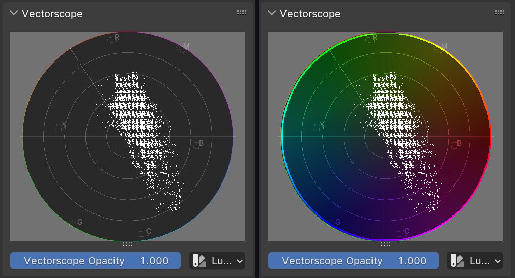
vectorscope_luma.jpg

Oooh nice! I think the outer ring could be a bit thicker (if possible, I know we have OpenGL limits). For the Luma version (or both?), perhaps having the background of the scope be a darkened version of the colorwheel. What do you think? I've made a quick mockup in GIMP: ![vectorscope_luma.jpg](/attachments/600cff34-0bd8-49d5-bc93-80dadc299f88)
Author
Contributor

@pablovazquez, thank you for the feedback!
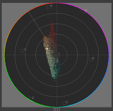
Changing the line width is pretty easy. Here's a screenshot with GPU_line_width(2.0f):
blender_uPBS5Eu1uz.png
I've also increased the opacity to 100% (might be too much), previously it was at 70%.

Making the background have an accurately filled in color wheel would require writing a new OpenGL shader, which would take a bit longer, though.

@pablovazquez, thank you for the feedback! Changing the line width is pretty easy. Here's a screenshot with `GPU_line_width(2.0f)`: ![blender_uPBS5Eu1uz.png](/attachments/e5e2a6e9-0dcb-45b6-9444-be4eb864bc6b) I've also increased the opacity to 100% (might be too much), previously it was at 70%. Making the background have an accurately filled in color wheel would require writing a new OpenGL shader, which would take a bit longer, though.
Member

Changing the line width is pretty easy. Here's a screenshot with GPU_line_width(2.0f):

Neat! I think the wider line makes it look nicer and serve its purpose better.

Would it help to add GPU_line_smooth(true); in the mix for better anti aliasing? Or am I wishful thinking here. Thanks!

> Changing the line width is pretty easy. Here's a screenshot with `GPU_line_width(2.0f)`: Neat! I think the wider line makes it look nicer and serve its purpose better. Would it help to add `GPU_line_smooth(true);` in the mix for better anti aliasing? Or am I wishful thinking here. Thanks!
Author
Contributor

Would it help to add GPU_line_smooth(true); in the mix for better anti aliasing? Or am I wishful thinking here. Thanks!

Oh wow, that look a lot better!
I like the way it looks a lot now.
blender_OjaNp4bn0J.png

> Would it help to add `GPU_line_smooth(true);` in the mix for better anti aliasing? Or am I wishful thinking here. Thanks! Oh wow, that look a lot better! I like the way it looks a lot now. ![blender_OjaNp4bn0J.png](/attachments/023bbf3b-73da-43f0-a55f-72f5b454e943)
Jonas Dichelle added 1 commit 2024-01-31 21:45:24 +01:00
-increased line width and opacity
-made lines smooth

Making the background have an accurately filled in color wheel would require writing a new OpenGL shader

It does not necessarily need a new shader, you could draw a triangle fan with vertex colors, and use the existing "with vertex colors, smooth interpolation" shader. More triangles than scribbled here, but you get the idea:
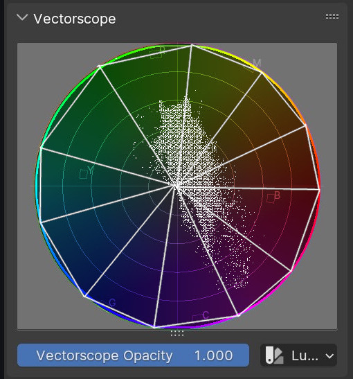
vectorscope_luma.jpg

> Making the background have an accurately filled in color wheel would require writing a new OpenGL shader It does not necessarily need a new shader, you could draw a triangle fan with vertex colors, and use the existing "with vertex colors, smooth interpolation" shader. More triangles than scribbled here, but you get the idea: ![vectorscope_luma.jpg](/attachments/0e2a55e8-412e-4788-8afd-213f9fbdda51)
Author
Contributor

@aras_p, I've thought about that too. But in that case, for example, you wouldn't have an accurate loss of saturation towards the center because the color would change linearly towards the center on each radius.
To accurately represent the colors in the background, I believe, you would need some sort of new fragment shader.

@aras_p, I've thought about that too. But in that case, for example, you wouldn't have an accurate loss of saturation towards the center because the color would change linearly towards the center on each radius. To accurately represent the colors in the background, I believe, you would need some sort of new fragment shader.
Pablo Vazquez approved these changes 2024-02-01 11:34:24 +01:00
Pablo Vazquez left a comment
Member

For this vectorscope specifically it didn't mean to be super accurate but dimmed in the background as a hint.

If you (+Aras) plan to improve scopes code and design in general we could re-visit this again in the future as part of a more unified look.

This already is a great improvement for 4.1, so in regards to design: +1 !

For this vectorscope specifically it didn't mean to be super accurate but dimmed in the background as a hint. If you (+Aras) plan to improve scopes code and design in general we could re-visit this again in the future as part of a more unified look. This already is a great improvement for 4.1, so in regards to design: +1 !
Author
Contributor

Yes, I just tested it and was going to add that it actually looks quite good even if not entirely accurate and might be good enough.

blender_HCrrP0ciRv.png

Thanks for approving!

Yes, I just tested it and was going to add that it actually looks quite good even if not entirely accurate and might be good enough. ![blender_HCrrP0ciRv.png](/attachments/1061780e-bdd2-4c8f-b5d9-587645135608) Thanks for approving!
Member

Yes, I just tested it and was going to add that it actually looks quite good even if not entirely accurate and might be good enough.

Ooh much nicer indeed! My +1 goes to this one now hah.

Thanks for approving!

Thank you for having a look at this far corner of Blender :D

> Yes, I just tested it and was going to add that it actually looks quite good even if not entirely accurate and might be good enough. Ooh much nicer indeed! My +1 goes to this one now hah. > Thanks for approving! Thank you for having a look at this far corner of Blender :D
Author
Contributor


Cool, I pushed the new version.
I only added it to the luma mode since it looked really bad together with the colored points.

<video src="/attachments/1d325f7b-e4cf-49de-a931-75e47c6ea06a" title="blender_4yTryjAoxm.mp4" controls></video> Cool, I pushed the new version. I only added it to the luma mode since it looked really bad together with the colored points.
Jonas Dichelle added 1 commit 2024-02-01 12:41:02 +01:00
Pablo Vazquez approved these changes 2024-02-01 12:42:40 +01:00
Member

Thanks! I'll leave this then for @Jeroen-Bakker or @aras_p to review the code.

Thanks! I'll leave this then for @Jeroen-Bakker or @aras_p to review the code.

@pablovazquez should I put the same visual look into VSE vectorscope? (I think that would be good to do)

@pablovazquez should I put the same visual look into VSE vectorscope? (I think that would be good to do)
Member

@pablovazquez should I put the same visual look into VSE vectorscope? (I think that would be good to do)

That'd be awesome! First step towards a unified look.

> @pablovazquez should I put the same visual look into VSE vectorscope? (I think that would be good to do) That'd be awesome! First step towards a unified look.
Aras Pranckevicius requested review from Aras Pranckevicius 2024-02-01 15:51:42 +01:00
Aras Pranckevicius reviewed 2024-02-01 15:58:17 +01:00
@ -976,2 +972,4 @@
{0.75, 0.0, 0.75}, /* Magenta */
};
const char color_names[6][4] = {"R", "Y", "G", "C", "B", "M"};

Minor: not sure why color names are array of 4 characters each, when they are all a single char. Maybe change them to not be strings at all, and make vectorscope_draw_target just take a single char for the letter? (and internally have a char[2] buffer for passing to font drawing functions)

Minor: not sure why color names are array of 4 characters each, when they are all a single char. Maybe change them to not be strings at all, and make vectorscope_draw_target just take a single char for the letter? (and internally have a `char[2]` buffer for passing to font drawing functions)
Author
Contributor

Good call, I'll change that!

Good call, I'll change that!
Author
Contributor

i updated it in 2bebddf117

i updated it in 2bebddf117
aras_p marked this conversation as resolved
Aras Pranckevicius reviewed 2024-02-01 15:59:54 +01:00
@ -1016,0 +1099,4 @@
circle_draw_rgb(circle_points, tot_points, circle_vertex_colors, GPU_PRIM_LINE_LOOP);
GPU_line_width(1.5f);
/* inner circles */

Should the inner circles also use circle_draw_rgb machinery, instead of immediate mode?

Should the inner circles also use `circle_draw_rgb` machinery, instead of immediate mode?
Author
Contributor

Yes we can do that, updated it in the latest commit!

Yes we can do that, updated it in the latest commit!
aras_p marked this conversation as resolved
Aras Pranckevicius reviewed 2024-02-01 16:03:40 +01:00
@ -1362,0 +1363,4 @@
scopes->vecscope_rgb[color_idx + 0] = rgb[0];
scopes->vecscope_rgb[color_idx + 1] = rgb[1];
scopes->vecscope_rgb[color_idx + 2] = rgb[2];
scopes->vecscope_rgb[color_idx + 3] = scopes->vecscope_alpha;

Given that vecscope_rgb always uses the same single value for the alpha component of each point, would it be worth changing it to allocate 3 floats per sample instead of 4? Would save some memory, and at draw time could just fetch the alpha from vecscope_alpha field.

Given that `vecscope_rgb` always uses the same single value for the alpha component of each point, would it be worth changing it to allocate 3 floats per sample instead of 4? Would save some memory, and at draw time could just fetch the alpha from `vecscope_alpha` field.
Author
Contributor

I did this because we need to pass in 4 values for each Vertex into the shader.
Having individual alphas for each vertex is necessary to get good looking accumulation.
If we didn't do this here we would need to add the alpha values to the array at a later point.
The only way to avoid this would be to create a new shader.
But please correct me if I'm wrong.

I did this because we need to pass in 4 values for each Vertex into the shader. Having individual alphas for each vertex is necessary to get good looking accumulation. If we didn't do this here we would need to add the alpha values to the array at a later point. The only way to avoid this would be to create a new shader. But please correct me if I'm wrong.

Ah, I see, this array is directly copied into the GPU vertex buffer. Ignore me then!

Ah, I see, this array is directly copied into the GPU vertex buffer. Ignore me then!
aras_p marked this conversation as resolved
Aras Pranckevicius reviewed 2024-02-01 16:04:23 +01:00
@ -1147,1 +1147,4 @@
static const EnumPropertyItem prop_vecscope_mode_items[] = {
{SCOPES_VECSCOPE_LUMA, "LUMA", ICON_COLOR, "Luma", ""},
{SCOPES_VECSCOPE_RGB, "RGB", ICON_COLOR, "Red Green Blue", ""},

"Red Green Blue" as a UI label feels a bit weird (and hardly fits into UI control space). Maybe "RGB" or "Color" instead?

"Red Green Blue" as a UI label feels a bit weird (and hardly fits into UI control space). Maybe "RGB" or "Color" instead?
Member

I had the same issue with this but looking at all other scopes they use Red Green Blue. This patch is just following what's already there.

Once this gets in we can do a pass and rename that for all scopes. I'd also like to make a few changes in that UI later for all scopes (the opacity slider after the type selector, leave just "opacity" in the label so it's less verbose, remove icon from enum, etc).

I had the same issue with this but looking at all other scopes they use `Red Green Blue`. This patch is just following what's already there. Once this gets in we can do a pass and rename that for all scopes. I'd also like to make a few changes in that UI later for all scopes (the opacity slider after the type selector, leave just "opacity" in the label so it's less verbose, remove icon from enum, etc).
Author
Contributor

I agree RGB would be better.
I just copied the label from the Waveform which has "Red Green Blue".
But I'm also in favor of changing this.

I agree RGB would be better. I just copied the label from the Waveform which has "Red Green Blue". But I'm also in favor of changing this.
aras_p marked this conversation as resolved
Jonas Dichelle added 1 commit 2024-02-01 16:35:22 +01:00
-changes color letters to chars
-using circle_draw_rgb for all circles

@pablovazquez should I put the same visual look into VSE vectorscope? (I think that would be good to do)

That'd be awesome! First step towards a unified look.

@pablovazquez @JonasDichelle hey look! #117738

> > @pablovazquez should I put the same visual look into VSE vectorscope? (I think that would be good to do) > > That'd be awesome! First step towards a unified look. @pablovazquez @JonasDichelle hey look! https://projects.blender.org/blender/blender/pulls/117738
Author
Contributor

@aras_p Very cool, it looks a lot better especially compared to 4.0!

@aras_p Very cool, it looks a lot better especially compared to 4.0!
Aras Pranckevicius approved these changes 2024-02-02 06:13:52 +01:00
Aras Pranckevicius left a comment
Member

The code looks alright to me. Might be worth rebasing or merging latest main though.

The code looks alright to me. Might be worth rebasing or merging latest main though.
Jonas Dichelle added 1 commit 2024-02-02 11:38:03 +01:00
Merge branch 'main' of projects.blender.org:blender/blender into vectorscope-update
Some checks failed
buildbot/vexp-code-patch-darwin-x86_64 Build done.
buildbot/vexp-code-patch-windows-amd64 Build done.
buildbot/vexp-code-patch-lint Build done.
buildbot/vexp-code-patch-linux-x86_64 Build done.
buildbot/vexp-code-patch-darwin-arm64 Build done.
buildbot/vexp-code-patch-coordinator Build done.
8ecf051684
Author
Contributor

The code looks alright to me. Might be worth rebasing or merging latest main though.

Done, thanks for reviewing it!

> The code looks alright to me. Might be worth rebasing or merging latest main though. Done, thanks for reviewing it!

@blender-bot build

@blender-bot build
Jonas Dichelle added 1 commit 2024-02-06 10:28:09 +01:00
Jonas Dichelle added 1 commit 2024-02-06 11:12:33 +01:00
Merge branch 'main' of projects.blender.org:blender/blender into vectorscope-update
All checks were successful
buildbot/vexp-code-patch-lint Build done.
buildbot/vexp-code-patch-darwin-x86_64 Build done.
buildbot/vexp-code-patch-linux-x86_64 Build done.
buildbot/vexp-code-patch-windows-amd64 Build done.
buildbot/vexp-code-patch-coordinator Build done.
7ee562ba00

@blender-bot build

@blender-bot build
Aras Pranckevicius merged commit 567455124d into main 2024-02-06 12:22:57 +01:00
Sign in to join this conversation.
No Label
Interest
Alembic
Interest
Animation & Rigging
Interest
Asset System
Interest
Audio
Interest
Automated Testing
Interest
Blender Asset Bundle
Interest
BlendFile
Interest
Code Documentation
Interest
Collada
Interest
Compatibility
Interest
Compositing
Interest
Core
Interest
Cycles
Interest
Dependency Graph
Interest
Development Management
Interest
EEVEE
Interest
Freestyle
Interest
Geometry Nodes
Interest
Grease Pencil
Interest
ID Management
Interest
Images & Movies
Interest
Import Export
Interest
Line Art
Interest
Masking
Interest
Metal
Interest
Modeling
Interest
Modifiers
Interest
Motion Tracking
Interest
Nodes & Physics
Interest
OpenGL
Interest
Overlay
Interest
Overrides
Interest
Performance
Interest
Physics
Interest
Pipeline, Assets & IO
Interest
Platforms, Builds & Tests
Interest
Python API
Interest
Render & Cycles
Interest
Render Pipeline
Interest
Sculpt, Paint & Texture
Interest
Text Editor
Interest
Translations
Interest
Triaging
Interest
Undo
Interest
USD
Interest
User Interface
Interest
UV Editing
Interest
VFX & Video
Interest
Video Sequencer
Interest
Viewport & EEVEE
Interest
Virtual Reality
Interest
Vulkan
Interest
Wayland
Interest
Workbench
Interest: X11
Legacy
Asset Browser Project
Legacy
Blender 2.8 Project
Legacy
Milestone 1: Basic, Local Asset Browser
Legacy
OpenGL Error
Meta
Good First Issue
Meta
Papercut
Meta
Retrospective
Meta
Security
Module
Animation & Rigging
Module
Core
Module
Development Management
Module
Grease Pencil
Module
Modeling
Module
Nodes & Physics
Module
Pipeline, Assets & IO
Module
Platforms, Builds & Tests
Module
Python API
Module
Render & Cycles
Module
Sculpt, Paint & Texture
Module
Triaging
Module
User Interface
Module
VFX & Video
Module
Viewport & EEVEE
Platform
FreeBSD
Platform
Linux
Platform
macOS
Platform
Windows
Severity
High
Severity
Low
Severity
Normal
Severity
Unbreak Now!
Status
Archived
Status
Confirmed
Status
Duplicate
Status
Needs Info from Developers
Status
Needs Information from User
Status
Needs Triage
Status
Resolved
Type
Bug
Type
Design
Type
Known Issue
Type
Patch
Type
Report
Type
To Do
No Milestone
No project
No Assignees
4 Participants
Notifications
Due Date
The due date is invalid or out of range. Please use the format 'yyyy-mm-dd'.

No due date set.

Dependencies

No dependencies set.

Reference: blender/blender#116974
No description provided.